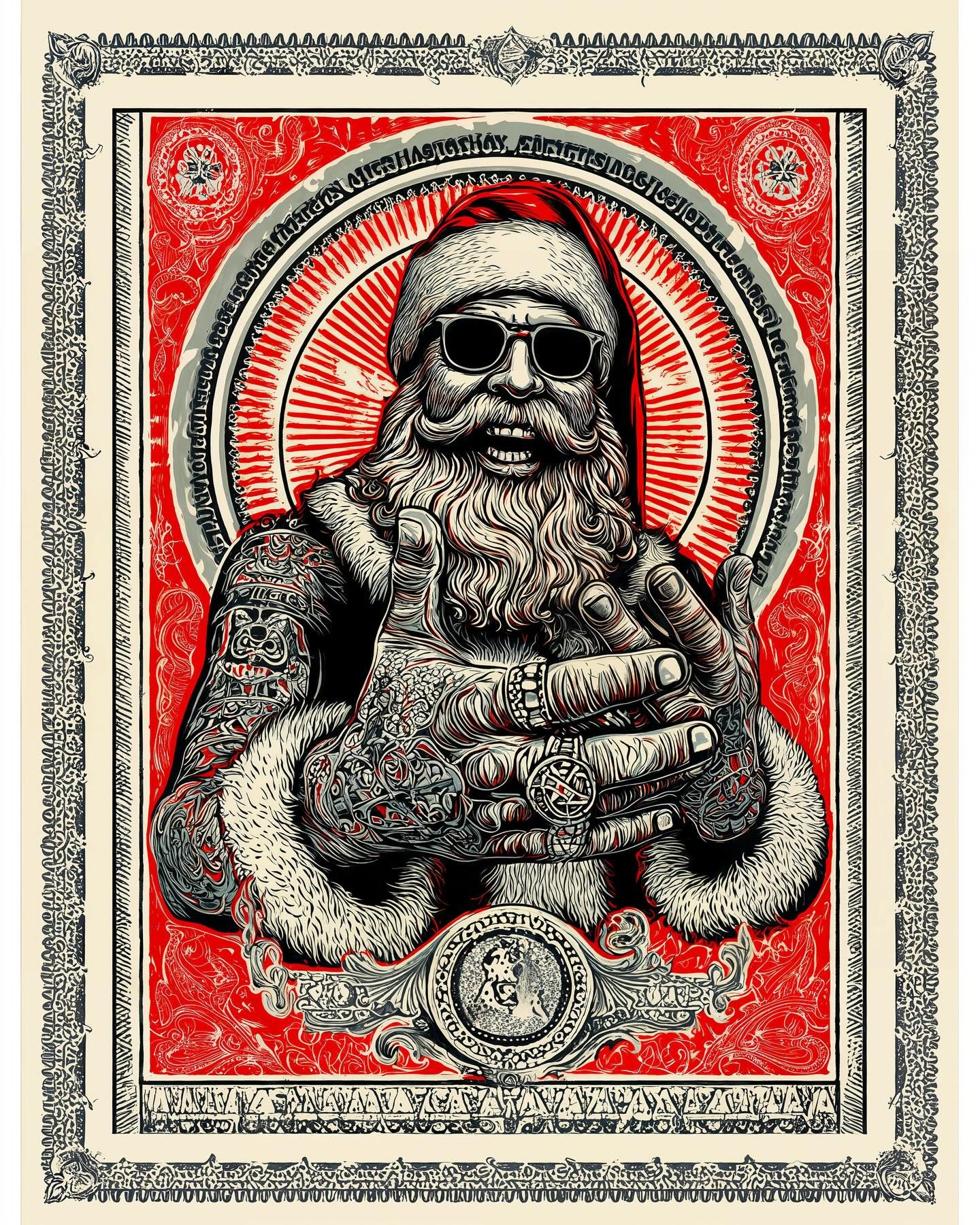
Saint of Bad Decisions
Blood-red halo rays. Black-and-cream linework so sharp it could shave. Santa in sunglasses, stacked rings, and tattoo sleeves that look like an entire cathedral got inked onto his arms.
He’s front and center like an icon… if icons started lifting, stopped apologizing, and “accidentally” became the coolest guy at your holiday party. The ornate border frames him like a sacred poster, but the vibe is pure mischief. Reverence with a smirk.
This is poster-art lineage all day: the graphic punch and limited palette nod to Shepard Fairey and the whole screenprint tradition—bold reds, hard blacks, decorative patterning that feels both political and devotional. You can also feel a whisper of Alphonse Mucha’s Art Nouveau framing in the ornamental border and medallion-like layout.
Mini art lesson: this is how you command attention with hierarchy. Big shapes first (face, hands, halo). Then medium shapes (fur cuffs, jacket blocks). Then the tiny fireworks of detail (tattoos, filigree, border). Your eye reads it like a good joke: setup, pause, punchline. Also notice the palette discipline—red + black + cream. Fewer colors means louder design.
Fun fact you can reuse at dinner: the word “icon” originally meant a devotional image, often framed and treated with serious reverence. Modern poster artists hijack that same visual language—halo, symmetry, ornate borders—to make pop culture feel holy. It’s basically sainthood via graphic design.
Related works
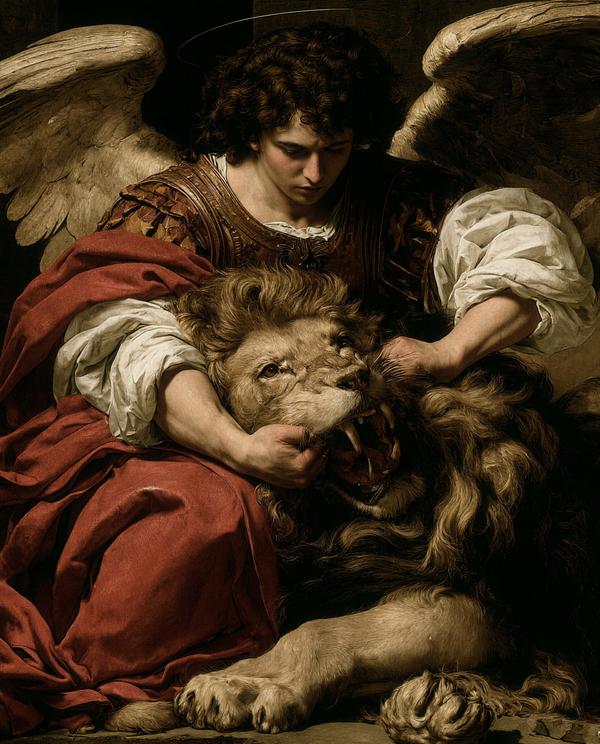
Emotional Support Lion
Some people bring a weighted blanket. This angel brought a lion with a jawline problem and a lot of unresolved roar.
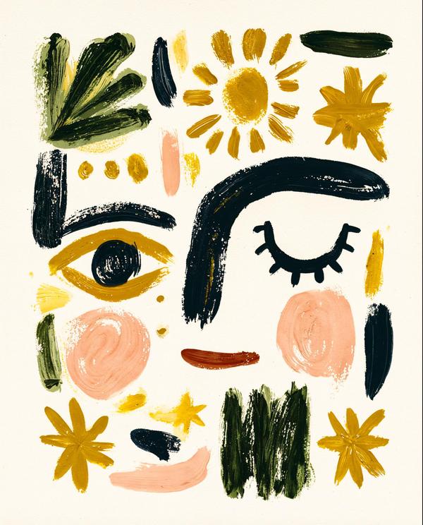
The Poster Forgot How to Spell
This poster tried to say “A Sky Full of Stars” and accidentally became one.
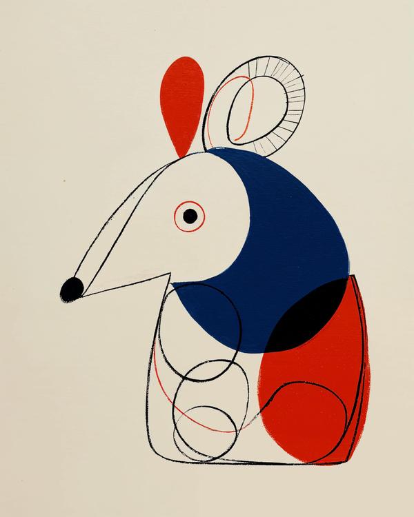
Florida Armor
Florida handed me an armadillo, and my brain turned it into a tiny Bauhaus parade float.
Available as a museum-quality print.
Request this print