
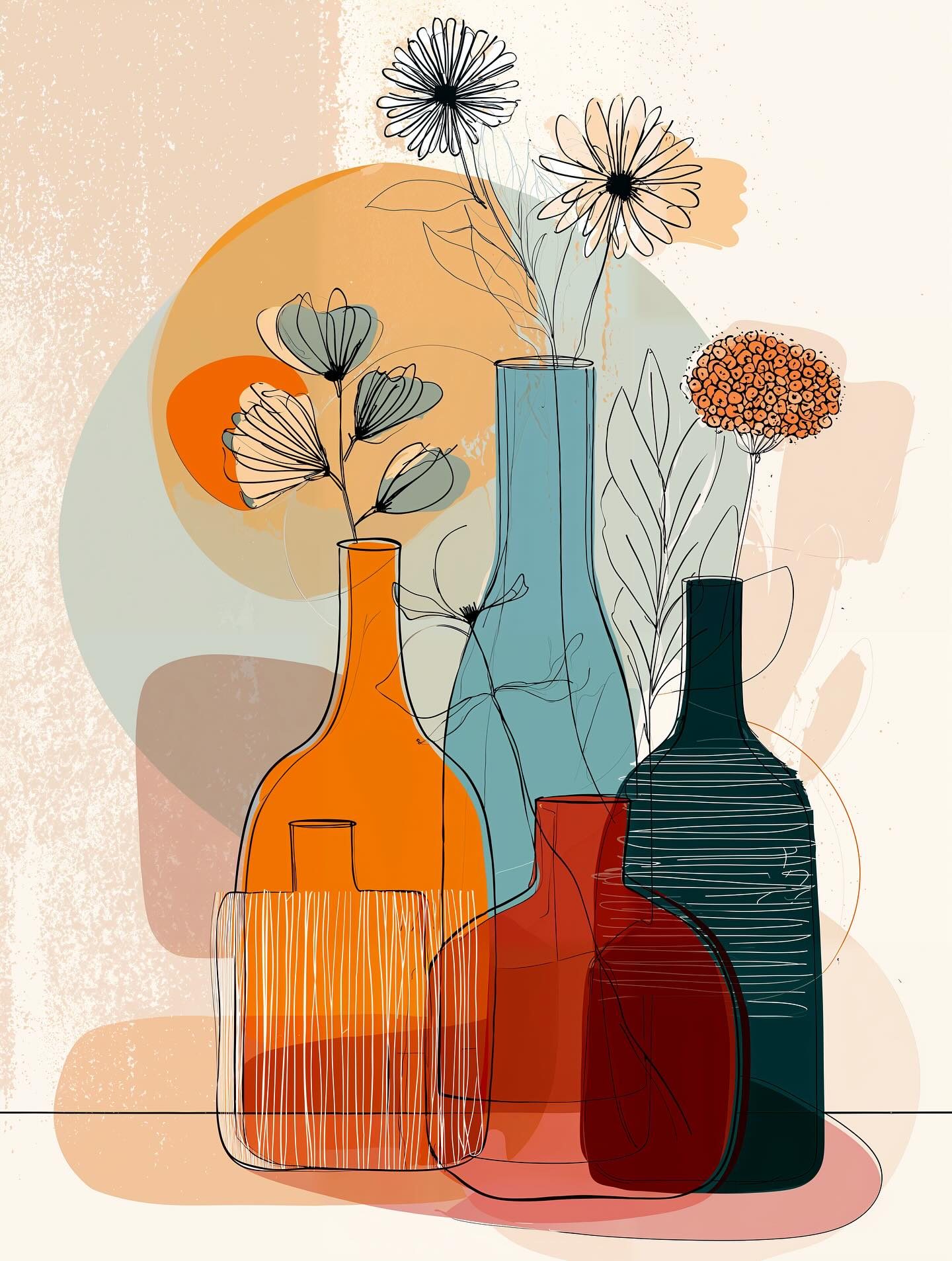
Vases Better Dressed
What we’re looking at here is a mash-up of mid-century modern vibes and contemporary minimalism. Those bold blocks of color—burnt orange, dusty teal, deep red—are pure Bauhaus by way of IKEA catalog chic. And the thin, sketchy outlines of flowers? Straight out of the Paul Klee “draw like a child but smarter” playbook.
The real genius is how it layers transparency. The bottles overlap like a Venn diagram of elegance, creating subtle new shades where colors intersect. That’s not just pretty—it’s an echo of Josef Albers’ color theory: context changes everything. Orange next to teal isn’t just orange—it’s a whole new mood.
And let’s talk flowers: playful, a little scribbly, almost as if Matisse’s cutouts went for a joyride in a botanical garden. They balance the strict geometry of the vases with a breezy “don’t take me too seriously” energy.
Fun fact worth dropping at brunch: line art like this has exploded in home décor because our brains love incomplete information. The mind fills in what’s missing—making us feel clever just for looking at it. (Yes, art is basically giving your neurons a self-esteem boost.)
So whether you see it as poster-perfect design, or simply vases having a more coordinated aesthetic than your wardrobe, this is modern simplicity at its most stylish.
Related works
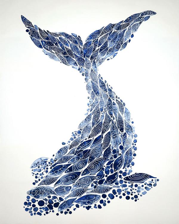
Tale of the Sea
This is what happens when a whale hires a tattoo artist with a marine biology minor.
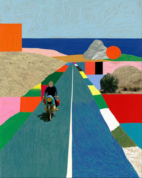
Roadside Daydream
A faceless biker, a silver boulder, and a giant orange slab by the sea. Already a better vacation than most group texts.
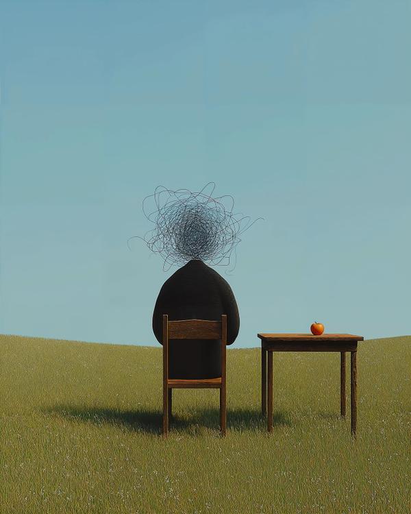
Quiet Spiral
This one is funny for about two seconds, and then it starts feeling a little personal. A lone figure sits in an open field, back turned, posture calm, while their head has become a frantic ball of scribbled pencil lines—part storm cloud, part doodle, part “nothing to worry about” from someone clearly worrying about everything. Next to them, on a plain wooden table, sits a single red apple, doing its best despite being hilariously underqualified.
Available as a museum-quality print.
Request this print