Iris Apology Tour
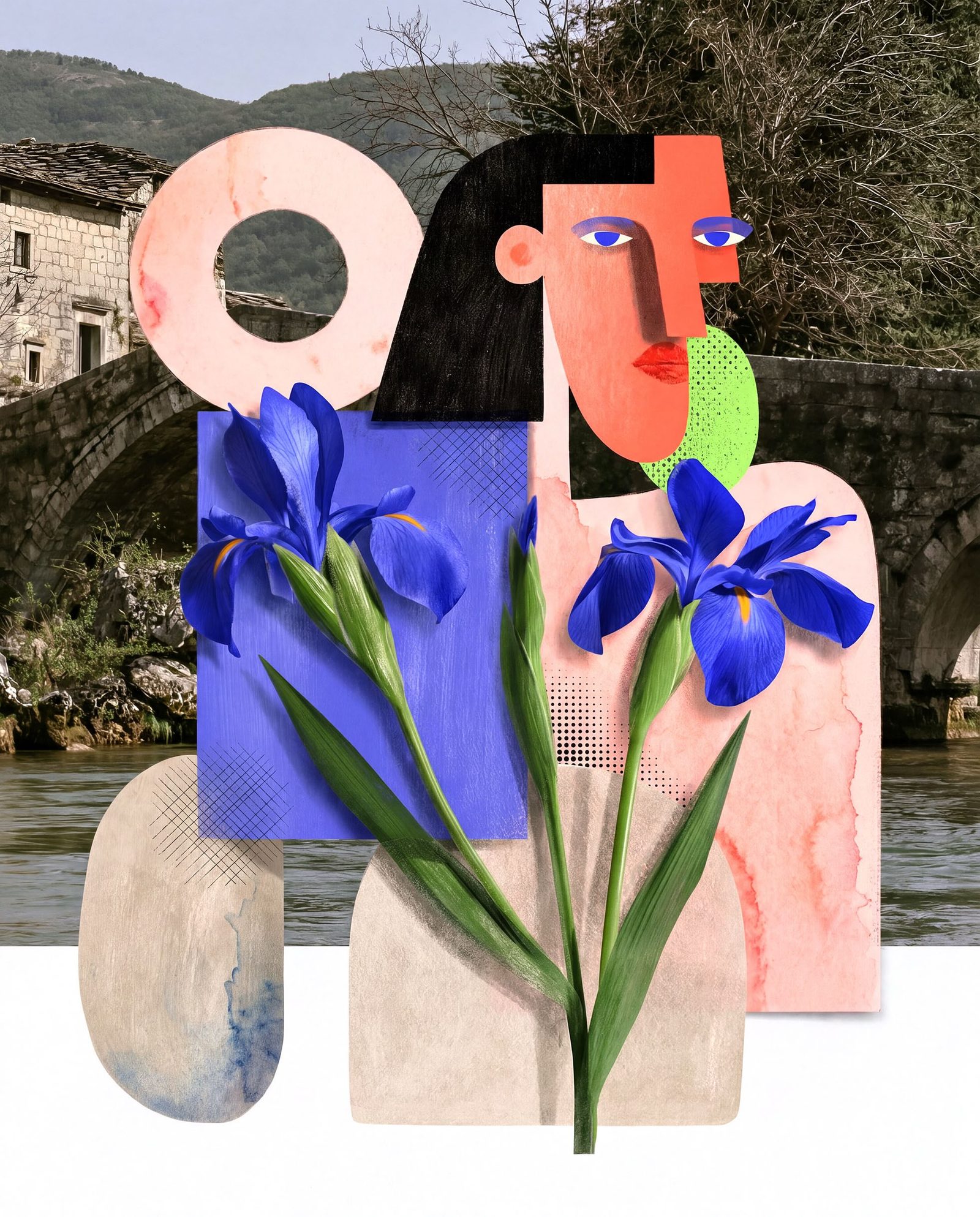
This image looks like a travel poster, a flower shop, and a Picasso portrait all got seated together at a very stylish Italian lunch.
A stone bridge and mountain village sit quietly in the background, doing their ancient, romantic thing. Then the foreground barges in with cut-paper confidence: blocky faces, coral skin, black hair, electric blue irises, and one large pale circle that feels part halo, part handle, part “don’t ask, it’s fashion.”
And somehow, it works.
The flowers are the loudest guests at the table. Those saturated blue irises slice through the muted landscape with pure theatrical drama. In art history, that kind of collage energy owes a lot to Cubism, especially Picasso and Braque, who broke the world into planes and angles so we could see more than one idea at once. There’s also a strong Matisse feeling in the bold shapes and fearless color, plus a little Italian Futurist swagger in the sense that everything is standing still but somehow moving.
Tiny fun fact: the iris gets its name from the Greek goddess of the rainbow, because the flower comes in so many colors. Which feels wildly appropriate here, since this blue is not whispering “spring.” It is entering the room with a key change.
The cool trick in this piece is contrast. Real landscape meets invented figure. Soft petals meet hard geometry. Old stone meets pop color. Your eye keeps bouncing between the peaceful background and the graphic foreground like it’s trying to decide whether to book a vacation or start a design firm.
Honestly, same.
Related works
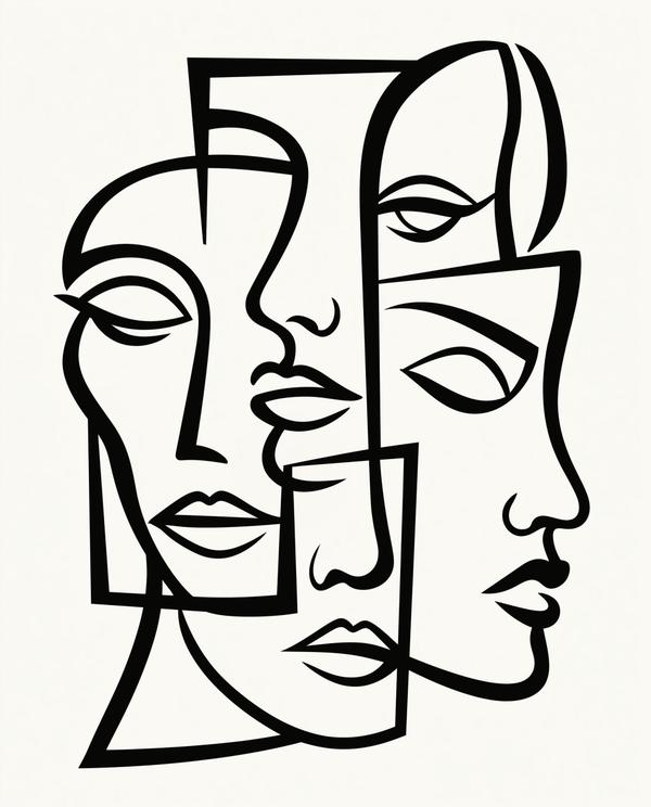
Available as a museum-quality print.
Request this print