Wi-Fi Cut Out
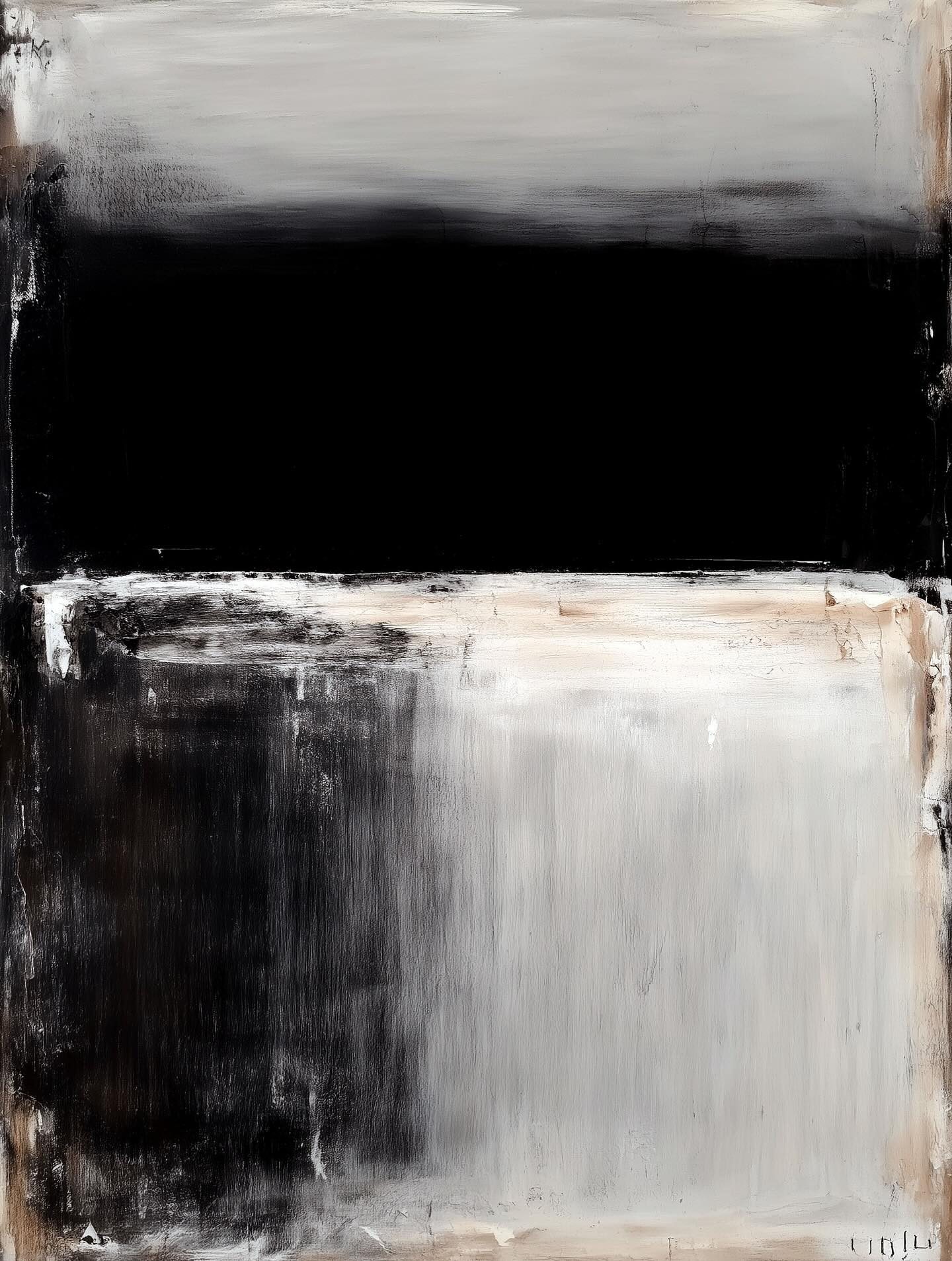
This canvas, with its stacked bands of black, gray, and cream, feels minimal at first glance—but sit with it and you’ll notice it’s humming with quiet intensity. The top half is like a storm rolling in, the middle like a blackout curtain, and the bottom like fog settling over a field. It’s simple in form but complex in feeling—like a symphony played with just three notes.
The influence here is straight from Mark Rothko, the painter who believed color could make you cry faster than a breakup song. Rothko’s “color field” paintings weren’t about objects or stories—they were about immersion. Stand in front of them and you don’t just look, you feel. He once said he wanted his canvases to be experienced “like you’re inside them.” That’s why they’re so big—bigger than your living room wall, and definitely bigger than your attention span.
Here’s the art lesson: abstraction isn’t emptiness. It’s concentration. By stripping away detail, you end up amplifying emotion. Think of it as the difference between reading a 400-page novel about heartbreak and just hearing Adele sing one note. Same punch, less clutter.
💡 Fun fact: Rothko was so picky about how his work was shown, he famously pulled out of a commission for a fancy New York restaurant when he realized people would just glance at his paintings between bites of steak. He said he wanted diners to lose their appetite, not enjoy their martini.
So next time you see a painting that looks like “just rectangles,” remember: sometimes the rectangles are holding more drama than a whole Netflix season.
Available as a museum-quality print.
Request this print