What the Walls Remember
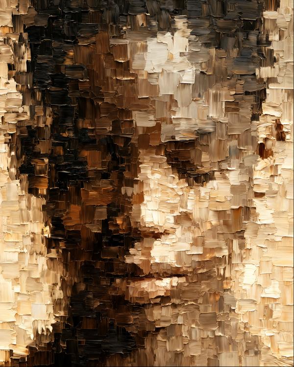
Somewhere between a midnight espresso and a very expensive renovation, a face started appearing in the plaster.
No lesson required. The image is the reason.
Somewhere between a midnight espresso and a very expensive renovation, a face started appearing in the plaster.
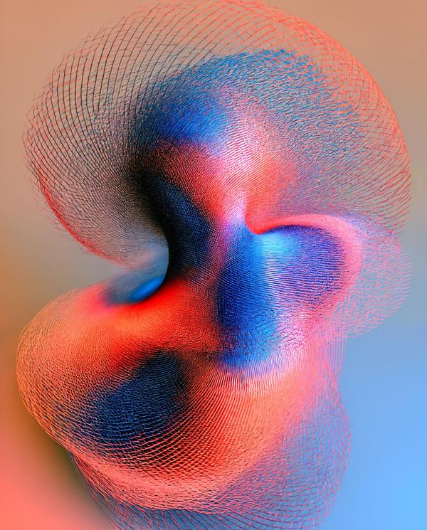
This looks like geometry discovering it has a nervous system.
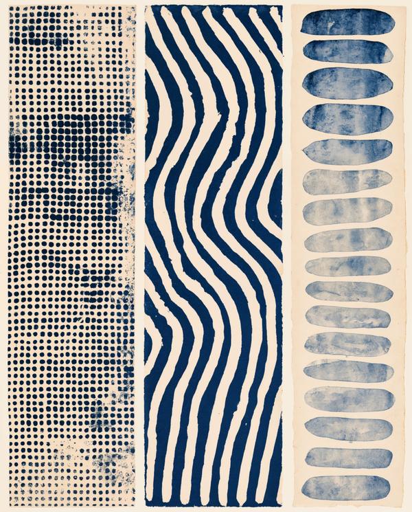
This looks like a calm person’s jazz solo.
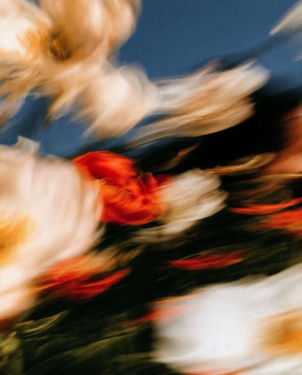
This bouquet looks like it heard the dinner bell and made a run for it.
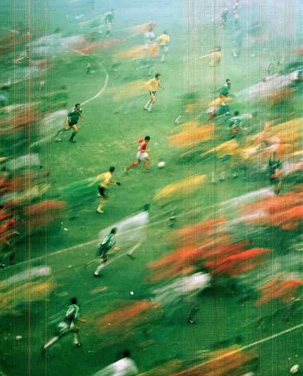
This match looks less remembered than relived.
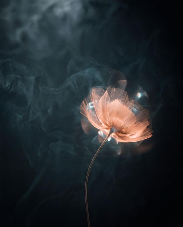
Some flowers sit politely in a vase. This one appears to have summoned weather.
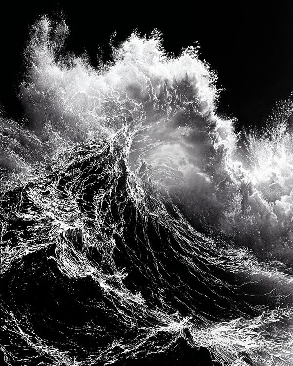
This wave looks like it’s about to give humanity a very short performance review.
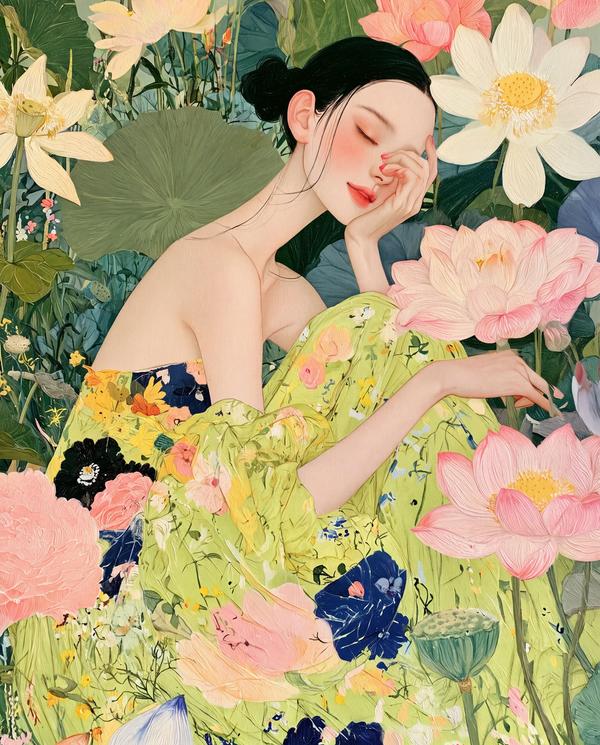
She appears to have reached the advanced stage of relaxation where even gravity has stopped making demands.
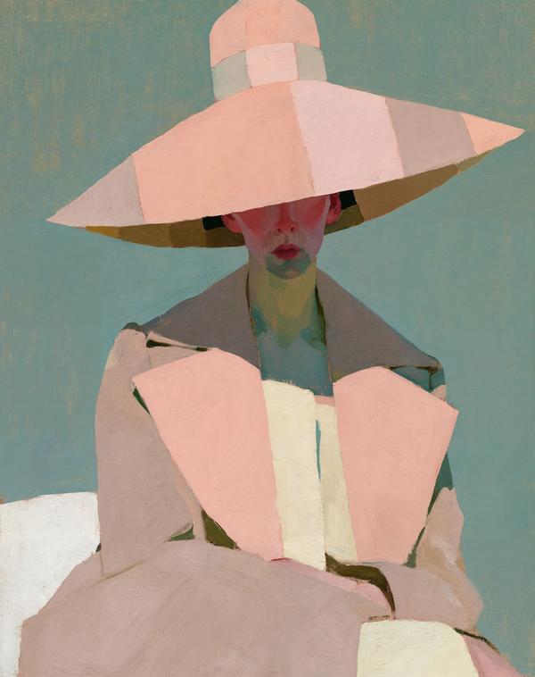
Today, pink means something.
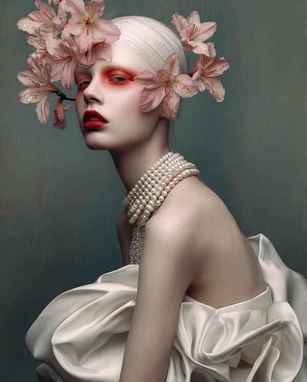
Like if a porcelain doll went to fashion week, fell into a cherry blossom storm, and came back emotionally untouchable.
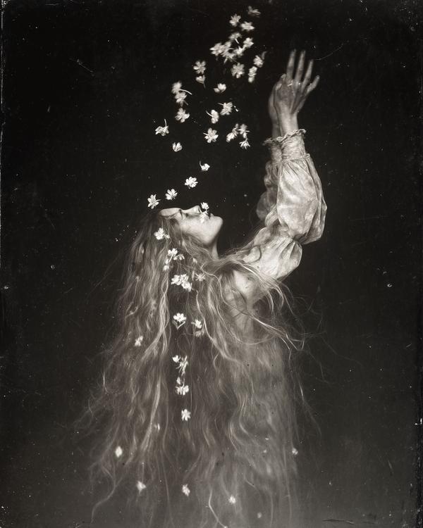
The figure seems to be disappearing into the same atmosphere that surrounds her.
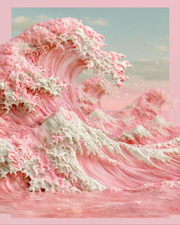
This is what happens when the sea gets invited to a baby shower and takes it personally.
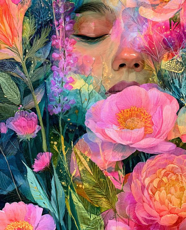
She looks like Mother Nature finally agreed to sit for a portrait.
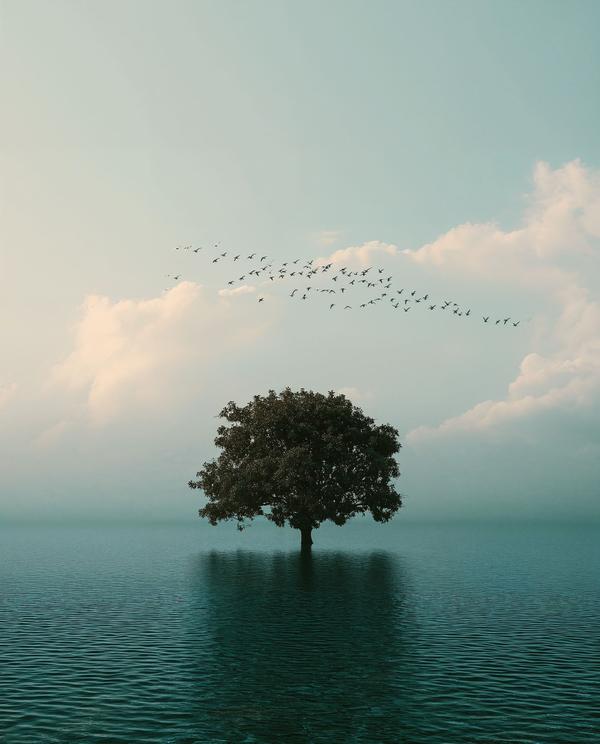
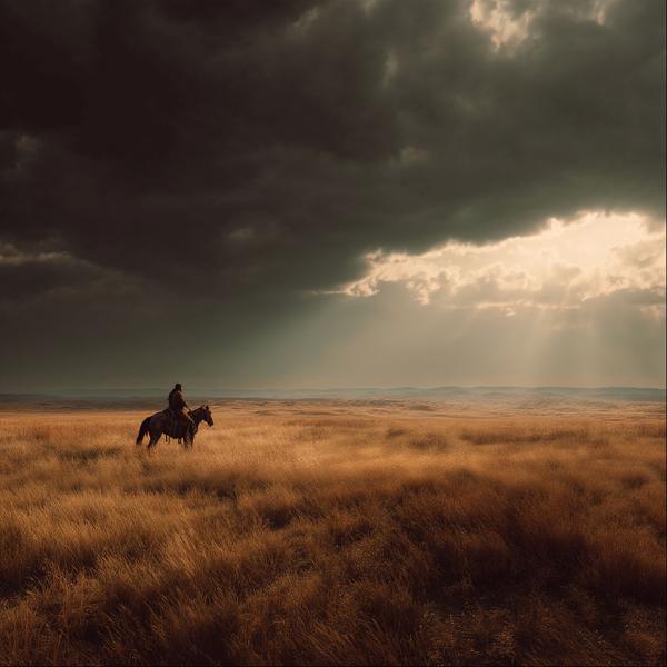
This looks like a landscape after the world exhaled.
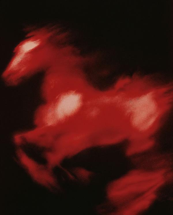
This looks like a horse galloping through a dream you only half remember.
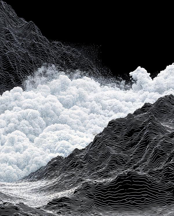
The mountains look like they hired a tailor and requested pinstripes.
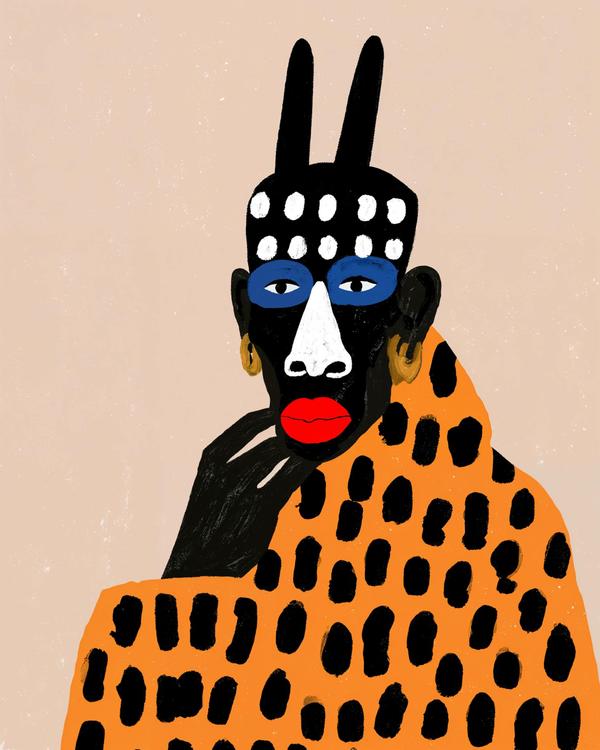
This person definitely knows how the evening ends.
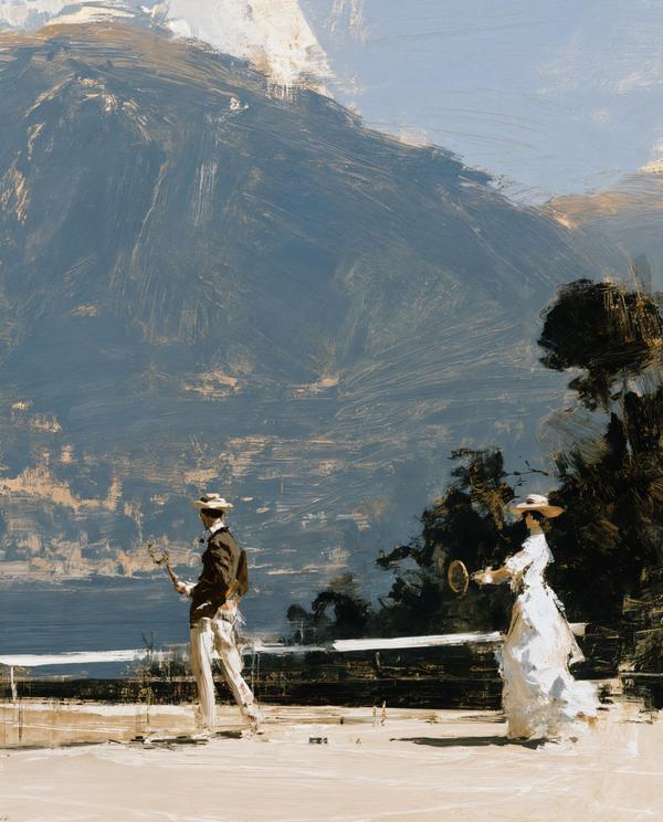
Tennis whites, mountain air, and a view so dramatic nobody seems concerned about keeping score.
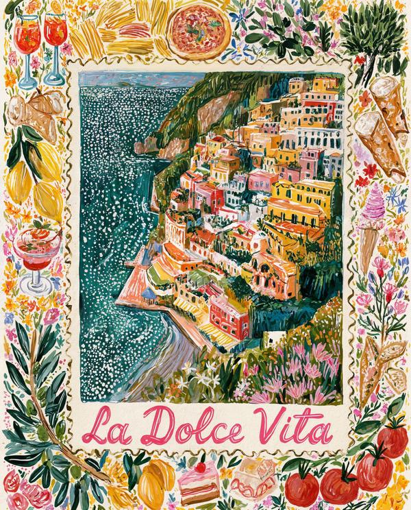
This painting has never once checked email on vacation.
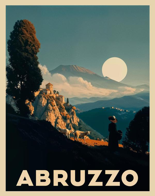
Abruzzo: where even the goats look like they’re waiting for a film score.
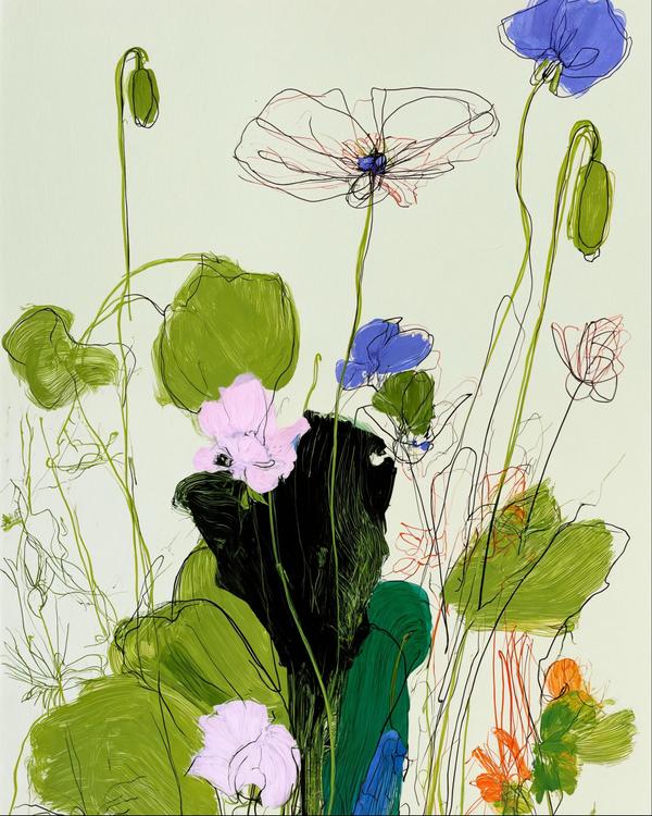
These flowers look like they’ve been awake longer than you.
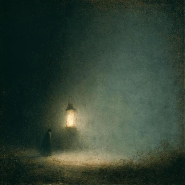
The darkness isn’t coming. It’s already here — and it brought atmosphere.
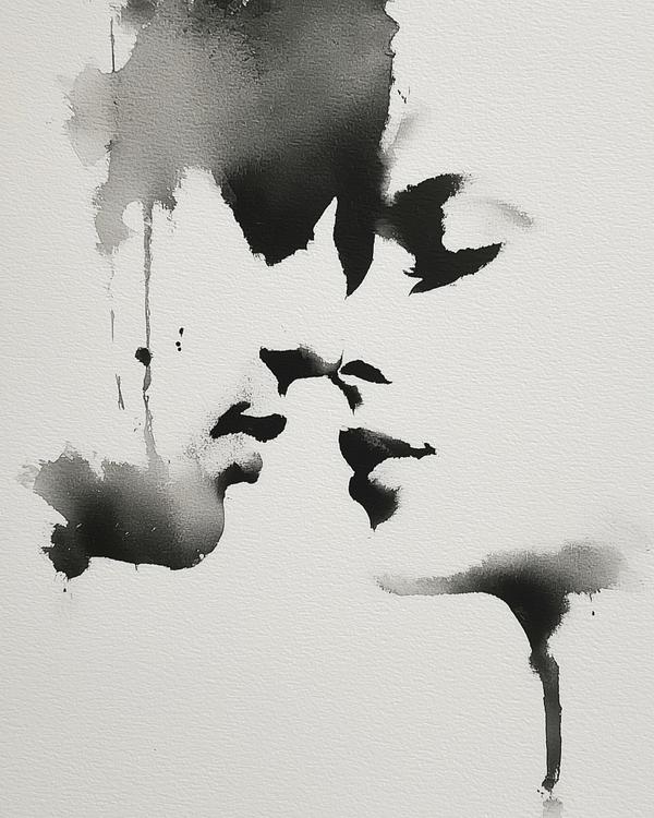
A beautiful wedding yesterday left a warm glow behind, and this is what came out: ink, paper grain, soft gray washes, and a few dark shapes drifting through the air like the room was still remembering.
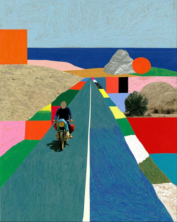
A faceless biker, a silver boulder, and a giant orange slab by the sea. Already a better vacation than most group texts.
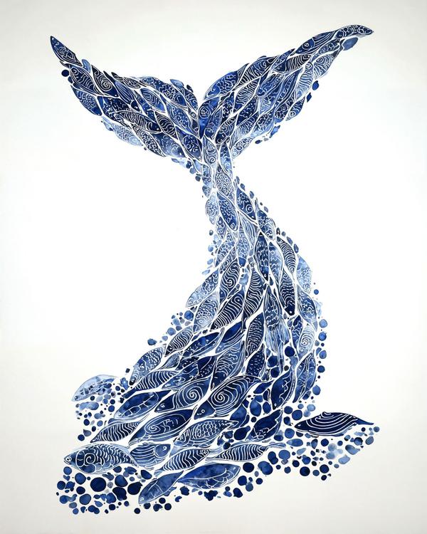
This is what happens when a whale hires a tattoo artist with a marine biology minor.
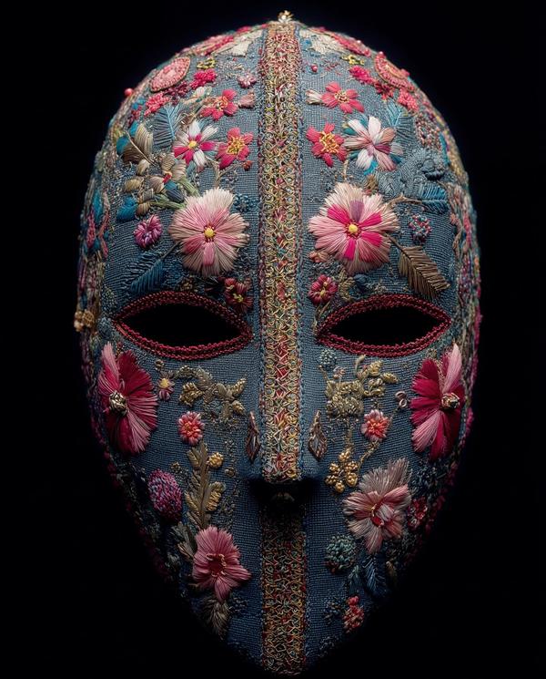
If a brick wall and a bouquet had a baby, and that baby could stop a slap shot, it would look like this.
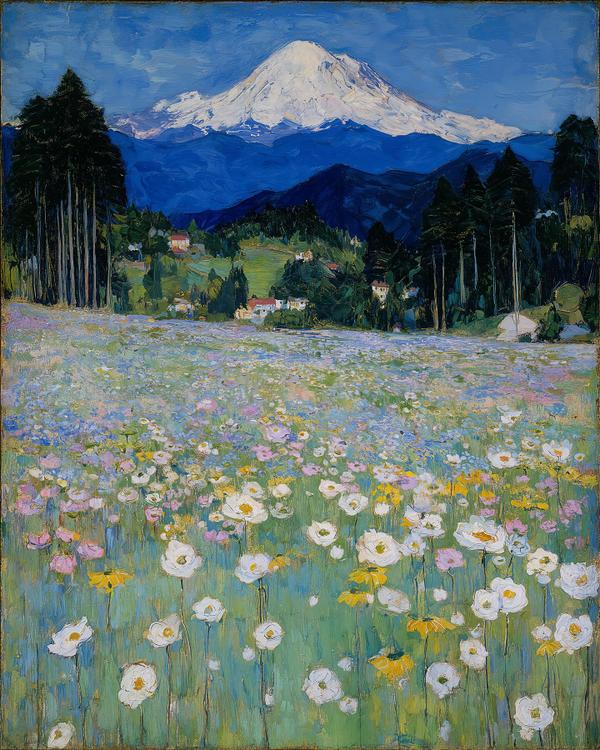
This is what happens when a meadow decides the mountain needs a proper introduction.
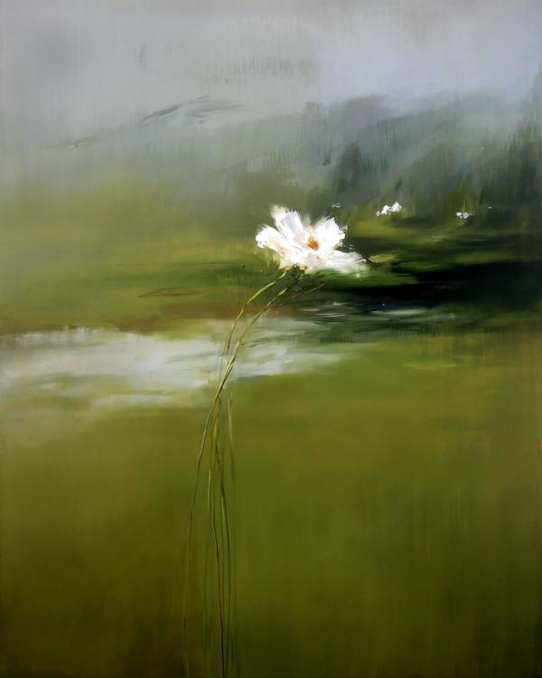
To celebrate the start of the Masters in Augusta today, this feels right: not a roar, not a trophy shot, not a fist pump. Just one fragile white bloom standing there like it knows greatness does not always arrive loud. The 2026 Masters begins today at Augusta National, where the tournament has been part of golf’s first full week of April ritual since 1934.
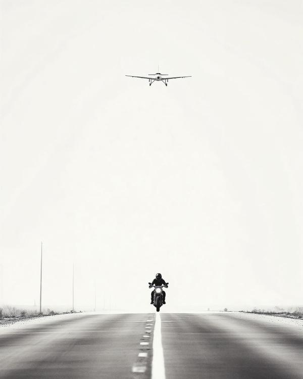
Like if a motorcycle had a trust issue and the universe sent a plane just to make it worse.
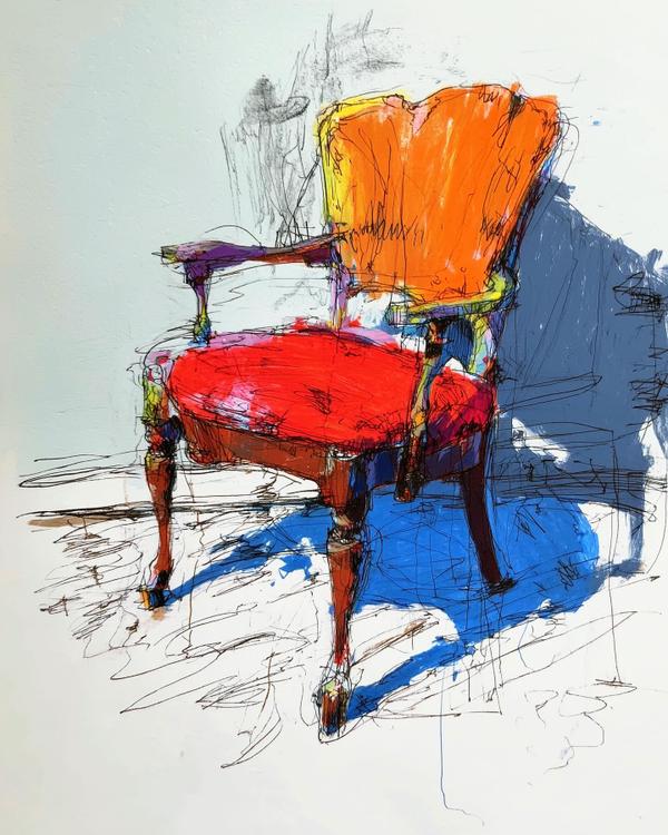
This chair looks like it arrived overdressed, emotionally unavailable, and still somehow became the most interesting thing in the room.
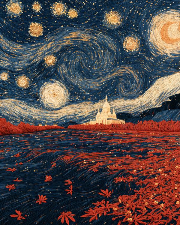
Paris has apparently been embroidered by someone who drinks espresso after midnight.
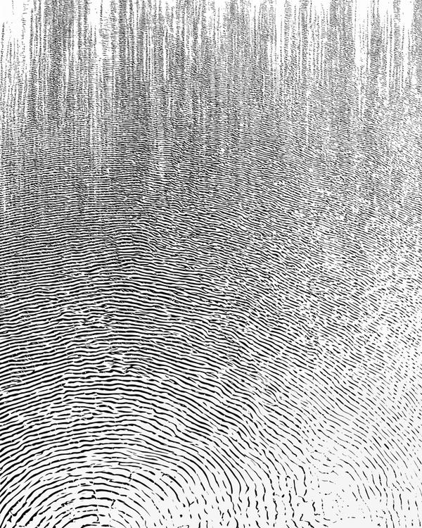
A fingerprint got ambitious and became a landscape.
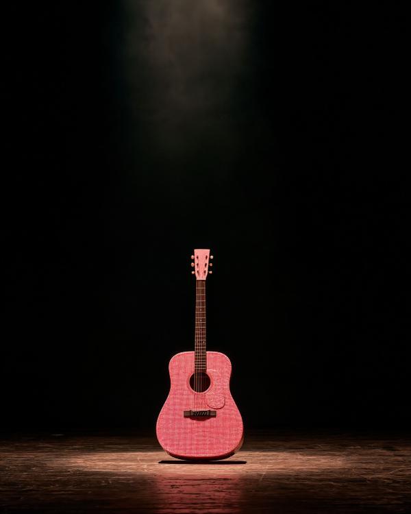
For once, the rhinestones have gone quiet.
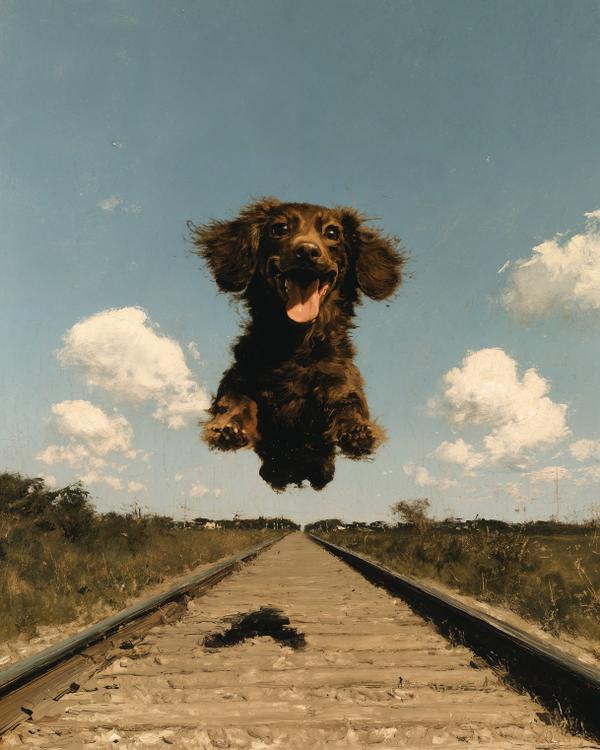
I have a feeling the next time we see Max, he won’t walk in politely. He’ll come flying.
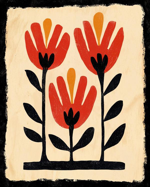
Like if a tulip, a woodblock print, and a Scandinavian tote bag all agreed to keep things simple.
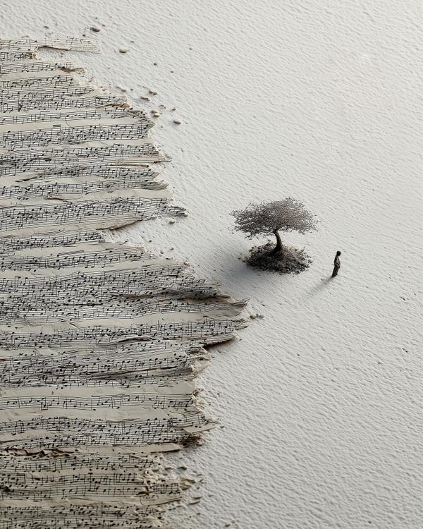
Like if the ocean took piano lessons and forgot its sheet music on the beach.
Like if a dragonfly got redesigned by a minimalist with a spreadsheet and excellent taste.
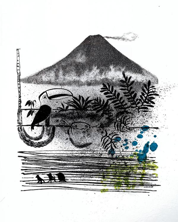
If Costa Rica had a postcard, it would be this… but with more humidity and at least one gecko judging your life choices.
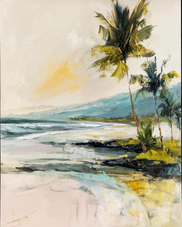
I came back from Costa Rica with a tan and zero interest in urgency.
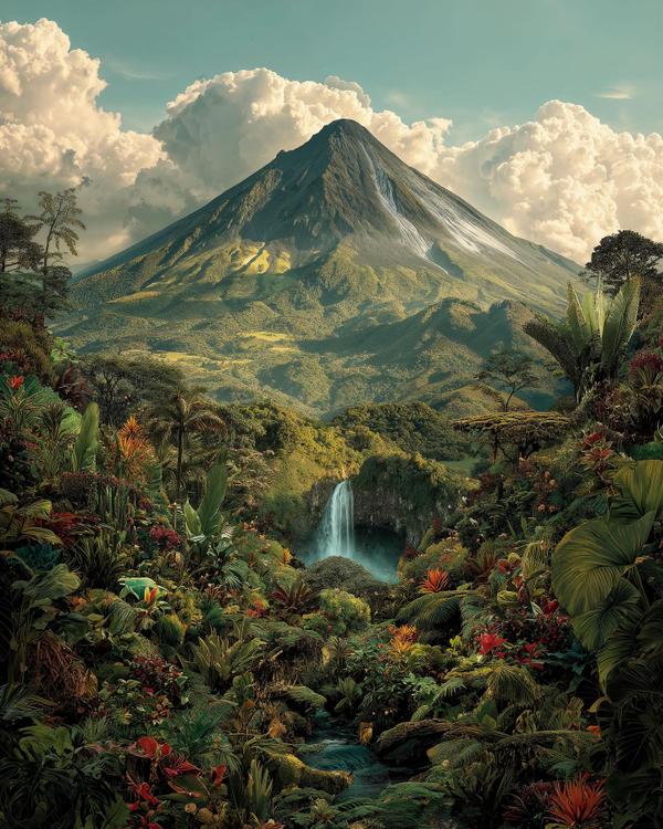
If the air could high-five you, it would smell like rain and mango.
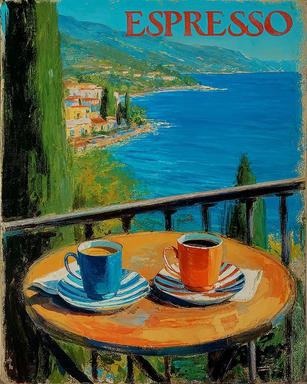
Electric blue sea. Sun-warmed ochre table. Two little espresso cups—one cobalt, one paprika—sitting on saucers that look like they got dressed for the occasion in candy-striped suits. And up top, the headline: ESPRESSO. Big. Proud. Like it paid the bill.
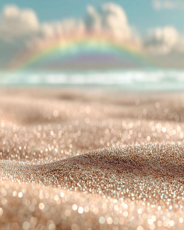
Champagne sand glittering like crushed diamonds. Turquoise water fading into a dreamy blur. And a soft rainbow brushed across the clouds like someone couldn’t resist adding one last stroke.

Pale blue sky. Ice piled like frozen ocean swells. A lone house glowing warm while a black crossover SUV sits half-swallowed in the driveway.
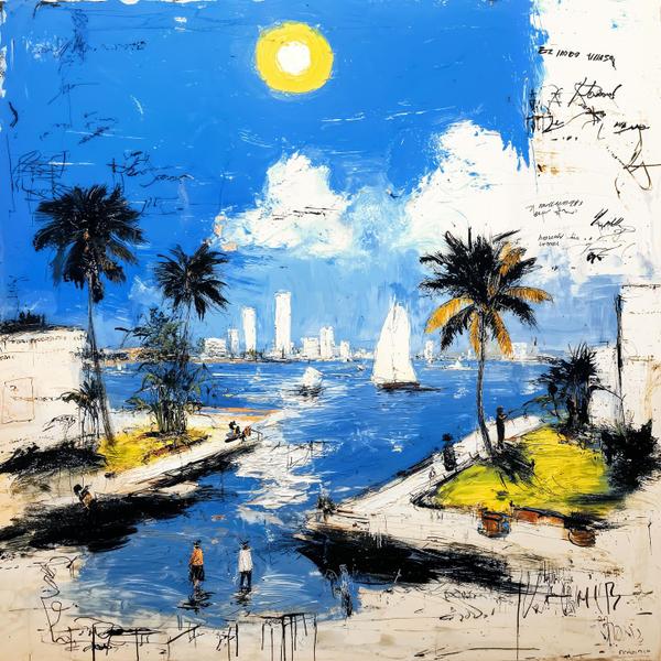
Electric blue sky. A lemon-drop sun. Palm trees scratched in like they were drawn during a phone call you didn’t want to be on.
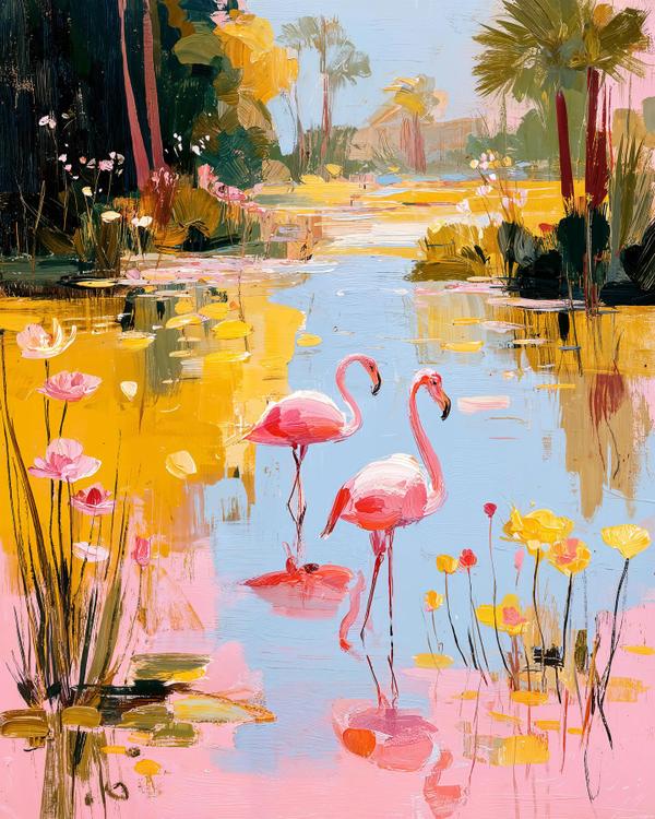
Bubblegum-pink flamingos. A ribbon of baby-blue water. And buttery yellow light smeared across the whole scene like Florida just hit “glow up.”
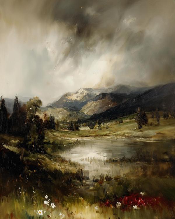
A silver lake holding a smeared reflection. A dark pine wall on the left like a curtain. And a sky that looks poured, not painted.
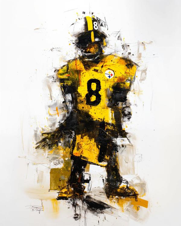
A mustard-gold jersey blasted with grime. A black helmet with that single yellow stripe. And a loud white 8 floating like a headline you can’t ignore.
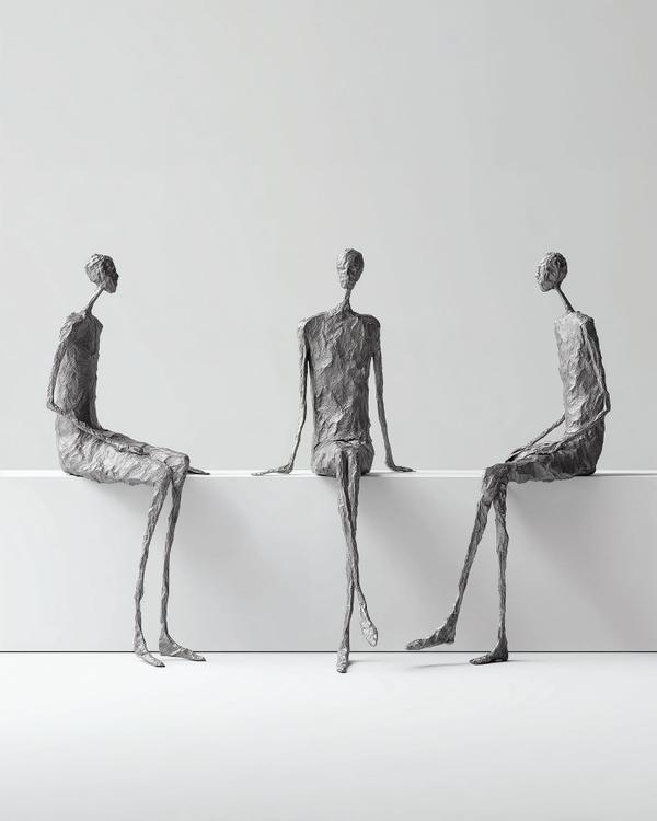
Three thin bronze figures. Legs like commas dangling off a stark white ledge. Faces reduced to quiet lumps of texture, like they’ve been weathered by thought.
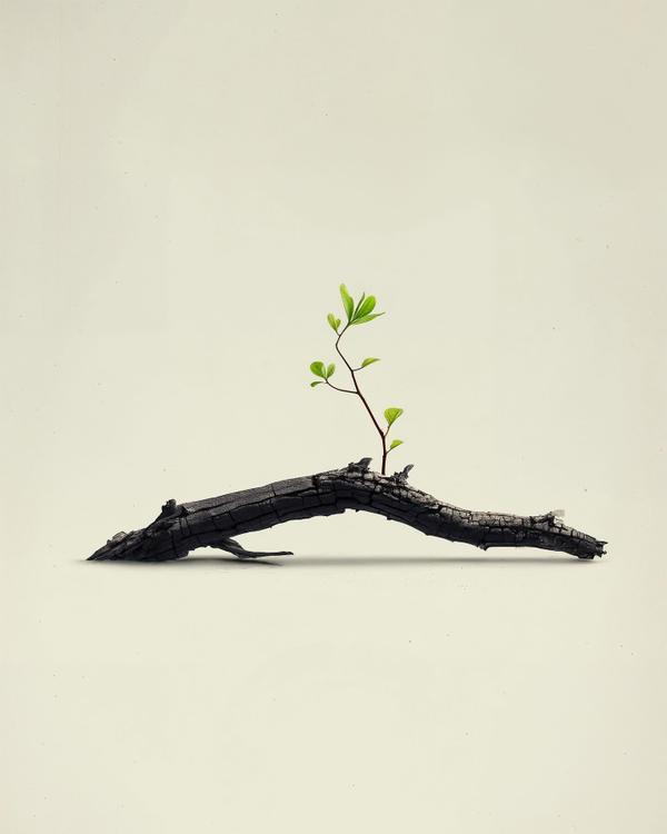
Charcoal-black branch. Bark split into little tectonic plates. A single green sprout climbing up into all that clean beige air.
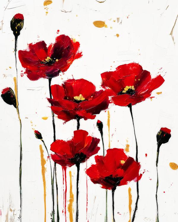
Thick white paint scraped like plaster. Five red poppies punched in like wet lipstick. Gold drips and black stems running down the page like ink. Twist: this is a bouquet that refuses to behave.
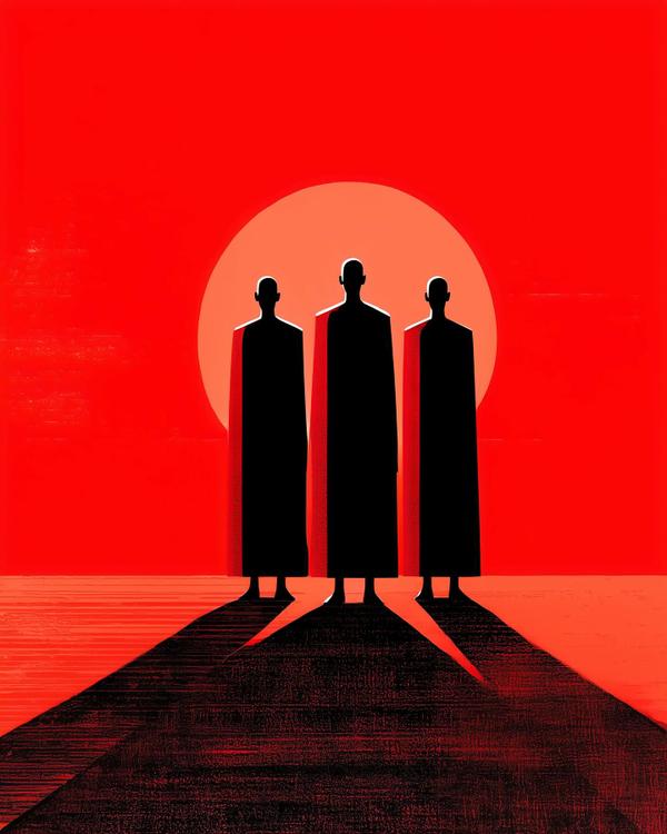
Three cloaks. One blazing sky. And the vibe is: “we brought gifts, not conversation.”
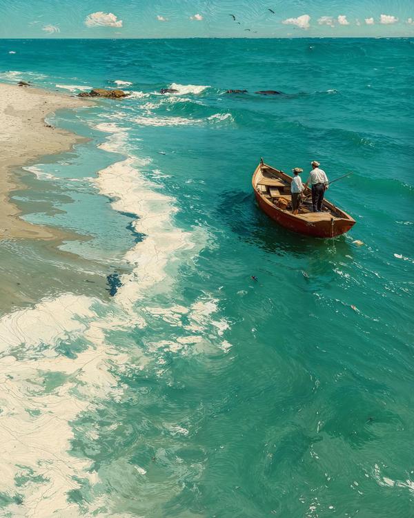
This piece sails with Winslow Homer energy: working boat, honest light, weather doing the storytelling. Two figures stand in a dory while turquoise water eats 80% of the frame—classic Homer move: small humans, big sea, maximum drama without shouting.
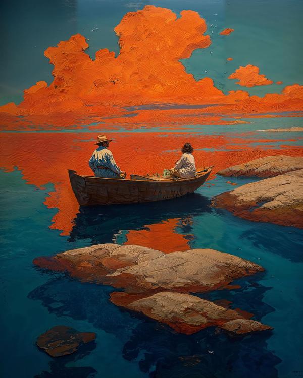
Two figures drift in a dory while the sky drops a molten orange reflection like a spilled Negroni across cool Atlantic blues. Today’s inspiration is Winslow Homer, America’s salt-sprayed realist, so think rugged rocks, working boats, and people who actually know what a tide chart is.
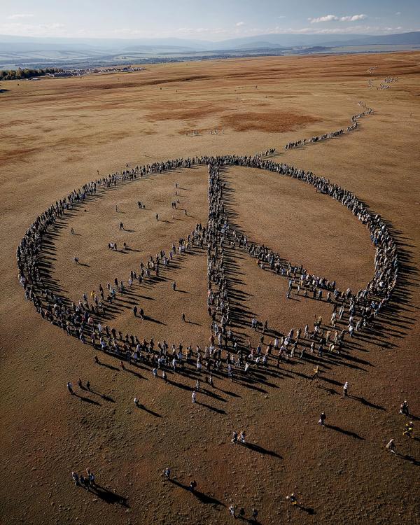
If a peace sign and a music festival had a baby… it would look like this.
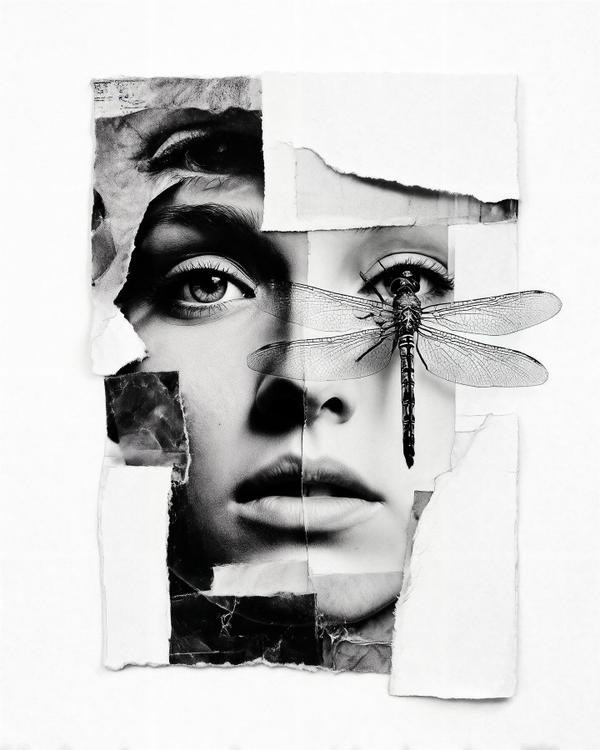
Ever feel like your identity is held together with Scotch tape, prayer, and a suspicious amount of caffeine? This collage says, “same.” A face, reconstructed from torn photo scraps, becomes a puzzle—half memory, half reinvention. And then a dragonfly swoops in like the world’s most glamorous photobomber, wings spread as if to say, “your aura needed editing.”
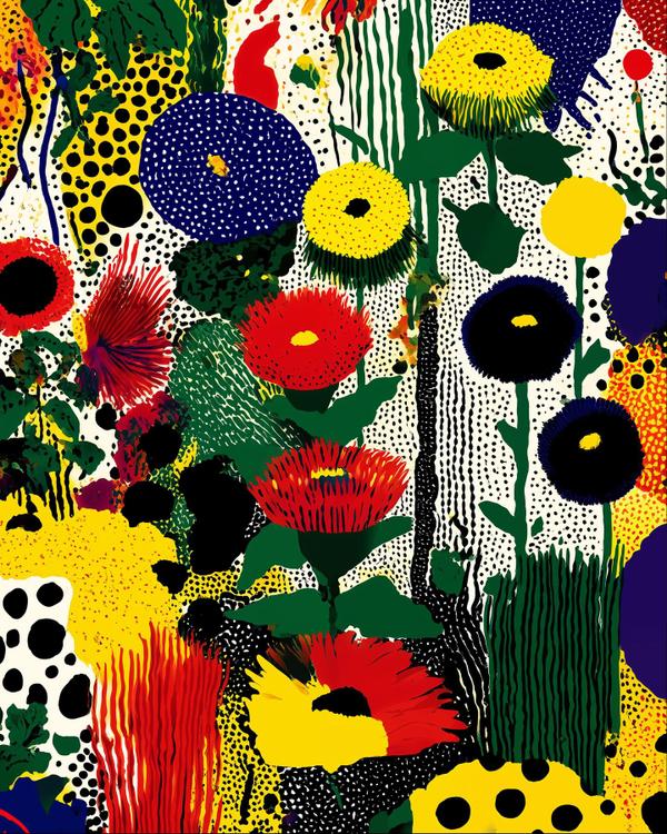
This is what happens when a wildflower meadow raids your highlighter drawer.
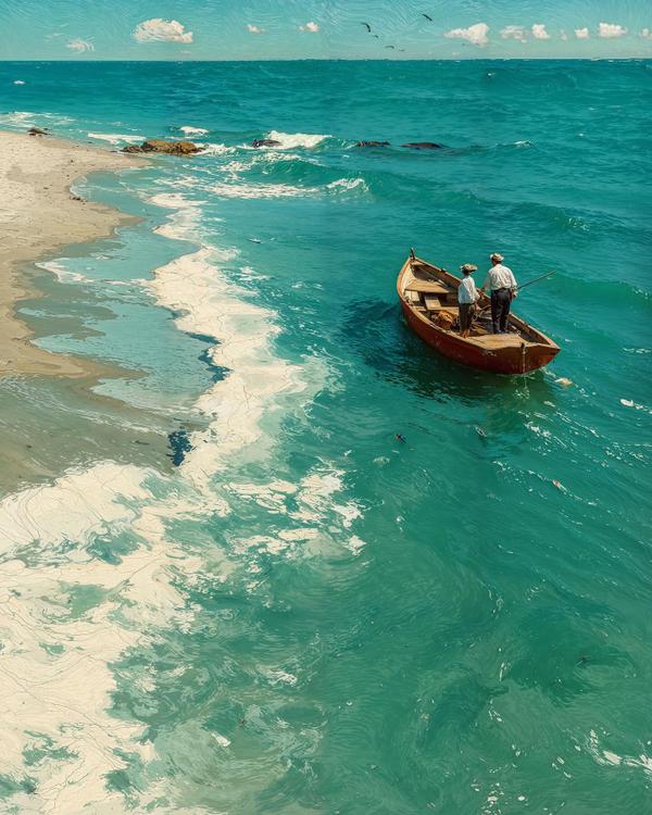
This piece sails with Winslow Homer energy: working boat, honest light, weather doing the storytelling. Two figures stand in a dory while turquoise water eats 80% of the frame—classic Homer move: small humans, big sea, maximum drama without shouting.
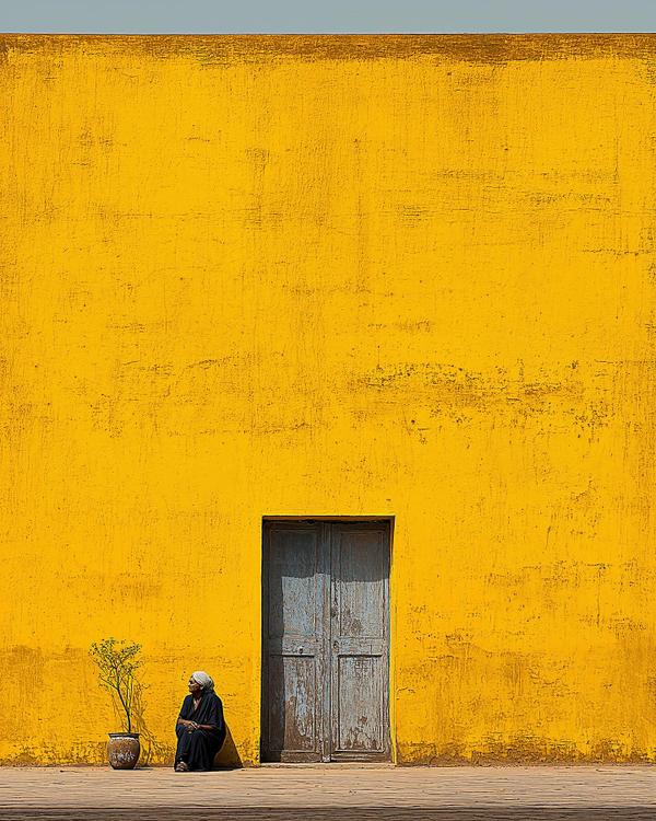
This scene looks like a minimalist’s dream and a color theorist’s mic drop. A massive mustard-yellow wall eats the frame, a weathered blue door cuts through the monotony, and a lone woman — wrapped in quiet dignity — becomes the punctuation mark in a sentence made of sunlight.
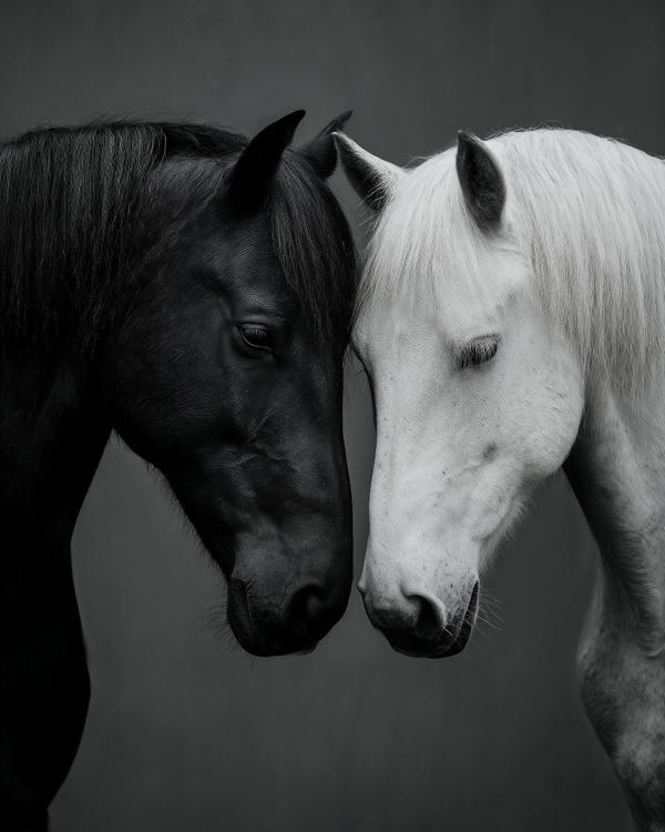
This creation feels like a still from a film where emotion is the plot. The smooth tonal gradient, the softness at their meeting point—it’s pure Nordic emotional minimalism, the kind you see in Mikko Lagerstedt landscapes where the atmosphere is half the story.
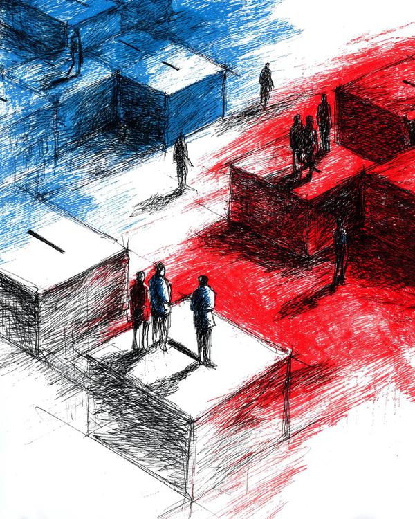
If you haven’t voted yet, this is your reminder: the masterpiece isn’t finished without your mark.
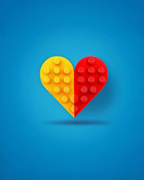
Ever fallen in love and thought, “This feels suspiciously like a Lego project”? One wrong move and—snap!—pieces everywhere. This artwork captures that emotional engineering perfectly: two interlocking halves, one warm yellow, one fiery red, forming a perfect heart made entirely of Lego studs. It’s love with instructions, but no manual.
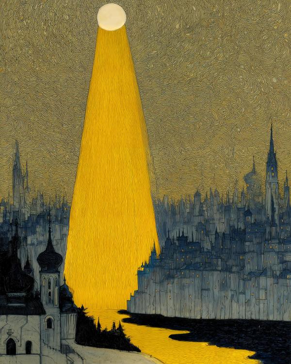
This haunting scene feels like if Van Gogh and Gustav Klimt painted a dream together after splitting a bottle of absinthe. The swirling skies and brushy textures whisper Starry Night, but that liquid beam of gold—spilling from heaven straight into a sleeping city—feels pure Klimtian shimmer, stripped of ornament but still drenched in reverence.

Ever wonder what it would look like if patience had a paintbrush? This is it. A winding road that glows like a comet’s tail, snaking up Mount Fuji under the Milky Way — a scene our eyes could never catch in a single moment, but our cameras can if we give them time.
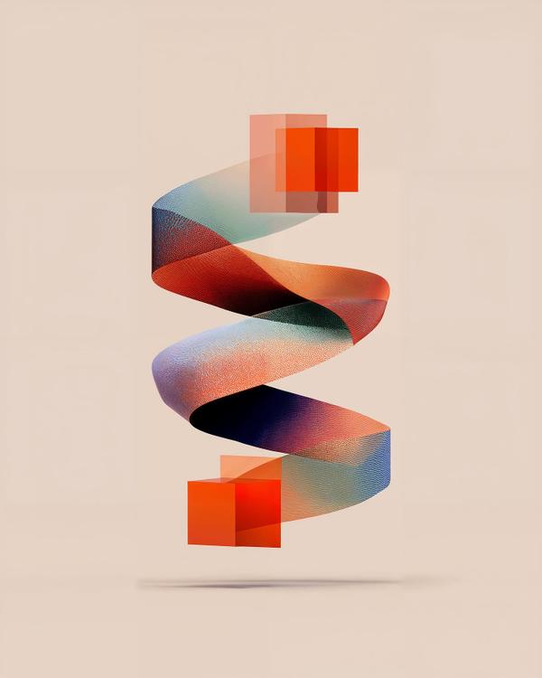
What you’re staring at is geometric poetry: red cubes dissolving into a ribbon that pirouettes mid-air like it’s auditioning for Cirque du Soleil. It’s the visual equivalent of going from clunky spreadsheets to “one-click automation”—chaos ironed into grace. Stylistically, this owes a debt to the Bauhaus and Op Art families: geometry as metaphor, clarity as drama. The way those cubes become a flowing strip recalls Josef Albers’ experiments with shape and perception, but with a digital-age twist. It’s not about paint anymore—it’s about process. Think Bridget Riley’s optical illusions smoothed out for a TED Talk on productivity. The background? A pale, almost skin-toned hex #FBF9F8 that’s so neutral it practically whispers, “Don’t worry, I’m just here to make the ribbon pop.” And pop it does: gradients sliding from crimson to indigo, showing how even rigid forms can melt into something elegant. Fun fact: in design psychology, our brains love transformation sequences—watching one thing become another triggers the same dopamine buzz as hearing a great punchline. Which is why this feels oddly satisfying… like watching Tetris finally line up perfectly. So yes, this is art. But it’s also a diagram for life: start blocky, stay flexible, and if all else fails—become a ribbon.
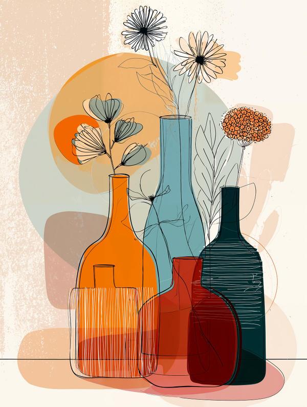
What we’re looking at here is a mash-up of mid-century modern vibes and contemporary minimalism. Those bold blocks of color—burnt orange, dusty teal, deep red—are pure Bauhaus by way of IKEA catalog chic. And the thin, sketchy outlines of flowers? Straight out of the Paul Klee “draw like a child but smarter” playbook. The real genius is how it layers transparency. The bottles overlap like a Venn diagram of elegance, creating subtle new shades where colors intersect. That’s not just pretty—it’s an echo of Josef Albers’ color theory: context changes everything. Orange next to teal isn’t just orange—it’s a whole new mood. And let’s talk flowers: playful, a little scribbly, almost as if Matisse’s cutouts went for a joyride in a botanical garden. They balance the strict geometry of the vases with a breezy “don’t take me too seriously” energy. Fun fact worth dropping at brunch: line art like this has exploded in home décor because our brains love incomplete information. The mind fills in what’s missing—making us feel clever just for looking at it. (Yes, art is basically giving your neurons a self-esteem boost.) So whether you see it as poster-perfect design, or simply vases having a more coordinated aesthetic than your wardrobe, this is modern simplicity at its most stylish.
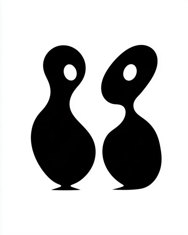
At first glance, this looks like two punctuation marks flirting across a grammar book. But look closer — these abstract blobs are quietly channeling some serious mid-century modern energy. Think Jean Arp’s organic minimalism met Barbara Hepworth’s sculptural rhythm, with a wink from Alexander Calder’s silhouettes. It’s the visual equivalent of jazz: smooth curves, negative space doing the heavy lifting, and just enough asymmetry to keep your brain dancing. The genius here is in the voids — those almond-shaped “eyes.” In art, negative space isn’t just empty; it’s active. It defines what’s there by what isn’t. That’s a concept the Minimalists borrowed from Zen philosophy: silence gives sound its shape, emptiness gives form its focus. This piece also taps into the psychology of pareidolia — our tendency to see faces in toast, clouds, or, apparently, abstract punctuation people. That’s why your brain whispers, “Hey, are these two… talking?” even though it’s just geometry with charisma. Fun fact: Arp used to toss paper shapes onto the floor and glue them where they landed — a process he called “law of chance.” Turns out, chaos has a great sense of composition. So yeah, this isn’t just two blobs on a date. It’s a masterclass in restraint, rhythm, and the art of saying more by showing less.
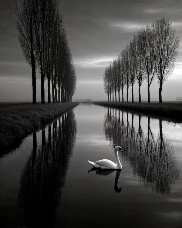
What you’re looking at is pure Pierre Pellegrini territory: haunting minimalism, razor-sharp symmetry, and a single subject—a swan—holding court like a diva on an empty stage. Pellegrini, a Swiss photographer, is known for crafting these meditative dreamscapes where nature becomes geometry and mood is everything. Notice the poplar trees standing like disciplined soldiers on both banks, their reflections doubling down in the canal. That’s not just pretty—it’s compositional strategy. In art history, this kind of symmetry taps into our brain’s love for order, but here it’s weaponized to heighten the loneliness of the swan. Think Caspar David Friedrich’s Romantic isolation meets Ansel Adams’ tonal drama, with a dash of Zen monk patience thrown in for flavor. And the choice of black and white? That’s no accident. Stripping away color forces you to obsess over form, shadow, and reflection. It’s like going from a Broadway musical to a whispered poetry reading—suddenly every detail matters more. Fun fact to drop at your next dinner party: swans were considered symbols of eternal love in Greek mythology, but in photography they’re often the ultimate test subject for contrast. White feathers against dark water? That’s basically nature auditioning for chiaroscuro. So yes, it’s tranquil. Yes, it’s romantic. But it’s also a masterclass in how less really can be more—unless you’re talking about dessert, in which case more is better than less.

You reach for it expecting soup, and suddenly it’s auditioning for the role of a fork. This is kitchenware doing cosplay. And crushing it.
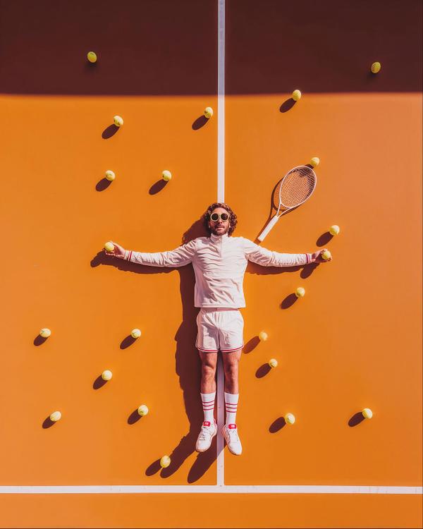
Tangerine court. A dead-straight white centerline. Tennis balls scattered like breadcrumbs, each one throwing a crisp little shadow. This is tennis, but make it theater. Our hero is flattened like a pressed flower, arms out, sunglasses on, looking like he just got “paused” mid-scene. The racket sits nearby like a prop that’s been carefully blocked. Even the chaos is choreographed. Nothing here is accidental. Especially the “random” balls. This is pure Wes Anderson energy: centered framing, obsessive order, and a color palette that feels like candy with a law degree. And the geometry? Hello, Mondrian. Big fields of color, strict lines, everything behaving itself. Mini art lesson: symmetry is a cheat code. Put your subject on the exact axis, then repeat shapes around them (balls, shadows, circles). Your brain relaxes because it can predict the pattern… and then it leans in because it wants to confirm it. Order creates attention. It’s visual ASMR. Fun fact you can steal for dinner: Wes Anderson is famous for centered compositions and whip-clean symmetry, and he even gave us one of the most iconic tennis characters in film with Richie Tenenbaum. The vibe is always: “storybook, but make it painfully precise.”
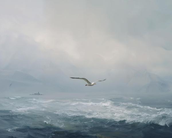
This image feels like a hymn to solitude — a lone gull gliding above restless waters, a flicker of life stitched against an endless horizon. It echoes the Romantic tradition, where painters like Caspar David Friedrich and Ivan Aivazovsky tried to capture not just what the sea looked like, but what it felt like: vast, sublime, and slightly terrifying. The faint lighthouse in the mist is a whisper of human presence, almost embarrassed to exist in nature’s cathedral. The sea, frothing and alive, reminds us that water is both cradle and abyss — a theme Romantic artists adored. They believed the “sublime” was that paradoxical beauty we feel when confronted with something larger than ourselves: awe wrapped in a shiver. Fun fact to pocket: Friedrich often painted tiny figures gazing at vast landscapes, not to glorify them, but to remind us of our own fragile scale. In a way, this gull is today’s “tiny figure,” suspended between the storm and the sky. What makes this piece contemporary is its dreamlike smoothness — like the edges of memory softened by time. The sea becomes less about geography and more about metaphor: freedom, longing, and that eternal tug between staying ashore or taking flight. So next time you see a bird over water, remember: it’s not just flying. It’s sketching poetry across the sky.
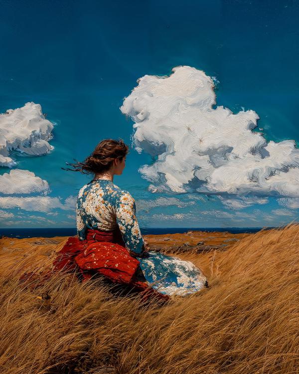
She’s planted in a field of wind-whipped gold, dress blossoming like a portable garden, staring down a sky that looks hand-carved from whipped cream. The vibe is rugged-poetic—Winslow Homer country—where weather is the main character and humans are tough enough to sit quietly in it. Homer’s fingerprints show up in the big, honest shapes: prairie of wheat vs. slab of sky, a horizon that slices the scene clean, and a single figure anchoring the story. The brushwork is muscular—strokes that actually feel like wind—and those spiraled, sculpted clouds add a modern jolt (think a little Hokusai line rhythm meets van Gogh swirl). Mini-lesson (bookmark this): this composition uses the Rückenfigur (roo-ken-fee-goor)—a figure seen from behind—to pull you into the view. Caspar David Friedrich made it famous; Homer used the same “you are here” trick with solitary coastal figures. It’s cinematic POV before cinema: we borrow her gaze, and suddenly the whole landscape is ours. Color-wise it’s warm vs. cool theater: amber grass sets the stage for that deep Atlantic blue, with white clouds popping because the values are stacked just right—dark sea, mid sky, light cloud. That hierarchy is why the scene reads instantly, even at thumbnail size. Fun fact: At his cliffside studio in Maine, Homer reportedly hung a sign on the door that read “SNAKES.” Not a herpetology hobby—just an artist’s way to keep drop-ins away so he could paint the weather in peace. File this under “nature therapy, premium plan.”
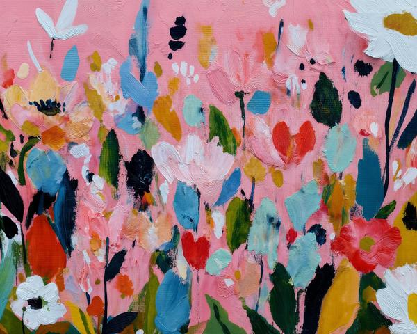
This piece is all about joy in chaos: brushstrokes smeared, dabbed, and swiped in colors that shouldn’t work together but absolutely do—coral pinks, sky blues, leafy greens, and bursts of daisy white. The backdrop? A candy-pink canvas that turns the whole meadow into a celebration. It’s not about accuracy—it’s about energy, mood, and letting the paint dance. The style sits somewhere between Abstract Expressionism and Contemporary Floral Abstraction, echoing artists like Joan Mitchell (who turned gardens into thunderous paint symphonies) or more modern painters like Ashley Mary and Yago Hortal, who embrace bold palettes and playful spontaneity. What makes it so satisfying is the looseness: petals aren’t petals, leaves aren’t leaves, but your brain fills in the garden anyway. Here’s the art lesson: abstraction doesn’t erase reality—it compresses it. Instead of painting every daisy, the artist gives you just enough shape, color, and rhythm for your imagination to bloom the rest. It’s like karaoke for the brain: the artist hums the tune, and you finish the song. Fun fact: Claude Monet planted an entire garden at Giverny just so he’d never run out of flower inspiration. By the end of his life, he said he was painting “the air between the flowers” more than the flowers themselves. Talk about commitment to vibes. So next time you see a blur of color and think, “What is that supposed to be?”—just answer: “Happiness, with extra petals.”
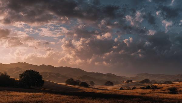
Welcome to the world’s fanciest screensaver—except this one didn’t come free with your laptop, it came with a director’s chair. Look at those clouds: moody, dramatic, and clearly auditioning for a role in the next epic saga. The hills? They’re doing their best Terrence Malick impression—“just let the light tell the story.” This is what “cinematic” means outside the theater. It’s not about popcorn; it’s about how light, lens, and atmosphere can turn ordinary fields into Oscar contenders. Notice the way the golden hour sunlight hits the grass like a soft-focus spotlight, while the distant ridgelines fade into misty layers. That’s depth of field at a landscape scale—your eyes are being directed like the audience in a film. Art Influences Think Hudson River School painters (Thomas Cole, Albert Bierstadt), but with modern cinematographers like Roger Deakins whispering “add more drama.” The painters gave us vast, romantic landscapes designed to inspire awe; Hollywood added color grading and widescreen framing to make us feel inside the scene. Fun Fact You’ll Want to Repeat “Golden hour” is only about 20–40 minutes long, twice a day. That’s why directors plan whole shoots around it—it’s basically nature’s free Instagram filter. Miss it, and you’re stuck with “midday harsh light,” a look that makes even Brad Pitt squint. So the next time you’re outside at sunset and it feels like you’ve wandered into a movie—spoiler alert: you kind of have.
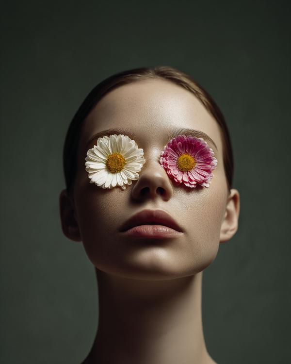
Yesterday’s post gave us daisies-as-sunglasses in a pastel dream world — playful, candy-colored, and ready for the runway. Today’s take uses the same flower-for-eyes idea, but flips the mood: darker, muted, and more symbolic, like a portrait that wandered straight out of a Magritte painting. Comparisons & Contrasts: * Pastel Portrait → Pop Surrealism + fashion photography: fun, bold, whimsical. * Muted Portrait → Classic Surrealism + Old Master lighting: eerie, symbolic, unsettling. * Both ask us to rethink how we see — but one does it with bubblegum and freckles, the other with shadows and silence. Concept Breakdown: This side-by-side shows the power of context in art. Swap the palette, lighting, and style, and suddenly the same concept (flowers for eyes) becomes either an editorial daydream or a symbolic riddle. It’s not the object that changes meaning — it’s the world you build around it. Fun Facts to Drop in Conversation: * Artists call this a visual trope — using the same symbol in different ways to spark new interpretations. * In cinema, Alfred Hitchcock famously reused staircases as a trope — sometimes representing danger, other times transformation. * Surrealism itself thrives on this kind of repetition. Magritte painted apples over and over, but with new settings each time to shift the meaning.
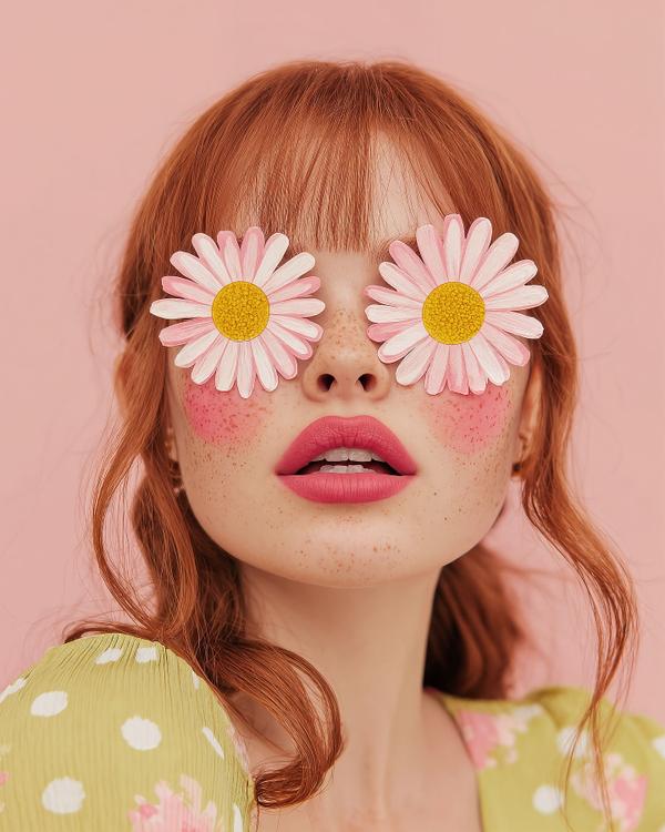
Who needs Ray-Bans when you’ve got daisies? This portrait is pure daydream energy: candy-colored, surreal, and styled like spring itself just walked into a photo shoot. The freckles, the bold lips, the pastel backdrop — it’s like Mother Nature signed a contract with a fashion magazine. Art Style & Influences: This image lives at the intersection of Pop Surrealism and Fashion Photography. Its flat, playful palette recalls Tim Walker’s whimsical editorials and David LaChapelle’s technicolor exaggerations. The daisies-as-eyewear also nod to 1960s mod fashion, when designers gleefully swapped practicality for visual punch. Concept Breakdown: This is conceptual portraiture, where the prop isn’t just decoration — it’s the meaning. Covering the eyes with flowers suggests a kind of willful innocence: a refusal to see the world’s sharp edges, choosing beauty and optimism instead. It’s wearable surrealism with a wink. Fun Facts to Drop in Conversation: * Daisies symbolize purity and cheer — but in Victorian flower language, gifting pink daisies specifically meant “I admire your playful spirit.” * The pastel backdrop owes its popularity to post-war advertising, where color printing exploded and marketers realized pink made products (and people) look happier. * In Pop Surrealism, artists often use oversized or out-of-place objects (like daisies for eyes) to question reality while still keeping things fun and accessible.
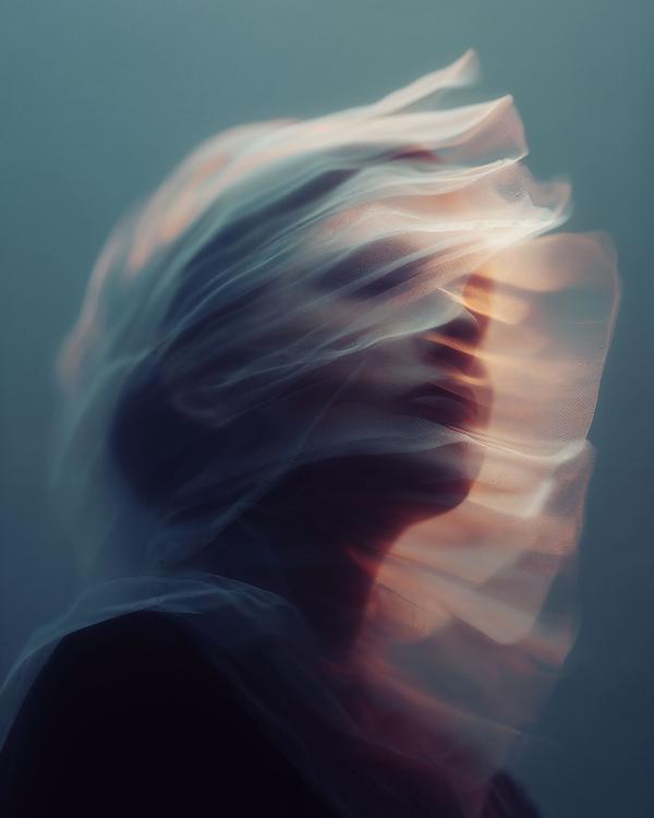
Who says motion can’t be captured in stillness? This image isn’t just a portrait; it’s a moment in time—frozen and fluid all at once. The ethereal swirls of fabric, combined with the soft glow of light, create a visual symphony that speaks of grace, mystery, and the beauty of the fleeting. What we’re seeing here is an intentional dance between light and motion, where the fabric becomes a metaphor for our own ever-changing emotions and thoughts. The soft, billowing veil? It symbolizes the way we all sometimes drift through life, caught between the past and the future, constantly in motion but hard to define. Photographers use motion blur to evoke this sense of flow, and in this piece, the blurred edges enhance the feeling that the subject is not quite here—suggesting both a presence and an absence, almost like a dream or memory we can’t fully grasp. Did you know? The art of capturing movement dates back to the earliest days of photography, when pioneers like Eadweard Muybridge were experimenting with motion to break down human and animal actions into sequential, frame-by-frame analysis. Here, we’re not breaking it down, but instead allowing the blur to tell a story of its own. So, next time you’re feeling caught in the swirl of life, remember that sometimes, beauty lies in the moment between clarity and chaos.
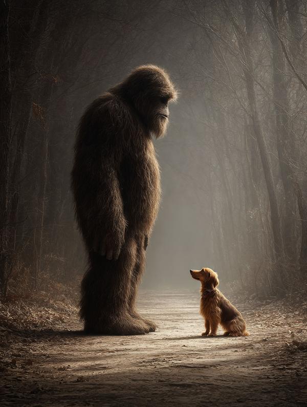
Once upon a fog-draped morning, two worlds collided in the woods, in silence. Bigfoot, who had spent his whole life carefully not being seen, padded down the leaf-strewn path. His massive feet left soft craters in the earth, but his heart was gentler than the moss that blanketed the forest floor. He liked solitude. Solitude was safe. Solitude didn’t gasp or run. Then came Barkley. A mini dachshund with ears too long for his face and bravery too big for his body. He had chased a squirrel too far from home and now stood nose-to-fur with a creature out of legend. The two froze. Bigfoot towered like a mountain of hair, and Barkley—well, Barkley wagged his tail. Because dogs don’t care about myths. They only care about truth. And the truth was this stranger smelled of pine and rain and earth. Not danger. Bigfoot crouched low, eyes soft. Barkley tilted his head, then barked once, sharp and fearless. The sound echoed like a secret handshake. Bigfoot chuckled—a deep rumble that made the trees quiver—and for the first time ever, he wasn’t alone. From that day onward, they met at the forest’s edge. Barkley brought sticks. Bigfoot brought silence, steady and kind. They shared sunsets, winter snows, and the quiet hum of the woods at night. Villagers whispered of shadows and pawprints, never knowing two friends were simply walking together. It didn’t matter that one was a legend and the other a lapdog. Barkley never asked Bigfoot to be less, and Bigfoot never asked Barkley to be more. They were just… friends. And in a world that often forgets the magic of unlikely companionships, that was enough. Because sometimes the greatest love stories aren’t about romance at all. They’re about a big heart and a little tail, finding each other in the wild. And so the woods held a secret: Bigfoot had a best friend, and his best friend was six inches off the ground.
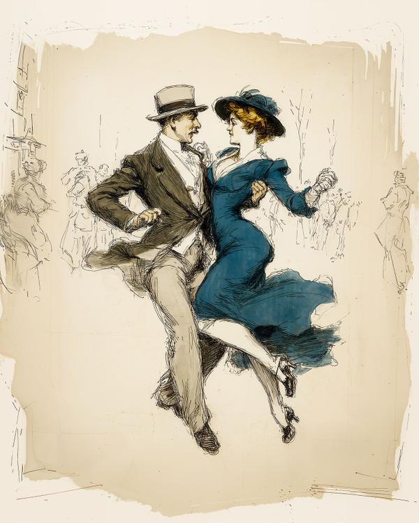
Freeze right here—because these two look like they just heard the band strike up and said, “Yes, we’ll be stealing the spotlight, thank you very much.” He’s got that smug little smirk, she’s got that “don’t drop me, Harold” grip, and together they’re turning the street into a stage. This lively illustration style owes a lot to the Belle Époque and early 20th-century magazine illustration traditions—think Charles Dana Gibson (creator of the “Gibson Girl”) or Albert Guillaume, who made Parisian high society look like a perpetual champagne commercial. The bold ink lines mixed with soft color washes were a hallmark of illustration before photography took over magazine covers. It’s sketchy, but in the best way—like the artist had 30 seconds and an espresso to capture the exact vibe. Art lesson in disguise: This loose, energetic drawing style is called line-and-wash. Ink does the heavy lifting with movement and contour, while watercolor-like washes add mood and depth. It’s why the woman’s sapphire dress feels like it’s swooshing mid-twirl—you can practically hear the fabric rustle. Fun fact: When tango and ragtime first hit Europe and the U.S. around 1910, critics called them “dangerous” and “indecent.” Naturally, young people lined up to scandalize their parents with every shimmy and swoop. So the next time you see an old-timey couple dancing, remember: they weren’t just waltzing. They were rebels with good posture.
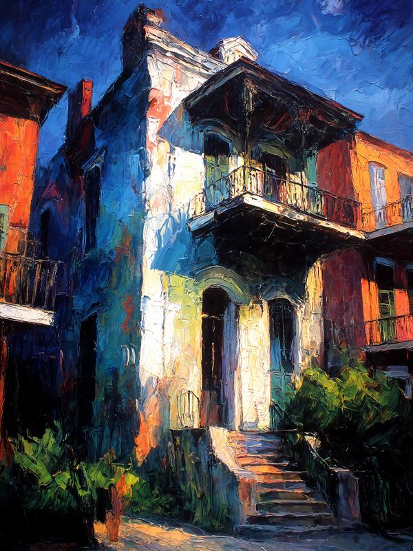
A love letter to James Michalopoulos, straight outta NOLA
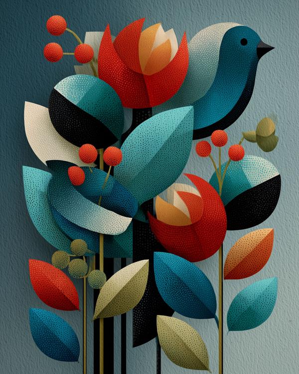
Art Movement: This beauty blooms straight out of the Mid-Century Modern garden, with clear roots in: * Cubism for the way it flattens and simplifies form into crisp shapes. * Bauhaus for its perfect marriage of form and function. * Folk Art meets Graphic Design—it’s whimsical, yes, but those shapes mean business. Art Influences: * Charley Harper, king of minimal realism, would tip his birdwatcher’s hat to this. * Mary Blair, Disney’s color queen, would say “That’s my palette, but make it punchy.” * Textile artist Alexander Girard would try to turn it into upholstery immediately. Fun Facts: * Mid-century artists were obsessed with simplifying nature—why draw every leaf vein when you can reduce it to a perfect almond? * Harper once said he stripped down his animals to “what’s visually important.” This bird? It’s basically coolth in winged form. * These flat bold shapes were the darlings of postwar optimism—designs that said, “The future is bright. And color-blocked.” Interpretation: This bird isn’t just sitting pretty. It’s judging your font choices and whispering design critiques to the tulips. Every leaf knows its place. Every color is deliberate. Even the background is like, “shhh, I’m letting them shine.” Bold colors. Clean shapes. That bird has better taste than all of us.
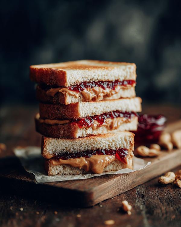
Behold, the humble peanut butter and jelly sandwich—elevated to high art through the lens of product photography. This isn’t just lunch. This is a visual love letter to nostalgia, comfort, and perfect sandwich symmetry. With its glossy jelly glisten and creamy peanut butter swirls, this stack of goodness isn’t just delicious—it’s deliberately delicious. Let’s talk product photography: This image is a masterclass in texture, lighting, and desire. Notice the warm, moody tones? That’s no accident—it’s the visual equivalent of a cozy memory. The rustic wooden background? A nod to authenticity. And that oozing PB&J? Carefully staged to say: “you want this… now.” Fun fact: In real advertising shoots, food is often swapped for lookalikes (motor oil for syrup, mashed potatoes for ice cream), but this? This feels honest. You can practically hear the bread squish. In the world of consumerism, product photography is the secret weapon behind our cravings. It makes us feel something, remember something, buy something. A good sandwich photo doesn’t just feed you—it sells you. So next time you scroll past a snack looking suspiciously seductive, remember: that’s not just lunch. That’s lighting, styling, psychology, and a sprinkle of capitalism.
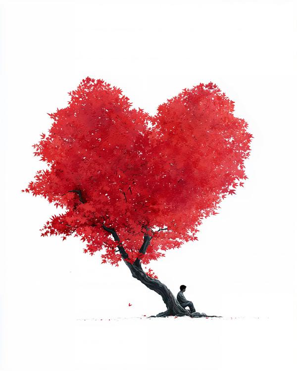
This minimalist piece nods to the paper-cut precision of Eiko Ojala, known for blending digital and hand-crafted textures into deceptively simple layers. And the contemplative figure beneath the tree? That’s pure Katsuya Terada energy — master of line, mood, and the art of quiet storytelling. Fun fact: Ojala’s work often plays with negative space and shadow like a visual haiku. Terada, aka the “Rakugaking,” sketches emotion with the flick of a pen — blending manga, fine art, and fantasy in one breath. This tree may not be real, but the feelings under it sure are.
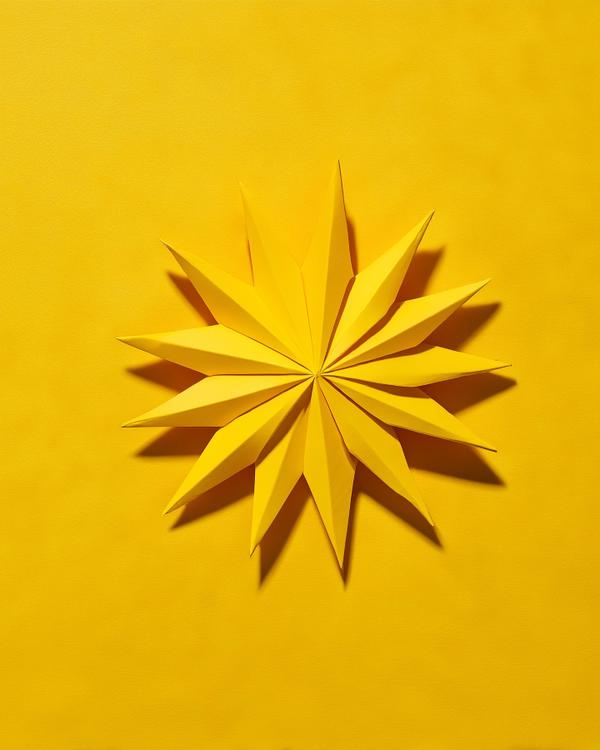
This bold little burst of origami sunshine is our tribute to the current heat wave, which has officially turned “going outside” into an extreme sport. Did you know? Origami originated in Japan in the 6th century, back when paper was so precious it was mostly used for religious rituals and royal ceremonies. Fast forward a few centuries and now we’re folding suns in a heatwave just to stay sane. Why a sun? Because it’s everywhere right now—on our faces, in our thoughts, and apparently... in our art. Plus, paper doesn’t sweat. Stay cool, friends. Or at least fold something that looks like it is.
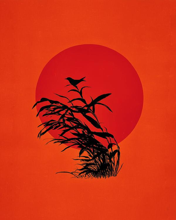
Let’s celebrate the first day of summer! This bold and breezy graphic is a nod to the legendary Saul Bass—the master of minimalist storytelling. Known for designing iconic film titles and posters (think Vertigo and The Man with the Golden Arm), Bass believed that simplicity is the ultimate form of sophistication. Here, a single bird perched on windswept reeds greets the blazing summer sun, rendered in Bass’s signature style: strong silhouettes, flat color, and emotional punch. It says everything without saying a word. Today marks the first day of summer—the longest day of the year. Nature’s big exhale. So step outside, soak up the light, and let it all in.
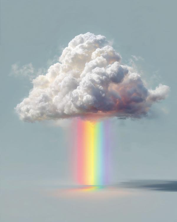
If clouds could rain anything—why not rainbows? We’ve had enough soggy socks and canceled plans. Let’s upgrade the forecast to 100% chance of color therapy.
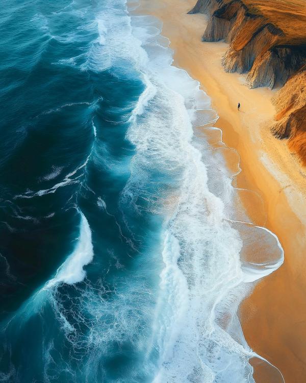
: Proof that saltwater and serotonin are clearly in a long-term relationship. Side effects may include: smiling for no reason, sand in weird places, and sudden clarity about your life. Let’s be real — if laughter is medicine, the beach is full-blown therapy. Stress levels: dropping. Vitamin D: maxed out. Mental health: thriving. Honestly, healthcare should cover beach days. Because no one ever needed a co-pay for watching waves. If massages are covered, so should laying in the sand contemplating the meaning of life while a crab scuttles by like your unpaid therapist.
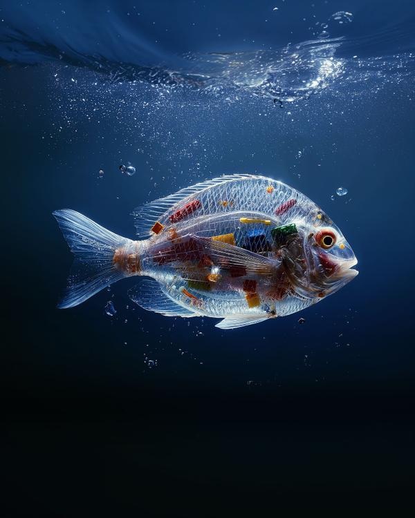
Something beautiful is carrying something it shouldn’t.
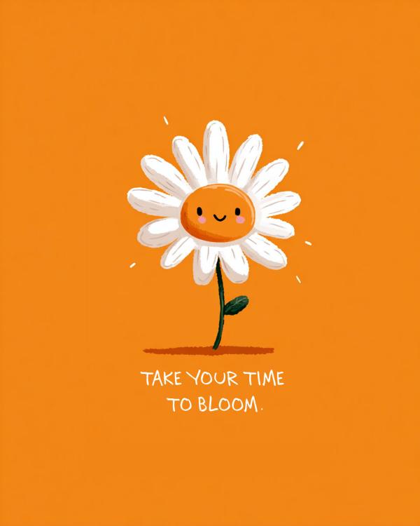
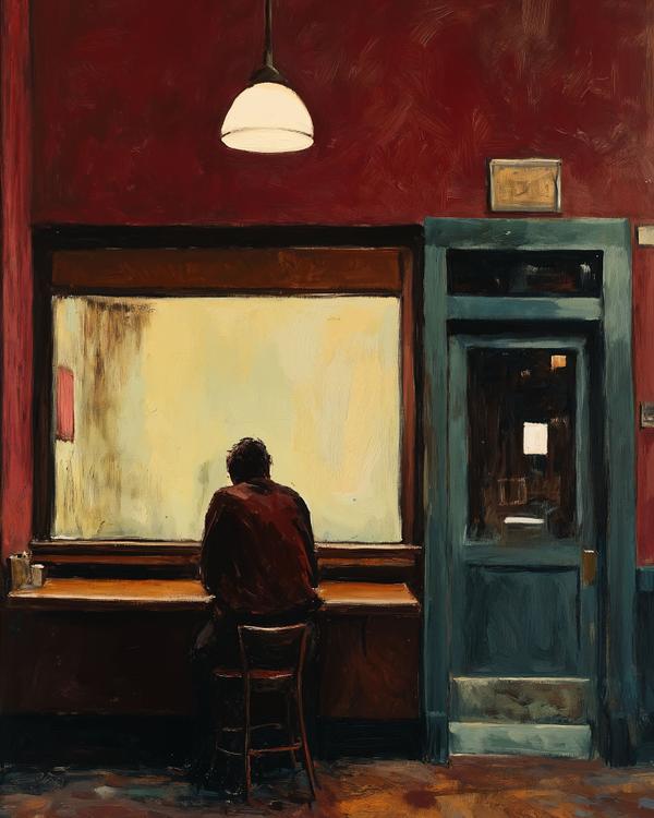
Art reminds us that someone, somewhere, understands—even in silence. If you’re in a quiet season right now, let this painting be a soft, painted hug. You matter. You are seen. The light will change. The door will open. Someone else is out there looking for the same connection you are. Keep going.