The Hour Between
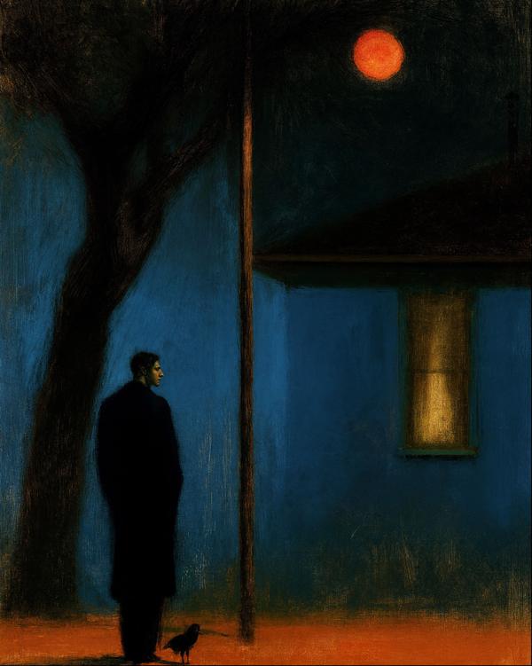
A man, a bird, and a streetlight. Apparently, loneliness has a dress code.
One fact per work, chosen to survive dinner.
A man, a bird, and a streetlight. Apparently, loneliness has a dress code.
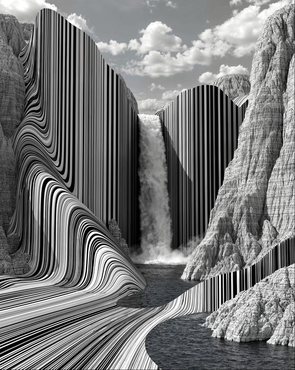
Nature got a barcode.
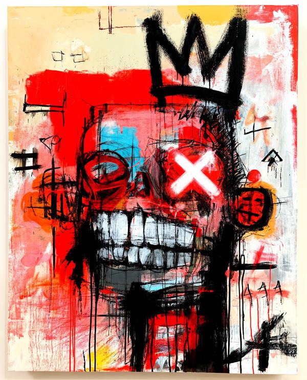
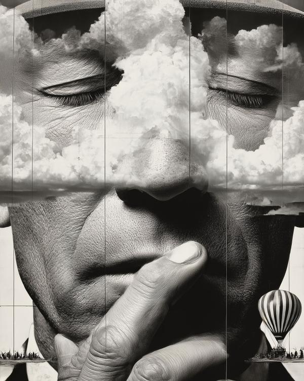
He looks like he knows the answer. Unfortunately, his handwriting is terrible.
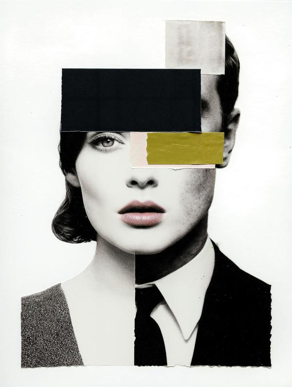
What do memes, glitch art and digital collage owe to a 100-year-old art movement? More than you might think.
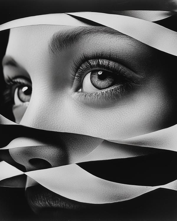
Man Ray treated the darkroom less like a lab and more like a place where accidents could become ideas.
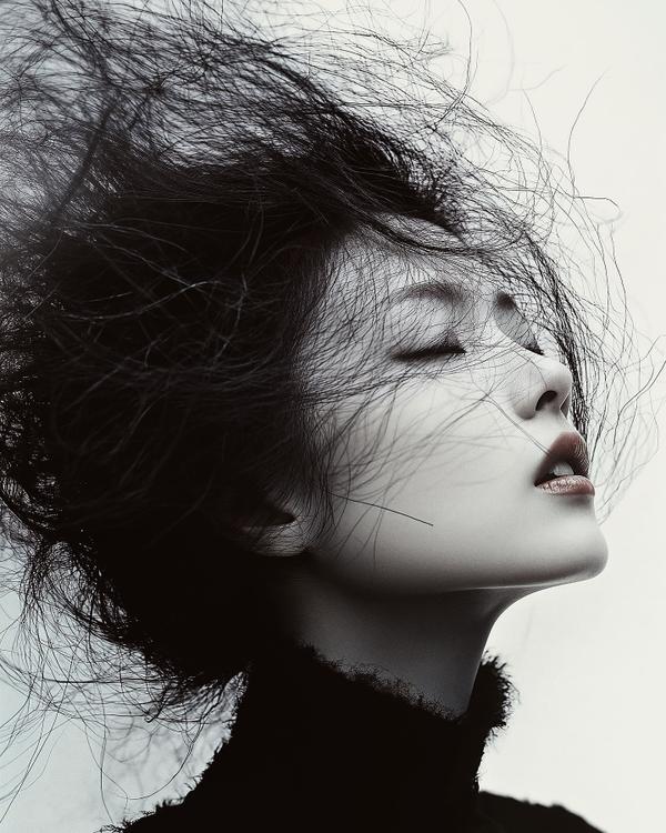
Hiro made fashion photography feel less like documentation and more like visual invention.
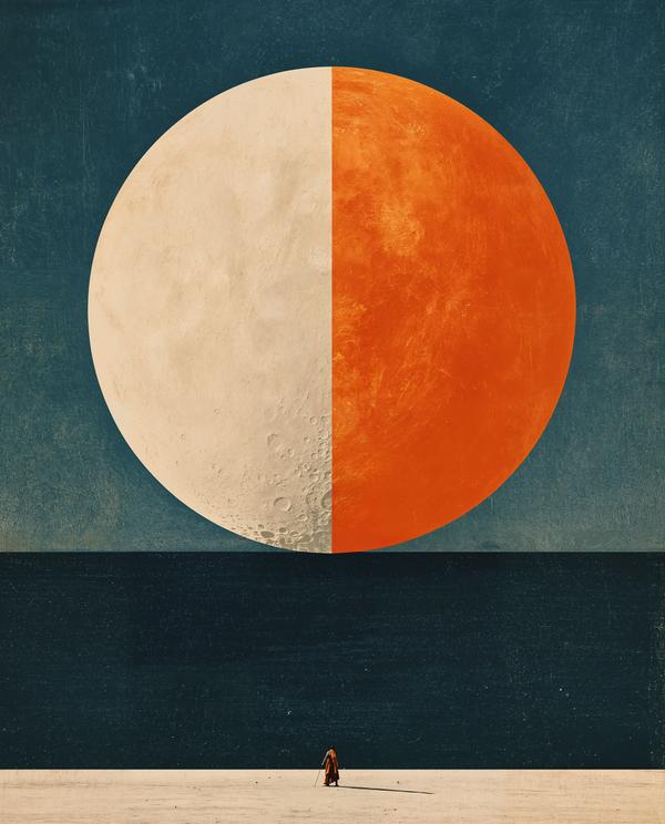
Coincidence—or a signature?
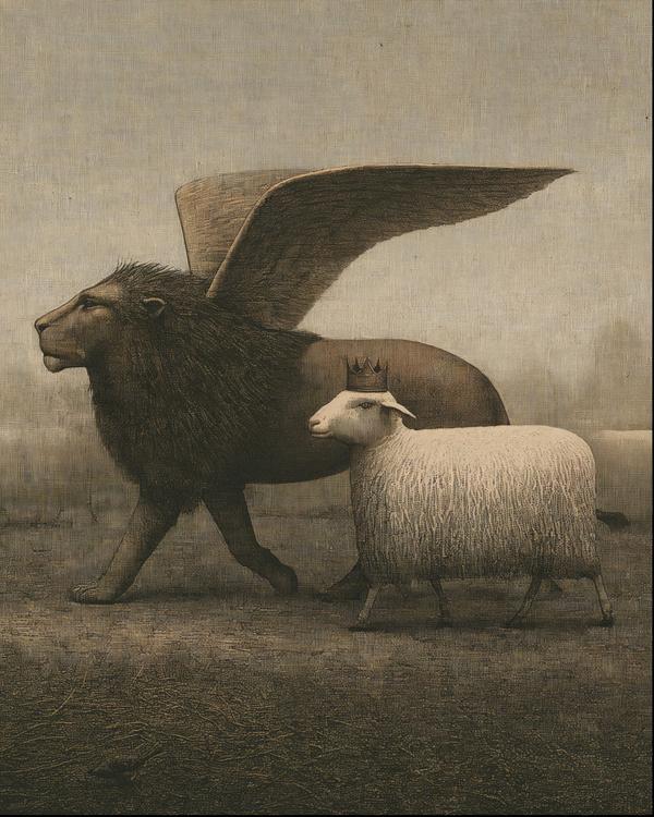
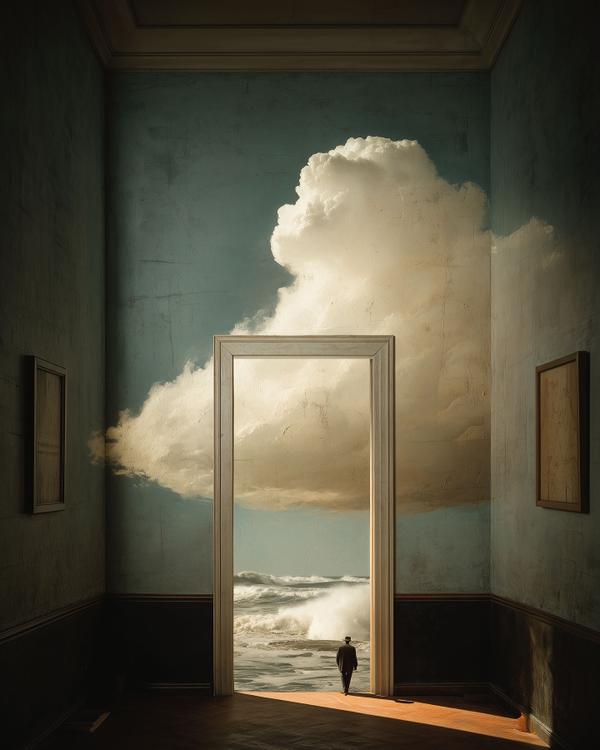
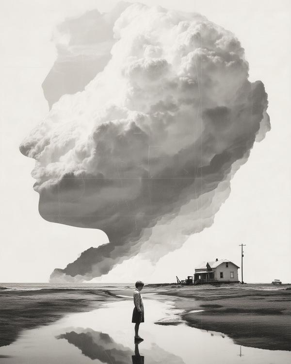
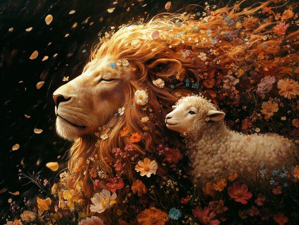
This looks like a fable wandered into a dream and forgot how to leave.
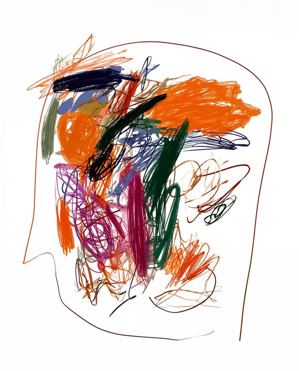
This looks like someone opened a human brain and found an art supply drawer having a nervous breakdown.
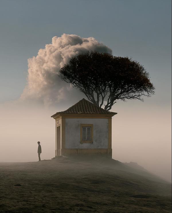
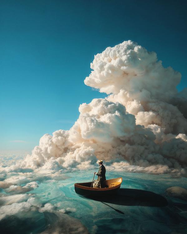
Even the cloud looks like it knows something.
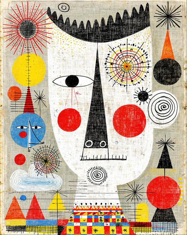
This looks like Picasso got into a toy box and came back nicer.
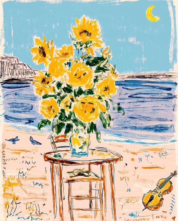
This feels like Van Gogh packed a weekend bag, rented a place by the water, and immediately started making everyone breakfast.
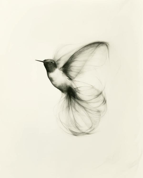
A hummingbird is basically a jewel with an espresso problem.
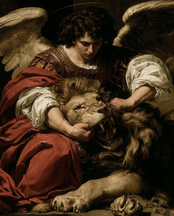
Some people bring a weighted blanket. This angel brought a lion with a jawline problem and a lot of unresolved roar.
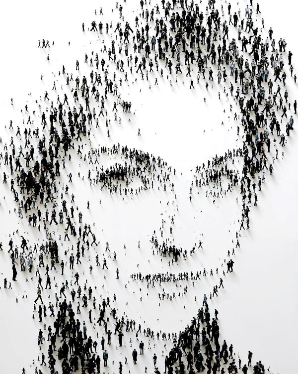
Humanity, seen from above, looks suspiciously like it forgot why it walked into the room.
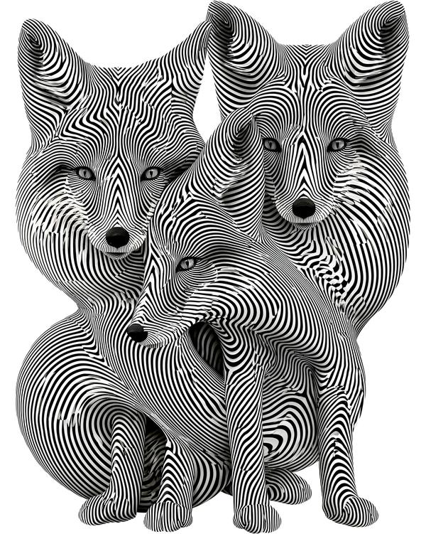
Three foxes, five suspicious eyes, and enough stripes to make a barcode question its career choices.

A scarred football. Rusted slabs. A background that looks like the inside of Pittsburgh’s memory.
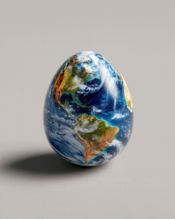
Like if Mother Nature hired a luxury packaging designer.
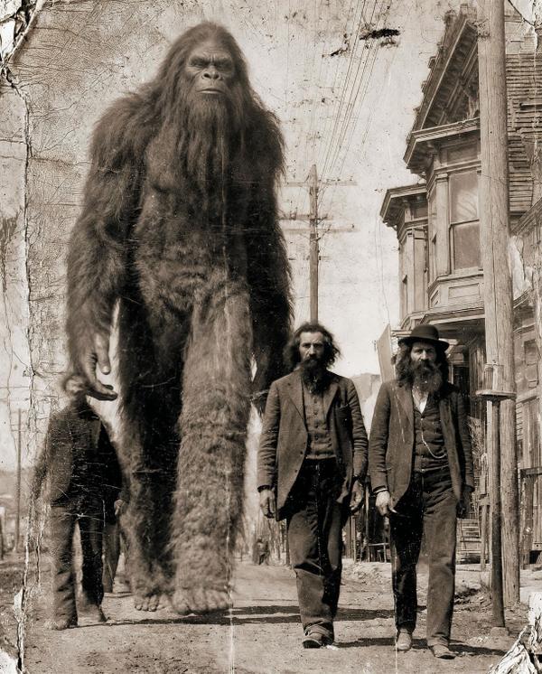
Not a nursery rhyme. A warning.
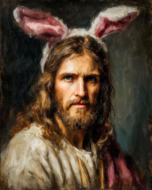
Quick question: how did we get from the resurrection of Jesus Christ… to a rabbit hiding pastel eggs like a tiny suburban criminal?
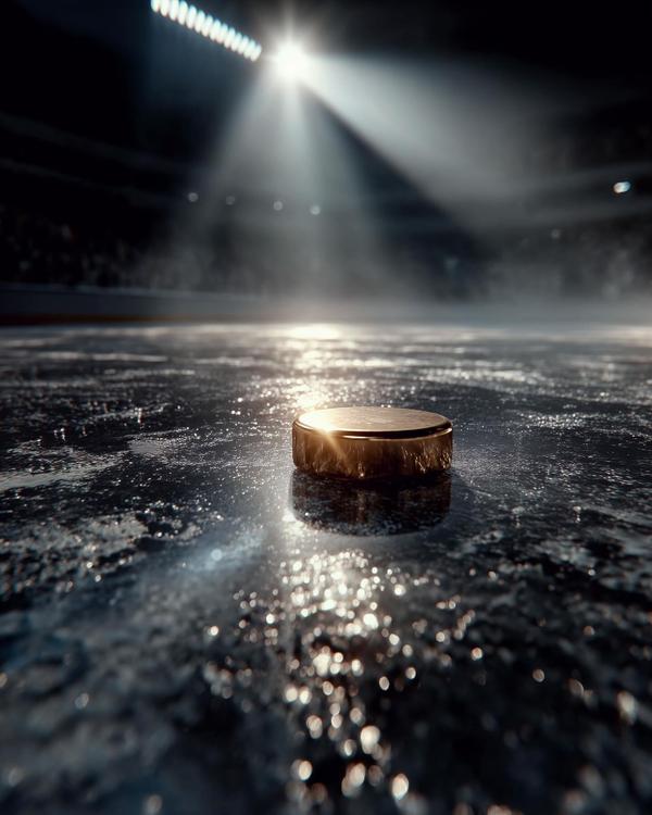
Look at this scene: one solitary solid-gold puck, dead-center, sitting on scarred ice like it owns the building. The spotlight is blasting down from the rafters. The crowd is a soft blur. Everything says “quiet before the roar.” And that warm metallic gleam? That’s not luck. That’s legacy.
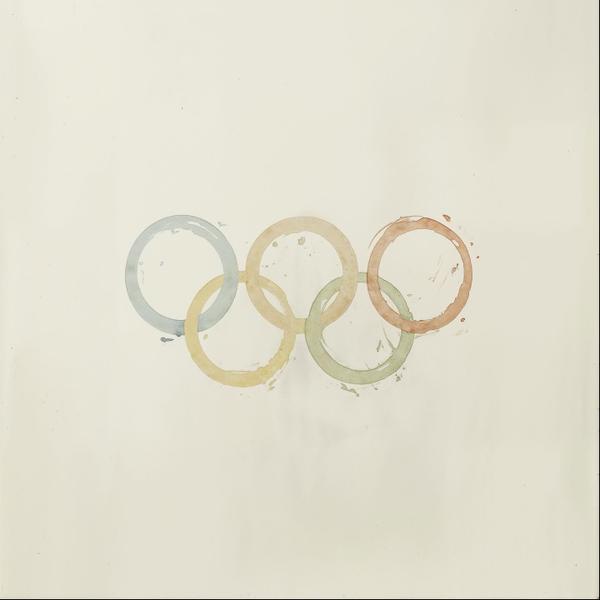
Five coffee-ring halos in soft, washed-out blues, golds, greens, and rust. Paper so quiet it feels like a whisper. And little splatters and smudges that prove someone was actually awake when this happened.
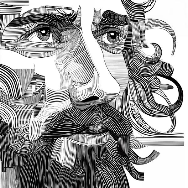
Black ink. White silence. A face built from a thousand parallel lines, like a fingerprint that learned how to stare back.

Ropey straw piled like a nest, a white veil catching the brightest beam, and a newborn wrapped in linen like the world’s tiniest burrito. Twist: the real crown in this room is the light.
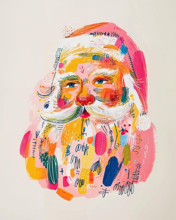
Bubblegum-pink hat. Teal-blue eyes that actually stare back. A whipped white mustache sliced with neon orange and lime. The twist? Santa looks like he got dipped in a paint palette and came out with opinions.
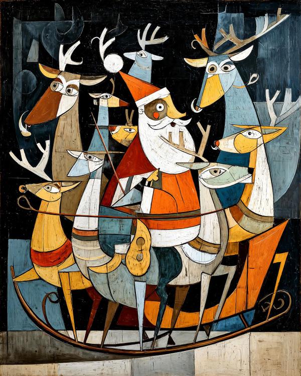
Three things you might’ve missed: the reindeer eyes staring in different directions, the sleigh drawn as one clean crescent swoop, and that patchwork night sky built from dark, blocky slabs. Now here’s the weird part: nothing in this scene agrees on what “front” even means—and it still works.
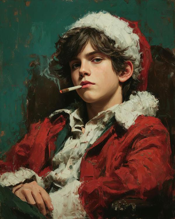
A sea-green backdrop like late-night silence. A red coat built from thick, impatient strokes. A tiny ember on a cigarette, glowing like a mistake with a spotlight.
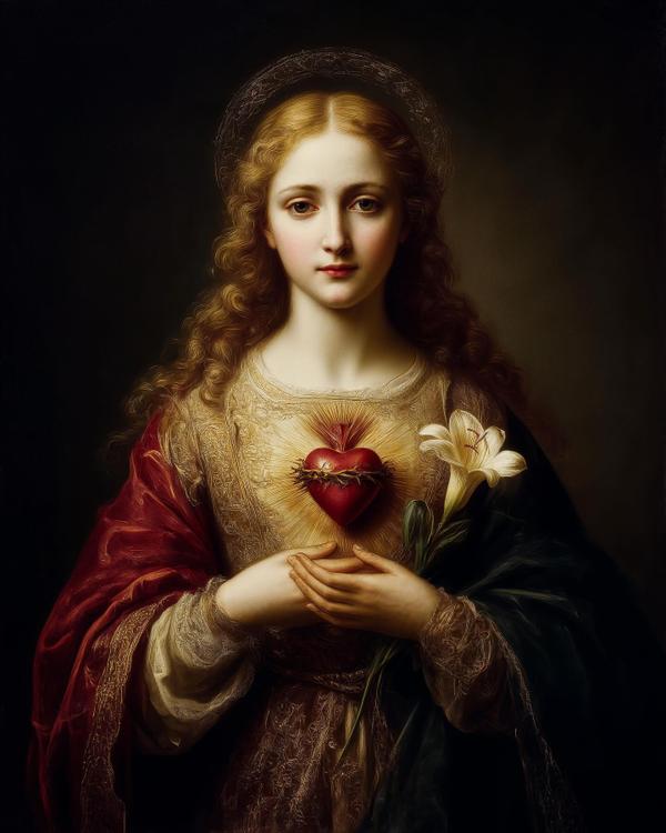
Gold-ring halo. A cherry-red heart wrapped in a thorn crown, kicking out sunrays like it pays rent. One crisp white lily, flawless and unbothered.
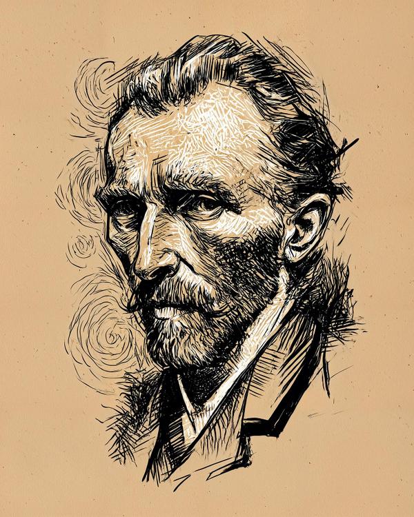
You can almost hear the scratching of the pen, like Van Gogh himself is trying to claw his way out of the page. Every stroke feels alive, half-drawn, half-screamed. If a soul could etch its own self-portrait, it might look like this: raw, fevered, and vibrating on the edge of revelation.

Ever wonder who the first guy was to stick a candle inside a vegetable and call it décor? Meet Jack — the moody influencer of the afterlife.
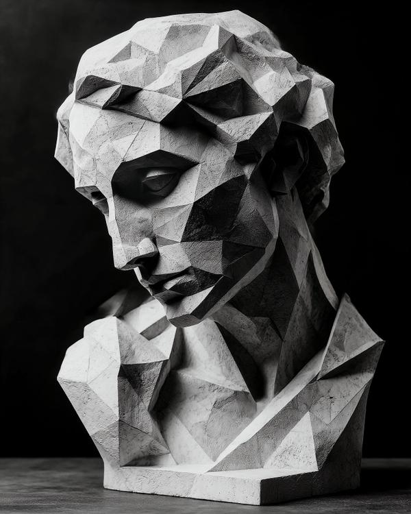
This bust takes classical beauty and runs it through a geometry problem. What was once smooth and divine—think the serene grace of a Greek goddess—now becomes a map of sharp planes and fractured light. It’s what happens when ancient sculpture meets digital modernism: call it Neo-Cubist Classicism.
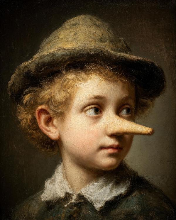
If Rembrandt ever moonlighted as Disney’s concept artist, this is probably what his portfolio would’ve looked like—fairy tales dipped in candlelight and moral ambiguity.
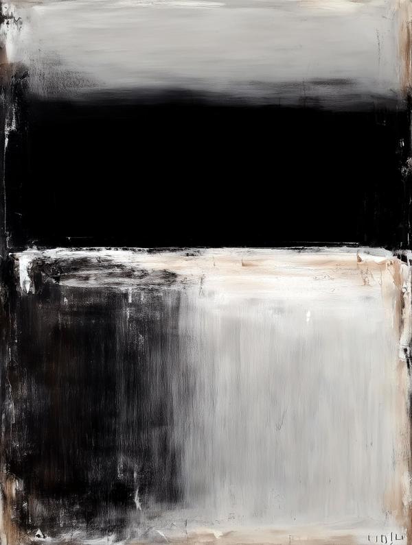
This canvas, with its stacked bands of black, gray, and cream, feels minimal at first glance—but sit with it and you’ll notice it’s humming with quiet intensity. The top half is like a storm rolling in, the middle like a blackout curtain, and the bottom like fog settling over a field. It’s simple in form but complex in feeling—like a symphony played with just three notes. The influence here is straight from Mark Rothko, the painter who believed color could make you cry faster than a breakup song. Rothko’s “color field” paintings weren’t about objects or stories—they were about immersion. Stand in front of them and you don’t just look, you feel. He once said he wanted his canvases to be experienced “like you’re inside them.” That’s why they’re so big—bigger than your living room wall, and definitely bigger than your attention span. Here’s the art lesson: abstraction isn’t emptiness. It’s concentration. By stripping away detail, you end up amplifying emotion. Think of it as the difference between reading a 400-page novel about heartbreak and just hearing Adele sing one note. Same punch, less clutter. Fun fact: Rothko was so picky about how his work was shown, he famously pulled out of a commission for a fancy New York restaurant when he realized people would just glance at his paintings between bites of steak. He said he wanted diners to lose their appetite, not enjoy their martini. So next time you see a painting that looks like “just rectangles,” remember: sometimes the rectangles are holding more drama than a whole Netflix season.

What you’re looking at is bonsai—literal translation: “tray planting.” It’s sculpture where the material is alive and the chisel is time. This little drama queen leans with an elegant S-curve, stacking “cloud pads” of foliage over moss like a tiered wedding cake with self-control. I’d call the style moyogi (informal upright): asymmetrical, rhythmic, and built around negative space—the Japanese concept of ma—so every gap feels as important as every branch. Influences? Think the hush of Zen gardens, the misty pines of Hasegawa Tōhaku or Sesshū Tōyō’s ink landscapes, and the clean restraint you see in Isamu Noguchi’s sculpture. The half-bowl pot is the “frame,” the moss is the stage, and the trunk—gnarled, twisting, full of stories—is the lead actor who has seen things. Quick bonsai primer (a.k.a. living-art secrets): * It began as penjing in China over a thousand years ago, then Japan refined it into a philosophy of scale, season, and patience. * Artists shape trees with selective pruning, wiring, and root work, never by “shrinking genes.” It’s discipline, not genetics. * Illusion is everything: taper in the trunk, nebari (root flare), and rough bark make a young tree read as a mountain elder. * Display matters: in Japan a bonsai sits in a tokonoma alcove like a poem on a pedestal—rotated through the seasons to show character in different lights. Fun fact: a five-generation Japanese white pine that survived Hiroshima was later gifted to the U.S. and still lives at the National Arboretum—proof that bonsai is resilience in miniature. Also, some specimens are 800–1,000+ years old. Your houseplant could never. Moral: patience is a power tool. Clip a little, wait a lot, and let the empty spaces do half the talking.
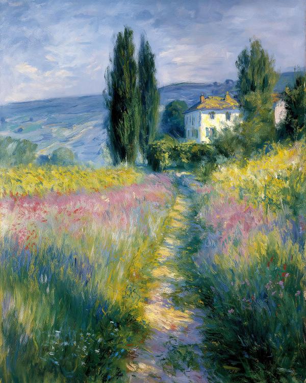
What you’re seeing here (vineyard fields, seaside strolls, Venetian shimmer, and that dreamy rowboat with lilies) is Impressionism in all its “caught in the moment” glory. Monet wasn’t trying to paint every leaf or stone; he wanted to capture how light felt at that instant. Morning haze? Sunset glow? A reflection rippling on water? He grabbed it before it slipped away, like an artistic paparazzo of sunlight. The Big Idea: Impressionists believed that reality wasn’t fixed—it changed with the hour, the season, the flicker of light. A meadow at noon is not the same meadow at dusk. Monet painted the same haystacks over 30 times to prove it (seriously, the man was the original “one more angle” content creator). Fun facts worth dropping at dinner: The term Impressionism came from a critic mocking Monet’s painting Impression, Sunrise—basically saying it looked unfinished. Joke’s on him: the “unfinished” look became the hottest style in art history. Monet’s eyesight got so bad later in life that some of his water lilies veer into abstract territory—like a preview of modern art before it even existed. Those quick, choppy brushstrokes? They weren’t laziness. They were speed-painting lighting before it disappeared. So the next time someone says, “That painting looks blurry,” just tell them: Exactly. That’s the point.
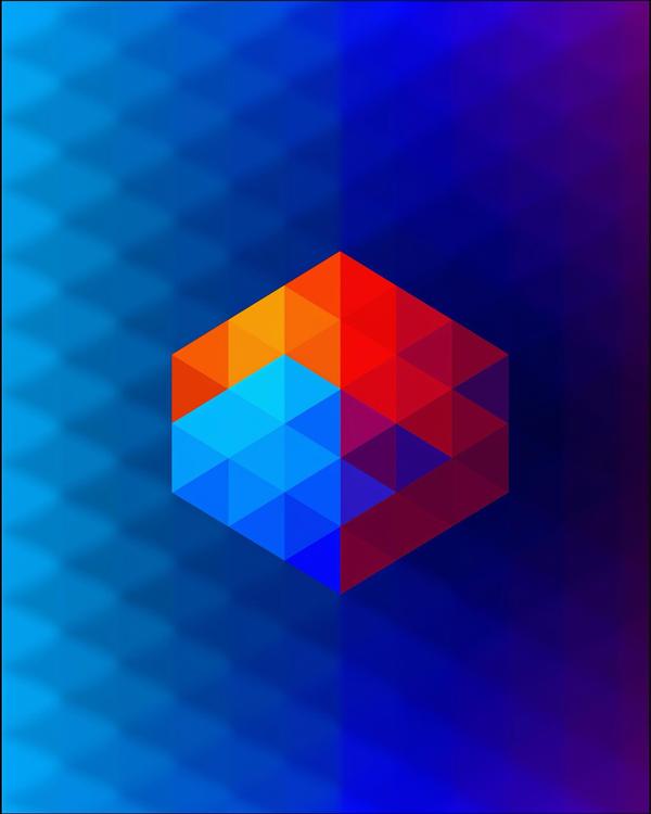
What you’re looking at sits squarely in the Op Art and geometric abstraction tradition—think Victor Vasarely, the “father of Op Art,” who made whole careers out of hypnotizing people with color-shifting grids, or Josef Albers, who basically proved that colors are moody little liars, changing their personality based on who they’re sitting next to.
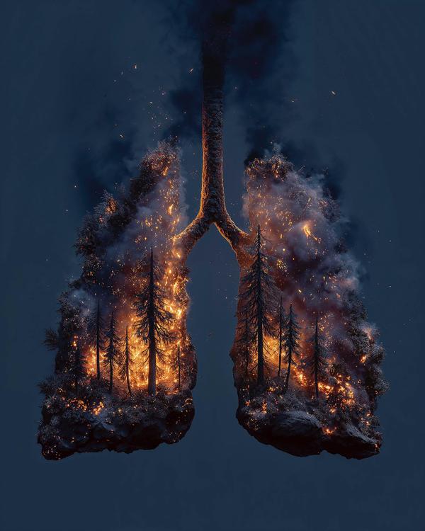
Alright, gather ‘round folks—because here we have lungs that look less like biology and more like a California wildfire survival guide. This piece sets the stage with a perfect metaphor: a forest on fire sculpted into the delicate shape of human lungs. Translation? Smoking doesn’t just burn through your pack—it burns through you. Visually, this artwork draws from the hyper-realistic, high-drama style of surrealist photographers like Jerry Uelsmann (master of photomontage) and the ecological urgency you’d find in Olafur Eliasson’s installations. The fire-lit pines have that Caspar David Friedrich sublime-but-terrifying vibe, but modernized with digital clarity so sharp it could slice through cigarette paper. And the symbolism? Chef’s kiss. Trees are often called the “lungs of the Earth,” so flipping the metaphor to show human lungs as a burning forest is a brutal mic drop of environmental and personal health commentary. It says: “If the forest goes, we go. If your lungs go, well… you go.” Fun fact you can drop at a party: every puff of a cigarette introduces over 7,000 chemicals into your lungs—some of which are also found in rat poison and rocket fuel. Not exactly the kind of cocktail you want shaken OR stirred. So here’s your unsolicited PSA: put out the fire before it puts out you. Or, if you must, at least know your lungs are auditioning for the next season of Survivor: Smoky Mountains.
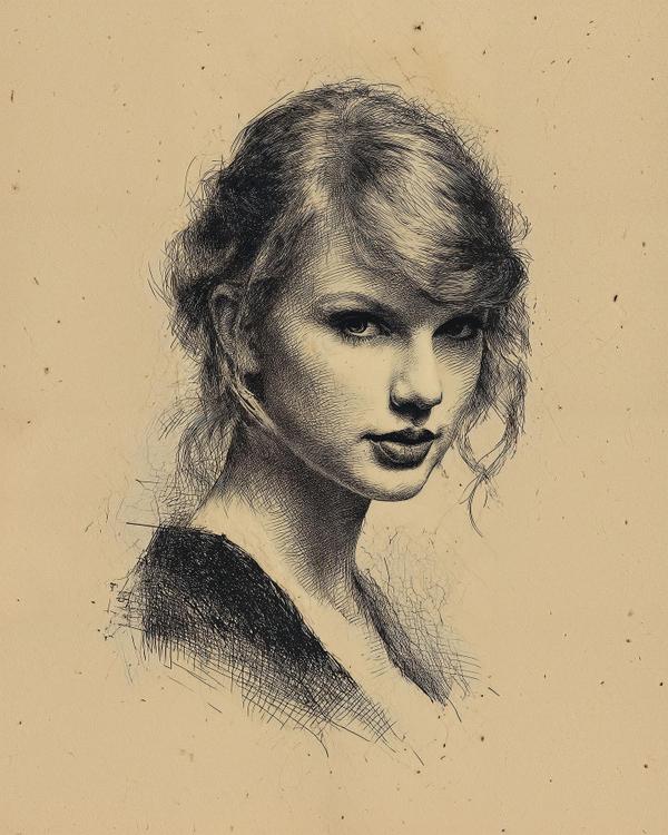
Earlier this year, curators cataloging a private collection in Antwerp stumbled upon an unsigned 17th-century etching hidden inside a bound ledger of Dutch trade accounts. The paper, watermarked and dated to the 1650s, shows a finely worked female portrait rendered with remarkable delicacy. The sitter’s identity remains unknown, but her features feel startlingly contemporary—so much so that many observers swear she looks like a modern pop icon. The portrait bears stylistic traits of Rembrandt’s circle: cross-hatched shadows, careful attention to hair texture, and a balance of light and dark that pushes the face forward in dramatic relief. Some specialists suggest it may have been a student exercise; others believe it could be an unfinished studio piece. What’s certain is that the craftsmanship is of the highest order, and the sitter’s enigmatic half-smile has already sparked global fascination. Fun Fact You’ll Want to Repeat Rembrandt’s workshop often produced etchings for private study rather than public sale. Many were tucked into books or sketch folios, only to vanish for centuries. Finding one intact today is rare; finding one that mirrors a modern cultural figure borders on uncanny coincidence. Whether you see a lost muse or a time-defying doppelgänger, this rediscovered work is a reminder that art—and faces—can echo across centuries in ways that feel almost magical.
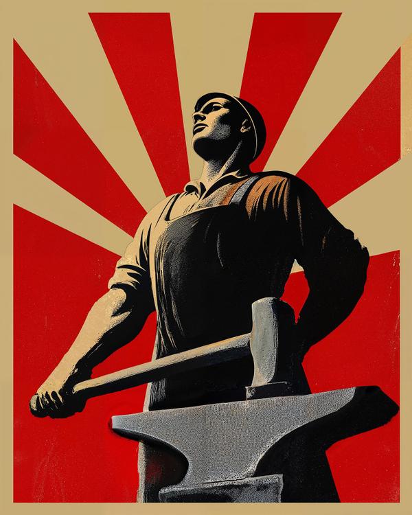
A worker stands in hero mode: chin up, shoulders squared, hammer parked on an anvil like it’s Excalibur for the 9-to-5. Red sunbursts flare behind him, turning the background into a megaphone. Limited palette (red, black, tan) + chunky shadows = instant poster punch. What it’s channeling Think Soviet Constructivist swagger meets American WPA grit. The radiating rays and low-angle pose echo Rodchenko and El Lissitzky—design built to rally a crowd in one glance. The muscular chiaroscuro and tool worship nod to Socialist Realism, while the clean screen-print edges and texture tip a hard hat to U.S. New Deal posters (Ben Shahn, Lester Beall) and, more recently, Shepard Fairey’s pop-propaganda vibe. Translation: museum-level graphic design that still smells like fresh ink. Why it works (Poster Design 101): • Low-angle figure = instant hero. • Radial lines = energy + your eye can’t not look at the face. • Flat colors = cheap to print, loud to read from across a street. • Big shapes, tiny details = legible at billboard speed. Labor Day fun facts (tell a friend): • The first U.S. Labor Day parade marched through NYC on Sept 5, 1882—about 10,000 workers took an unpaid day to strut for shorter hours and better conditions. • Credit for the idea is still a friendly feud: Peter J. McGuire (AFL) vs Matthew Maguire (a machinist). Pick a side at the cookout. • Oregon made Labor Day an official state holiday first in 1887; by 1894, 30 states were on board. • After the Pullman Strike crisis, President Grover Cleveland signed Labor Day into federal law in 1894—and chose September to avoid the radical politics tied to May Day. • That weekend you love? Thank the labor movement: the 40-hour week and overtime pay were cemented by the Fair Labor Standards Act (1938). Slogan back then: “Eight hours for work, eight for rest, eight for what we will.” Raise a burger, a banner, or both—this image reminds us that progress gets forged, not gifted.
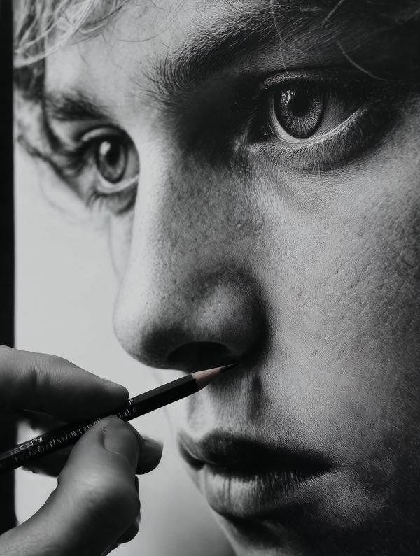
Okay, let’s just admit it: this face looks more HD than half the selfies on your phone. Every pore, every eyelash, every glint in the eye—it’s so real you half expect the drawing to blink and ask you for Wi-Fi. But plot twist: that’s not a photograph, that’s graphite. Welcome to hyper-realism, the art form that makes reality look like it needs an upgrade. Hyper-realism takes its roots from photorealism of the 1960s (think Richard Estes or Chuck Close), but then it said, “Cool, but what if we crank up the emotional drama to 11?” Instead of just copying a photo, hyper-realists exaggerate the textures and the mood. The skin looks too alive, the eyes too intense—like reality plus a little existential seasoning. Here’s your fun flex for trivia night: some hyper-realistic portraits take over 500 hours to finish. (Yes, that’s five hundred hours. Meanwhile, you gave up on a 1000-piece puzzle after day two.) And get this: the world’s largest hyper-realistic painting is a 66-foot-wide wave so convincing that surfers literally showed up with boards. What’s wild about this piece is how the artist nails micro-textures—the soft grain of skin, the wet sheen in the eye, even the faint chaos of hair strands. It’s intimate, almost uncomfortably so. Like zooming in too far on FaceTime, but instead of cringe, you get goosebumps. So next time you think “eh, it’s just a drawing,” remember: hyper-realism isn’t competing with photos. It’s competing with your sense of reality. And honestly? Reality should be nervous.

From far away, this face feels soft, human, almost whispering its story. Step closer, and—surprise—it’s not skin at all. It’s hundreds of little colored squares, each one a pixel, working together like tiny digital bees making honey. This is basically Pointillism’s glow-up. Back in the 1880s, artists like Georges Seurat and Paul Signac used thousands of dots of pure color, trusting your eyes (and brain) to mix them into a complete image. Today, pixels do the same—but instead of paint, it’s math and light. Here’s the science-y magic: your retina has about 120 million rods (light sensors) and 6 million cones (color sensors). They don’t “see” the image whole—they send little packets of information to your brain, which stitches everything together in real time. That means every image you see—whether on a screen or in life—is basically a live Photoshop composite inside your head. Fun fact to drop at parties: the word pixel comes from “picture element,” and the very first digital image was made in 1957—it was a photo of a baby, and it had a whopping 176 × 176 pixels. Your phone camera now laughs in 12 million. Artistically, this piece could’ve been dreamed up by Chuck Close if he’d been born in the Instagram era—taking the grid obsession of modernism, mixing it with a bit of Op Art optical trickery, and letting the human eye do the final “painting.” So, next time you’re staring at your screen, remember: you’re not looking at the image—you’re looking at thousands of tiny squares in a well-organized riot, and your brain is the world’s most overqualified art curator.
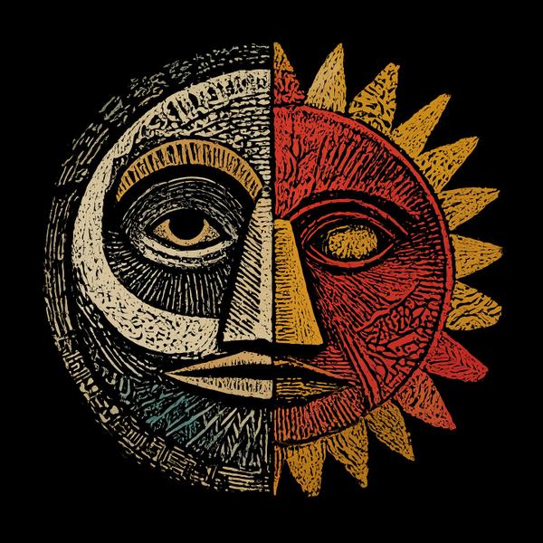
Ever wondered what would happen if the sun and moon decided to do a face swap? Well, this tribal-style linocut brings that cosmic collab to life—with bold lines, fiery symmetry, and a whole lot of personality. This piece screams linocut: a classic printmaking style where artists carve into a linoleum block, roll it with ink, and press it to paper. Think of it like the cooler, older cousin of the rubber stamp—messy, bold, and unapologetically textured. One side radiates hot reds and yellows like a sun that’s had its morning espresso. The other is cool, calm, and carved in inky blues and bone-white like the moon pulling an all-nighter. Together? A Yin-Yang face-off with vibes. Style Vibes: * Feels inspired by tribal and indigenous art, especially from African and Polynesian traditions. * Echoes the expressionist printmaking of German artist Ernst Ludwig Kirchner. * Has a nod to the mystical-meets-modern woodcuts of Jose Guadalupe Posada (that guy who made all those epic skeletons). Fun fact: Linocut became super popular because it was cheap, fast, and graphic—Picasso even used it to make posters and prints in his later years. Yep, that Picasso.
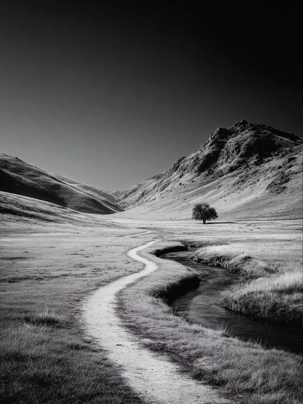
Ever feel like life’s pulling you somewhere, but you’re not sure where? That’s a leading line talking—and in art, it’s kind of like the universe whispering, “This way, friend.” In today’s black-and-white wander-dream, a winding path curls alongside a stream like it’s narrating its own story. Your eye can’t help but follow it—from foreground to distant tree, like a visual road trip without gas money. This is the power of leading lines—one of the oldest tricks in the artist’s playbook to guide your attention exactly where they want it. It’s like visual GPS... but without the annoying “recalculating.” What’s a Leading Line? It’s any natural or created line—roads, rivers, fences, shadows—that directs your eye through an image. Artists use them to create depth, drama, and focus. Basically: it’s visual persuasion dressed as scenery. Fun Facts to Drop Casually Like You’re a Gallery Guide: 1. Da Vinci was a fan. The guy didn’t just paint smiles—he used subtle leading lines to draw your eye to Mona Lisa’s gaze before you even know you’re looking. 2. Black-and-white images make lines pop. Without color to distract, your brain zones in on texture and shape. That’s why this piece feels like a quiet poem in pixels. 3. Your eyes love a journey. Studies show viewers spend more time with art that has strong directional elements. It’s visual storytelling at its finest. So next time you’re out walking a path like this, just know—it’s not just a trail. It’s a masterclass in composition, brought to you by dirt, water, and one very persuasive curve.
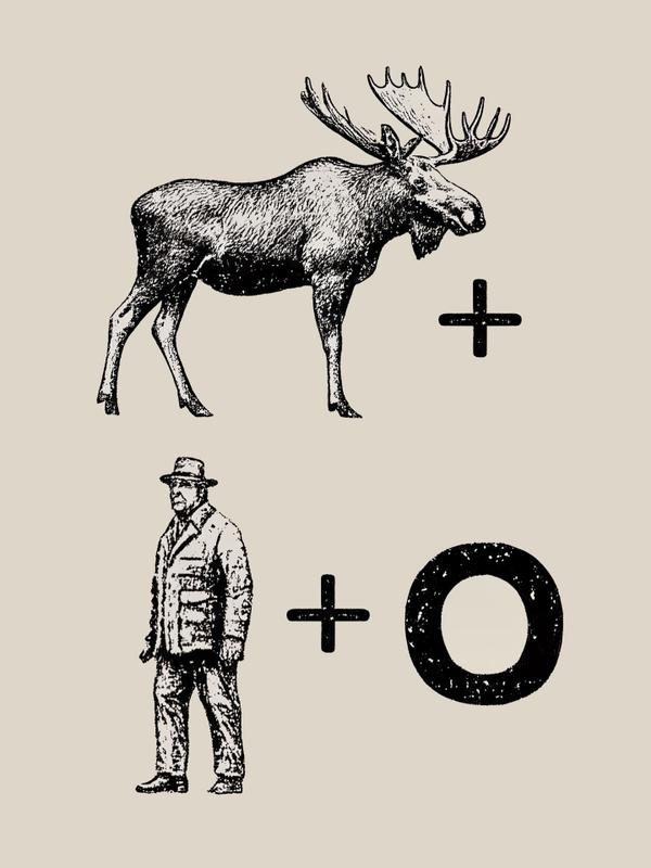
📜 Tiny backstory: The term rebus comes from the Latin phrase “non verbis, sed rebus”—meaning “not by words, but by things.” These puzzles date back to ancient Egypt and medieval Europe, when people used images instead of text because 1.) illiteracy was common, and 2.) who doesn’t love a little visual mischief? 👁️+💓+ u = “I love you.” 📦+ER = “Boxer.” Ever seen a moose, a man, and a giant “O” team up to spell a name? You have now. This vintage-style rebus puzzle doesn’t just say my last name “Musmanno”—it illustrates it. Let’s break it down like a detective in a tweed blazer: 🫎 Moose + 👨 Man + ⭕ = Musmanno. It’s phonetic, it’s visual, it’s pun-tastic. And yes, it’s my name spelled like a crossword clue after three espressos. 🧩 Art snack of the day: Rebuses work because of a cognitive trick called dual coding—your brain loves combining images and language. That’s why you’ll remember “moose + man + O” faster than someone’s phone number. 🎉 Fun fact: The rebus has even made its way into pop culture—from Prince’s symbol (yep, that one) to vintage game shows to tattoos. Some people literally ink cryptic wordplay on their bodies. In the 1600s, French aristocrats used rebuses to flirt in secret. Because nothing says romance like a drawing of a goose next to a ladder that somehow means “meet me behind the stables.”
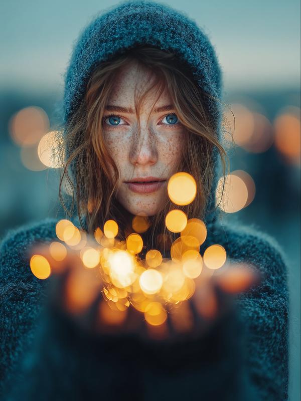
You know those dreamy, glowy blobs of light in the background of fancy photos? Like someone spilled fairy dust behind your latte or made a city skyline look like a soft-focus daydream? That, my friends, is bokeh (say it like “BOH-keh” – not “bouquet,” unless you’re gifting it to your camera). Here’s the deal: Bokeh happens when the background is out of focus in a pretty way. It’s not just blur—it’s deliberate blur that turns lights into magic circles and boring stuff into visual frosting. How it works (5th-grade level): Your camera sees like your eyes do. When it focuses on something close, the stuff behind it gets fuzzy. Bokeh is what happens when that fuzz turns into sparkly goodness. The better the lens, the dreamier the blur. Fun Bokeh Bites You’ll Want to Repeat: * The word “bokeh” comes from the Japanese word “boke,” which means blur or haze. Artsy, right? * Bokeh isn’t just about how blurry the background is—it’s about the quality of that blur. Some are soft and round like cotton candy. Others look like a cat knocked over your glitter drawer. * Some photographers actually DIY bokeh shapes—stars, hearts, even dinosaurs—by cutting patterns into lens filters. Yep, you can literally turn light into hearts. Cupid approves. * In portrait photography, bokeh helps the subject pop like the star of the show, while the background does polite, fuzzy applause. So today’s AI art? Think of it as a love letter to those glowing little background bubbles that quietly steal the spotlight. Because sometimes the most beautiful part of a picture… is the part you’re not looking at.
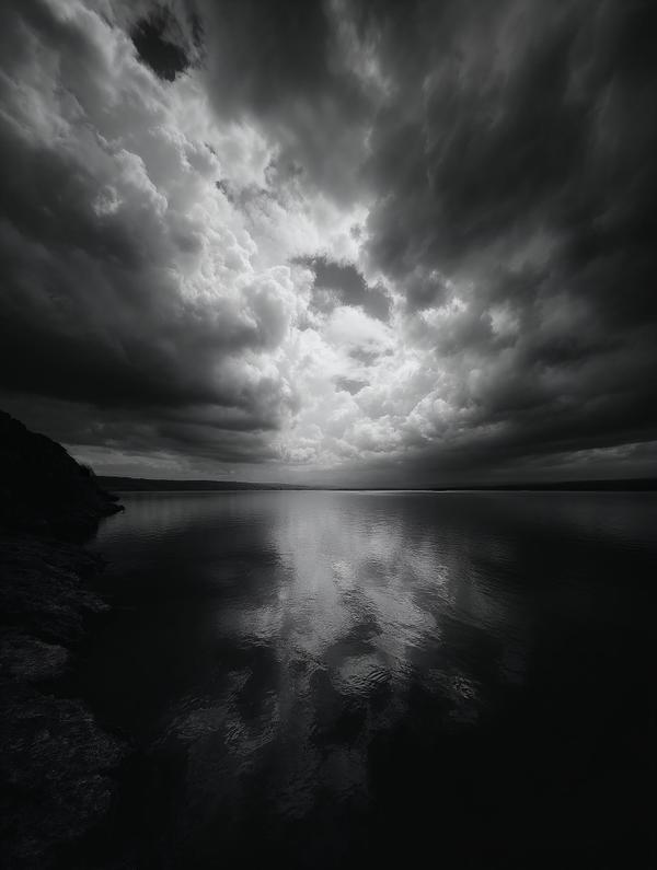
This image isn’t just moody—it’s practically Shakespearean. What you’re seeing is an example dynamic range, that magical tension between light and dark that makes a photo feel like it’s alive and humming with emotion. What’s Dynamic Range Anyway? In photography, it’s the span between the brightest bright and the deepest shadow. Too little range = flat and boring. Too much = hello, blown-out skies and ink-black shadows. Just right? That’s where the magic lives. Now, About Your Eyes: * The human eye can detect about 20 stops of dynamic range, which is wild. * But in any one glance? We process around 10–14 stops—meaning we’re adjusting on the fly, constantly. * Our pupils do this faster than the newest iPhone’s HDR mode. Seriously, your eyes are basically biological light meters. Artists Knew This Before Photoshop: From Caravaggio to Ansel Adams, artists have played with shadow and light to tell stories. That soft glow on a face? Or the pitch-black corner of a room? That’s dynamic range doing the heavy emotional lifting. Why This Image Works: It stretches the full spectrum—from jet-black water to clouds lit like a heavenly stage. Your eye dives in, then swims around, trying to figure out where the light ends and the drama begins. Bonus Nerd-Out: * Your eye is better than most digital cameras (yes, even the fancy ones). * In bright sunlight, a camera might capture ~12–14 stops. * The Zone System (invented by Ansel Adams) was all about managing dynamic range before Lightroom made it cool.
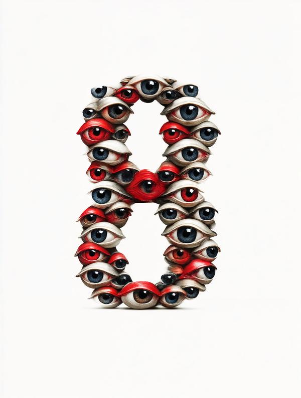
— inspired by Stephen Colbert’s satirical genius In 2005, The Colbert Report gave us the word Truthiness “Truth you feel in your gut.” Not fact-checked. Not researched. Just vibes. Colbert used it to parody how we choose feeling right over being right.
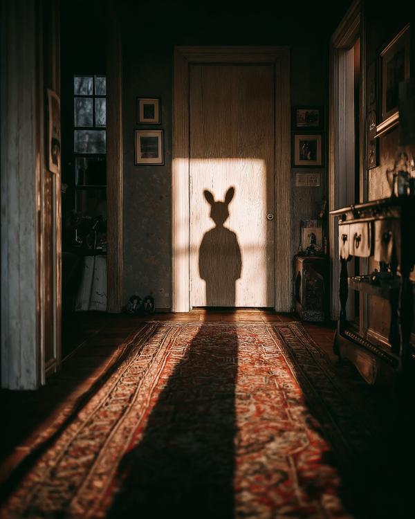
What you’re seeing is the magic of light and shadow at work. The soft golden glow from the door has cast a playful silhouette, transforming a simple hallway into a scene of mystery. Shadows like this are more than just illusions—they’re a little bit of visual storytelling. With just the right angle of light, everyday objects can take on entirely new forms. Today, it’s a bunny, but tomorrow it might be something else entirely. It’s a reminder that perspective is everything, and sometimes the most magical moments come from the simplest of things. Fun fact: The art of creating shadows goes back to ancient times, where they were used in everything from storytelling to art and even science. People once believed shadows had a life of their own! Today, they still have the power to spark creativity and wonder. So next time you pass through a doorway or stand in a patch of sunlight, take a moment to pause and let your imagination roam. Who knows what you might find lurking in the shadows?
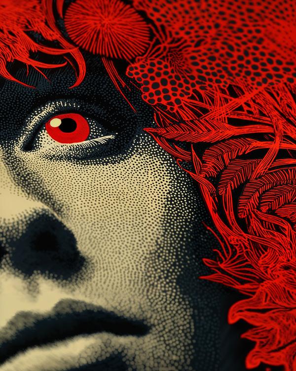
Welcome to a love letter to one of my favorite mediums: silkscreen printing (aka screen printing). It’s bold, it’s graphic, and it loves a good dot. Swipe your gaze across this piece — that lush red foliage, that hypnotic gaze — and thank silkscreening for the drama. From Andy Warhol’s soup cans to rock posters that melt your face off, this technique has seriously iconic roots. Fun silkscreen facts to impress your arty friends: — Silkscreening dates back over 1,000 years to ancient China (yep, the OGs). — The “silk” part? Originally, the mesh was literally made of silk. — Pop artists in the ‘60s embraced it for its ability to mass-produce images with wild colors and sharp lines — think Warhol, Lichtenstein, and Sister Corita Kent. — Each color in a silkscreen print = a separate screen and pass of ink = a meticulous, messy labor of love. It’s graphic art with grit, elegance with edge — and a medium that knows how to make a statement.
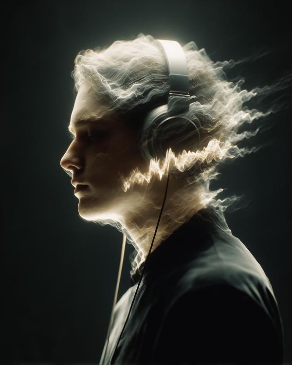
You’re standing still, but the air around you begins to shimmer. Waves of light ripple across your face—not randomly, but rhythmically. They pulse with intention, like a language made of motion and electricity. That’s what you’re seeing here. This image is a visual translation of music—the way sound might feel if it passed through you, not into your ears. The glowing waveforms wrap around the listener like wind with purpose. They don’t just bounce—they flow, wrap, build, and break like waves on an emotional shore. For someone who can’t hear, music isn’t lost—it’s rerouted. It’s vibration. It’s light. It’s felt through your skin, your bones, your imagination. Like heat from the sun, or the beat of a heart. So next time you listen, try closing your eyes. Feel the hum in your chest, the pulse in your fingers. You’re not just hearing music. You’re becoming it.
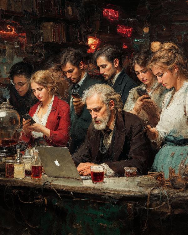
This scene might look like your average coffee shop scroll-a-thon—but what you’re actually seeing is a modern genre painting in the style of one of America’s greatest 19th-century artists. Eastman Johnson was known for his realistic depictions of everyday life, often portraying domestic scenes, rural labor, and moments of quiet humanity. He was deeply influenced by 17th-century Dutch and Flemish masters, especially in his use of chiaroscuro—dramatic light and shadow—which you can see echoing in this image. Here, that timeless technique is applied to a very current setting: glowing phones, cold brew, and a man who looks like he’s drafting the Declaration of Independence on a MacBook. Johnson believed in capturing people as individuals, not stereotypes—and you can feel that here, even as everyone’s collectively ignoring each other. It’s a perfect collision of old-world technique and new-world tech. If Johnson were alive today, he wouldn’t be painting fields—he’d be painting feeds. Oh—and fun fact: he co-founded the Met Museum, so if your cappuccino ever feels museum-worthy, now you know who to thank.
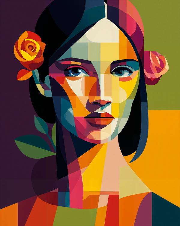
Say hello to Cubism — the art movement that shattered perspective like a broken mirror. Born in the early 1900s, Cubism ditched realism to show multiple angles at once. Think: Picasso’s brain meets a kaleidoscope. Fun Fact: Picasso co-founded Cubism with Georges Braque, and at one point, critics said their art looked like it was made of little cubes—and the name stuck. Cubism: where reality gets a remix.
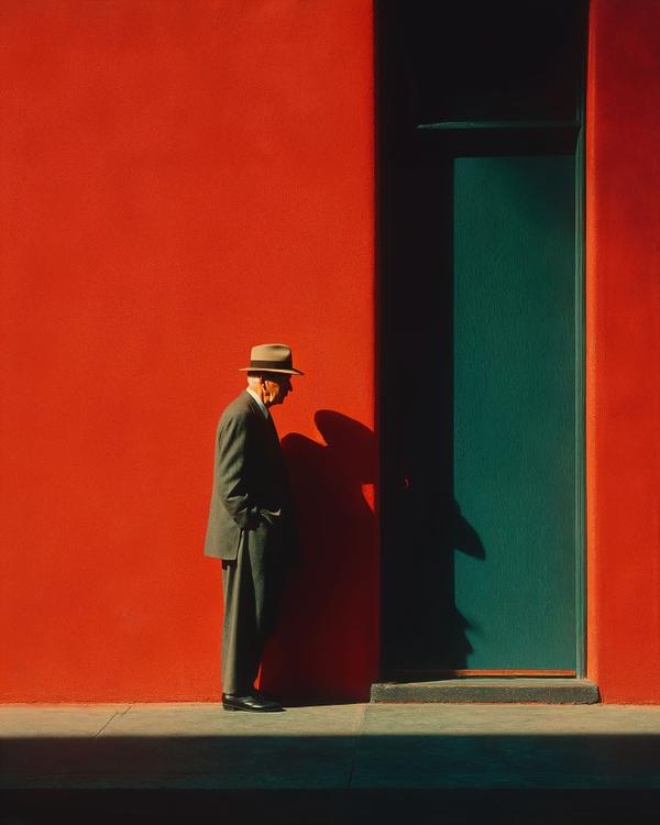
Swipe into the 1950s, where color wasn’t just an afterthought—it was the whole mood. This image, inspired by the iconic style of Marvin E. Newman, hits like a still from a film noir shot on Kodachrome. That fire-engine red wall? It’s not just a background—it’s a character. The emerald door? A mysterious portal. And the sharply dressed man in shadow? He’s either on his way to a jazz club or about to solve a mystery involving a femme fatale and a missing fedora. What Makes It Newman-esque? * Color as Emotion: Newman was one of the first to treat color like a visual symphony, not just a documentary detail. * Geometric Composition: Look at that play of rectangles and light—this isn’t a snapshot, it’s architecture meets attitude. * Street Meets Stage: His street photography often feels theatrical—like this guy was cast by fate to walk into the perfect patch of shadow. Fun Fact: Marvin E. Newman once said, “You photograph the city, but really you’re photographing people being themselves within it.” This image? A masterclass in that ethos.

There are easier ways to be a sports fan.
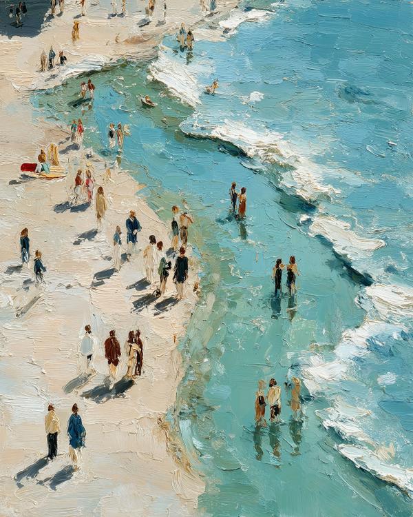
Imagine if Henri Matisse traded in his scissors for a beach towel—and brought Maira Kalman along for the ride. That’s today’s mash-up: painterly joy meets sun-drenched storytelling. Matisse gives us those bold shapes, sun-bleached shadows, and a sea so inviting you can hear it whisper “just one more swim.” Kalman chimes in with her whimsical cast of characters: strolling, floating, probably discussing toast or Tolstoy. This one’s for the endless summers of the soul. The kind where your worries float out with the tide and strangers feel like characters in your favorite children’s book. Dive in. Daydream a little.
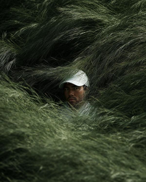
A “visual metaphor” is when an image represents a deeper, often abstract idea or evokes a feeling without direct statement. This representation of Oakmont’s deep, unrelenting rough isn’t just foliage; it’s a visual metaphor for the mental and physical gauntlet awaiting the world’s best golfers at the 2025 #USOpen. Buried within this challenge, every shot will feel like an escape.
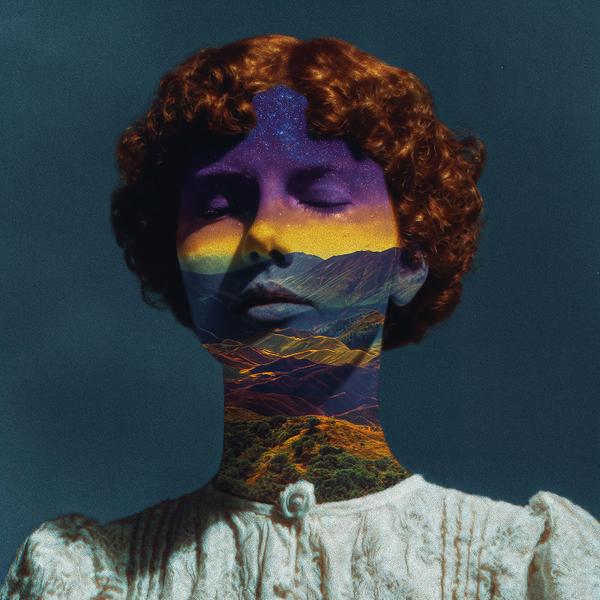
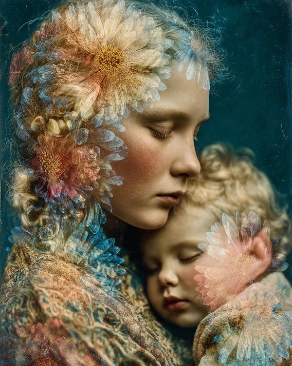
Ever wonder how artists create those dreamy images where one photo seems to blend into another? That’s the magic of double exposure. It’s a technique where two (or more) images are layered onto a single frame. Traditionally done by exposing film multiple times, in digital art, it’s achieved by blending separate photos or images. The beauty lies in the overlap – often, darker areas of one image reveal the lighter details of the other, creating a captivating visual fusion. Artists use double exposure to create surreal effects, tell symbolic stories, or explore ideas like identity and our connection to the world. It’s perfect for blending unexpected elements, creating a truly unique narrative. Today’s creation is an example of using this technique to merge the human form with nature, inviting you to see the universe within each of us.
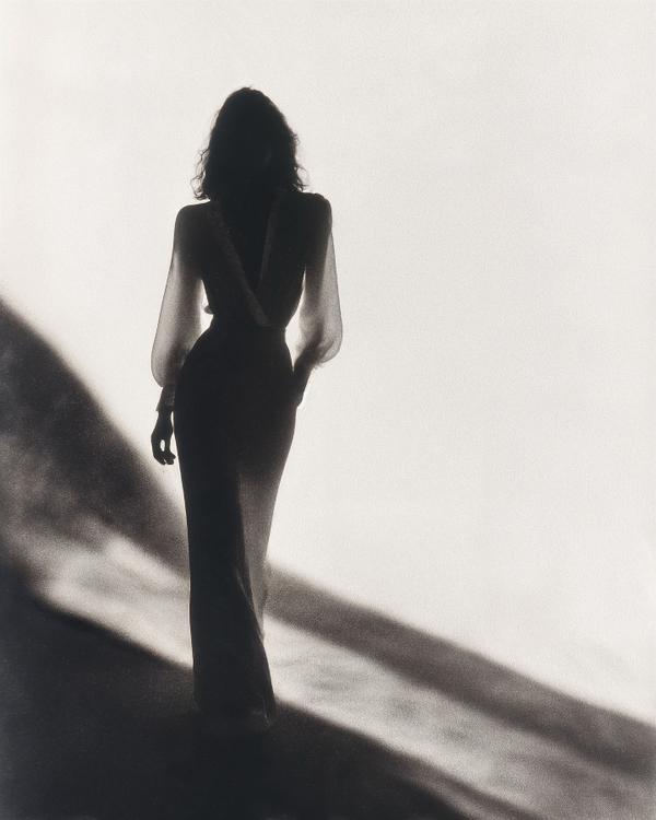
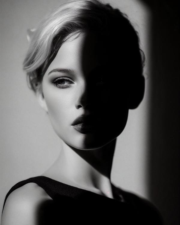
Sure, light gets all the credit, but shadows are the real storytellers. They add depth, stir up emotion, and bring that cinematic “something’s-about-to-happen” energy. Artists like Caravaggio made whole careers out of letting the darkness do the talking (hello, chiaroscuro).
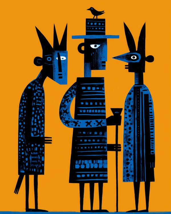
There’s a playfulness in the abstraction, like the figures know something we don’t. A secret handshake with the universe. A dance you weren’t quite invited to—but somehow found yourself joining anyway. Today, I’m letting that spirit lead: grounded in tradition, but with one foot lifted toward wonder.
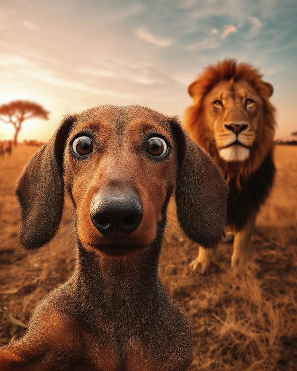
Meet my dog Max. Just your average dachshund, out for a casual stroll on the savannah (don’t ask how he got there). He whips out his phone for a quick selfie—because, of course, golden hour lighting is. But wait... Here’s where we talk foreshadowing—a storytelling device that hints at what’s to come, often before things go wildly (pun-intended) off-script. Like a lion. In the background. Foreshadowing sets the mood, builds tension, and makes readers shout “I KNEW IT!” when the plot twist hits. In this case, Max’s wide-eyed look might be the first sign that this story’s about to go off leash. So remember: Max = unsuspecting protagonist Lion = imminent plot twist Selfie = accidental Chekhov’s gun