The Fairest in the Garden
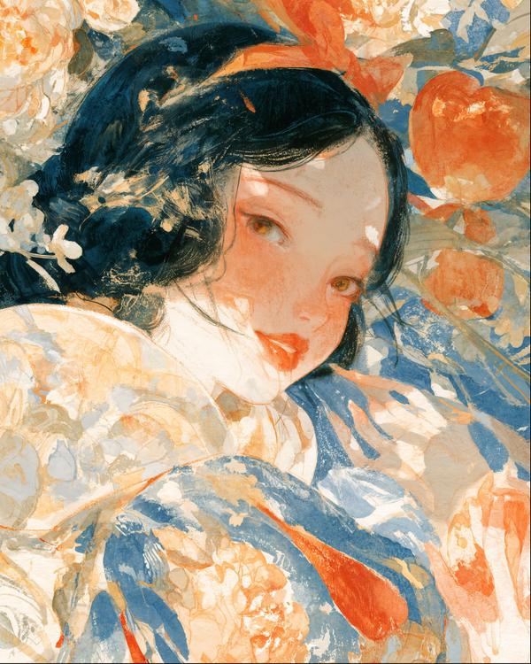
Snow White has traded the seven dwarfs for a Japanese garden, and frankly, it's a considerable upgrade.
Portraits that look back, and a few that refuse to.
Snow White has traded the seven dwarfs for a Japanese garden, and frankly, it's a considerable upgrade.
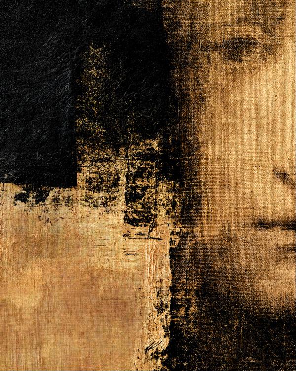
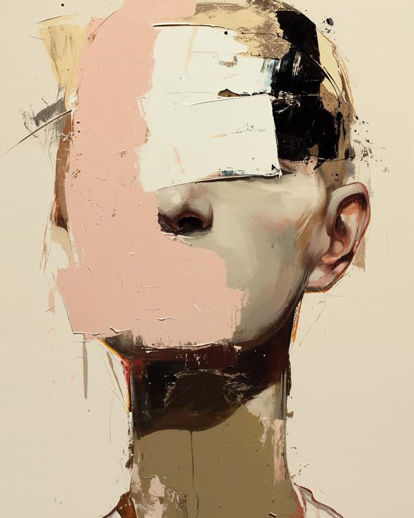
This face arrives the way a memory does—late, partial, and somehow in charge of the room.
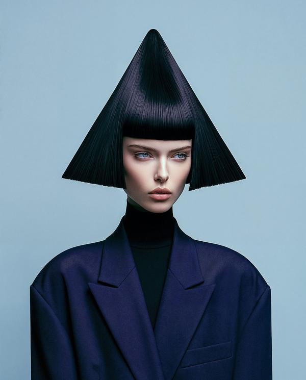
Her haircut has its own architectural plan.
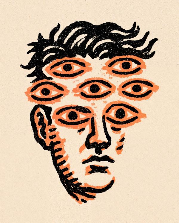
Some faces look back. This one seems to be running surveillance.
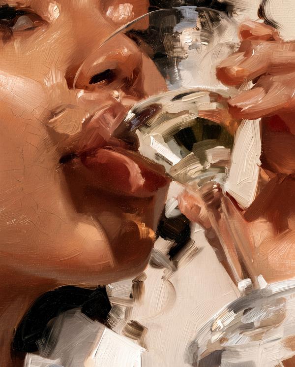
Someone ordered elegance and then drank it before it arrived.
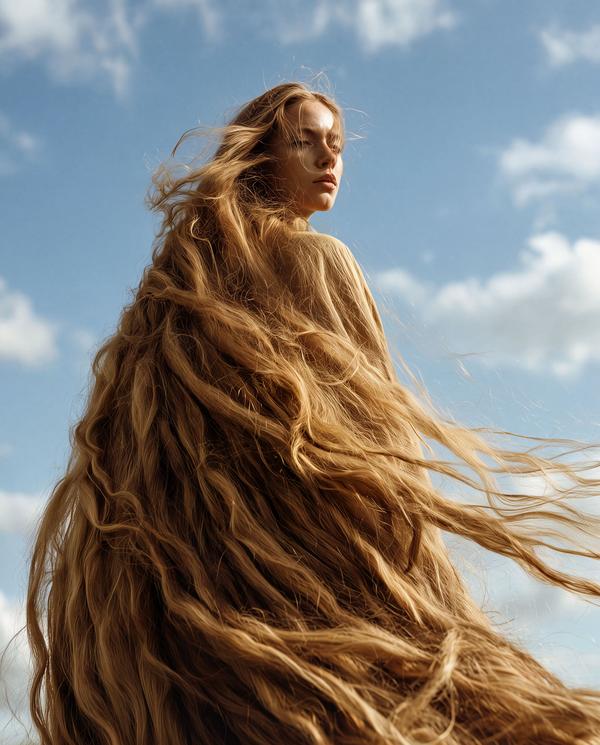
If the average person’s hair can add up to roughly 590 miles of growth over a lifetime, this image feels like it decided to wear all of it at once.
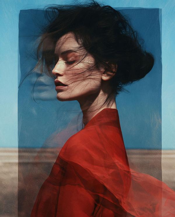
Some people carry emotional baggage. She brought a whole atmosphere.
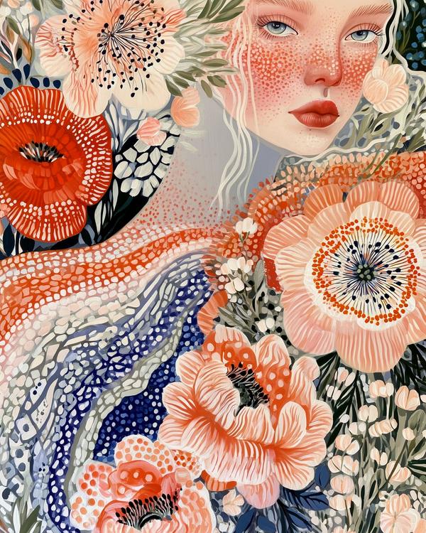
She looks like spring hired a very expensive costume designer.
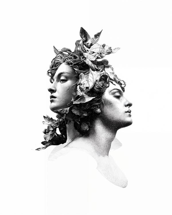
Looks like a Roman coin had a very glamorous midlife crisis.
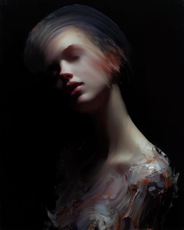
At first glance, it looks like beauty caught mid-meltdown—portraits of grace dissolving into motion.
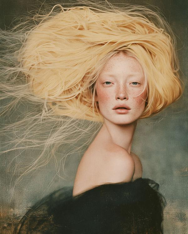
At first glance, she has fabulous hair. At second glance, dinner.
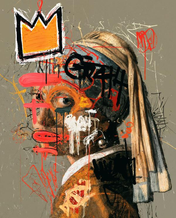
Vermeer’s quietest girl just discovered punk rock.
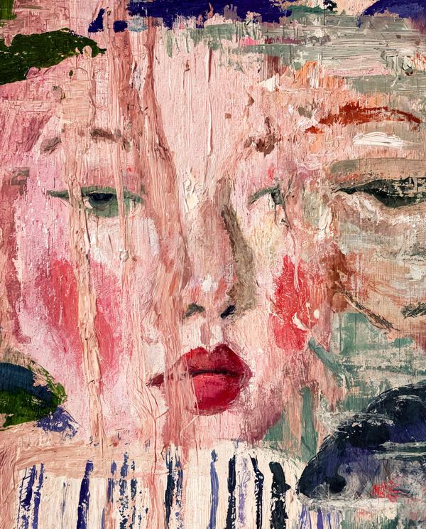
These sirens look like they’ve been crying beautifully for several centuries.
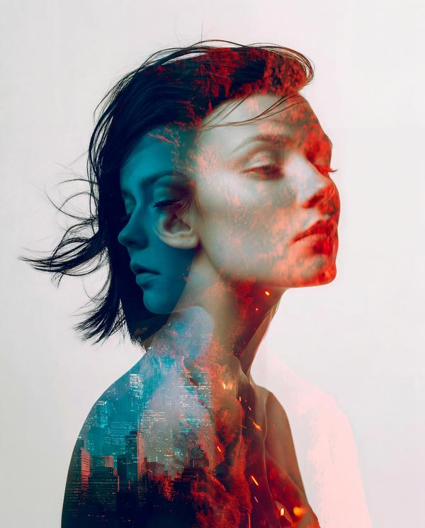
Some portraits look at you. This one is trying to remember your name.
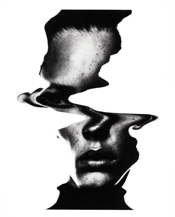
How much of a face can disappear before your brain gives up?
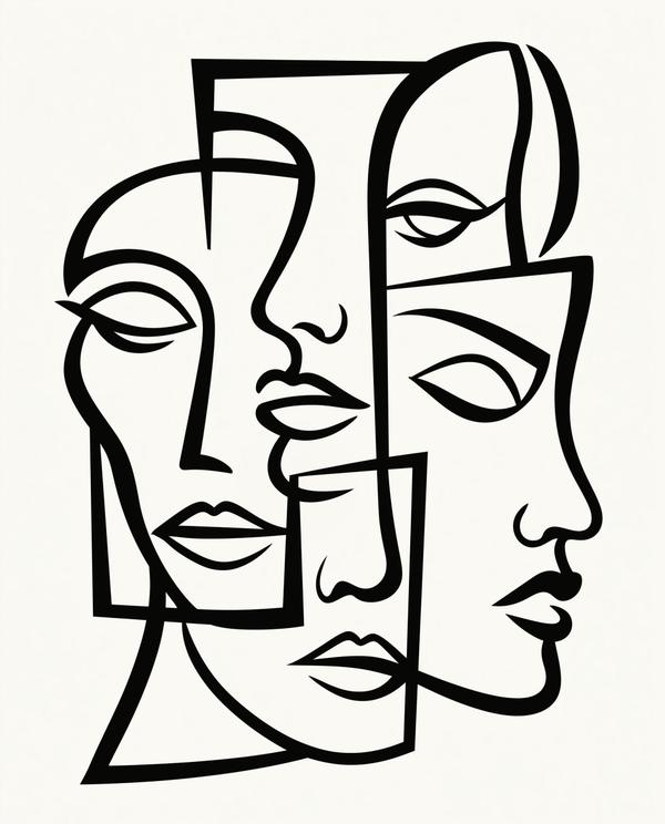
Four faces walked into a drawing. Nobody agreed where to sit.
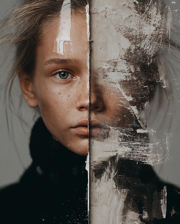
She looks like a portrait caught halfway between being painted and being erased.
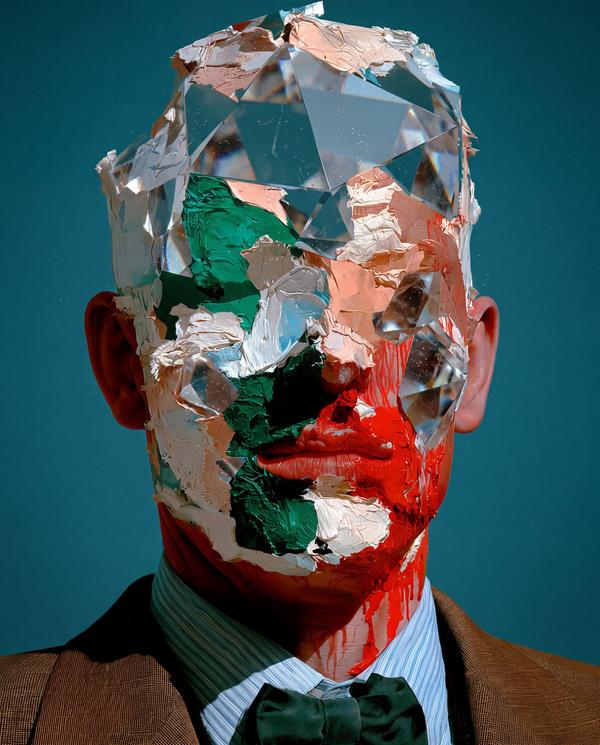
This looks like a CEO who got dressed for the board meeting and then walked straight through a prism.
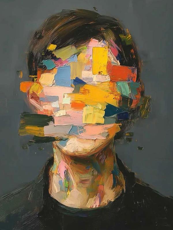
This portrait looks like it tried to remember its own password and gave up halfway through.
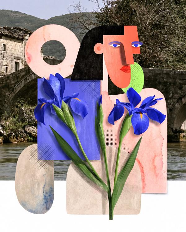
This image looks like a travel poster, a flower shop, and a Picasso portrait all got seated together at a very stylish Italian lunch.
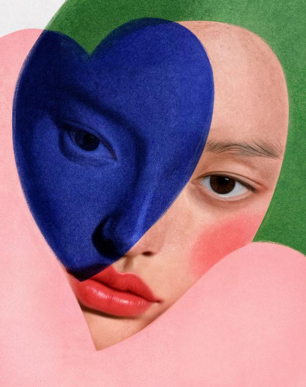
This looks like Cupid got a design degree and a slight identity crisis.
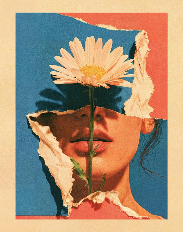
Nothing says “emotionally available” like replacing your eyes with a daisy.
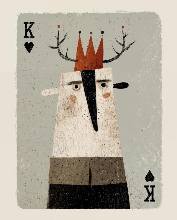
Every dad deserves a crown, even if it came from the junk drawer.
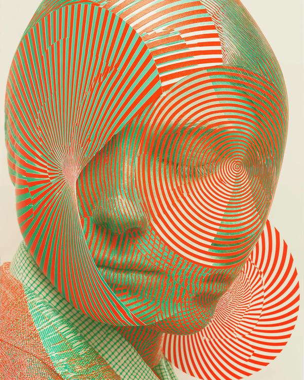
This portrait looks like it came with a warning label and a mild headache.
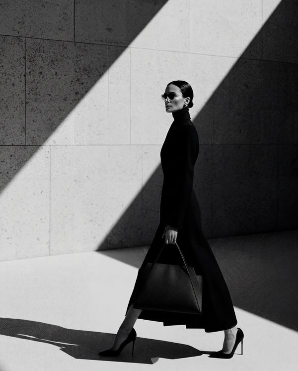
This woman looks like she schedules shadows.
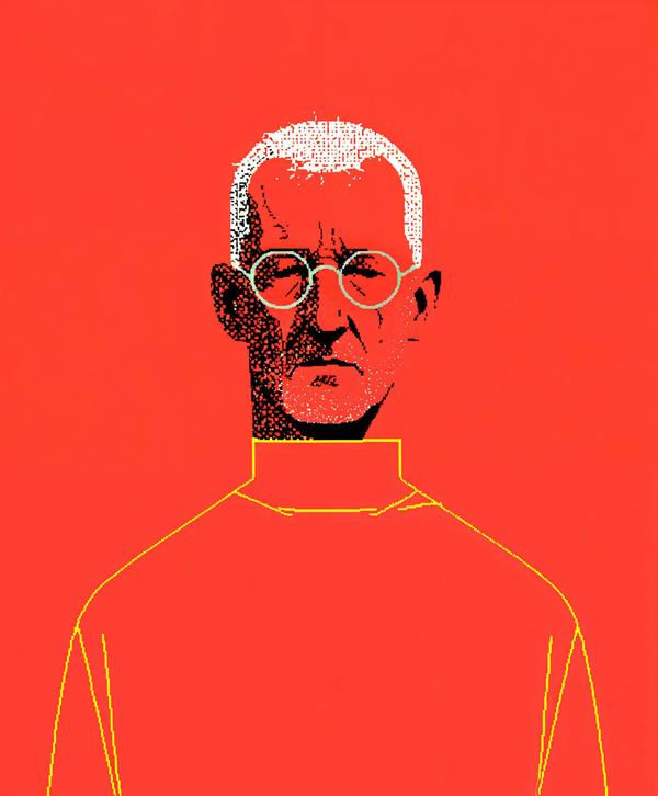
This man looks like he just read your group text and quietly lost faith in civilization.
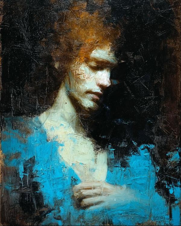
This guy looks like he just remembered every password he ever forgot.
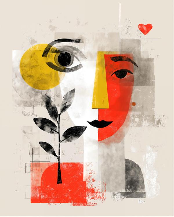
Moms see everything, which explains the giant eye.
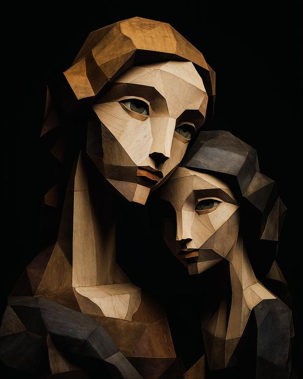
Two tilted faces. Four green eyes. Enough carved angles to make a Renaissance painter ask for a helmet.
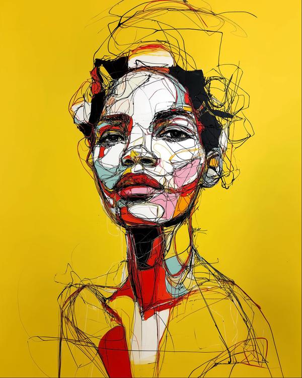
A canary-yellow background. A face built from looping black lines. Lips like a red dare.
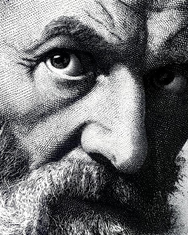
Like if wisdom itself got etched into a face and still wasn’t fully buying your argument.
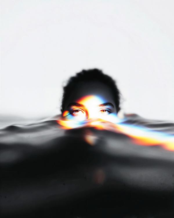
Like if a calm portrait and a private panic attack agreed to share the same pool.
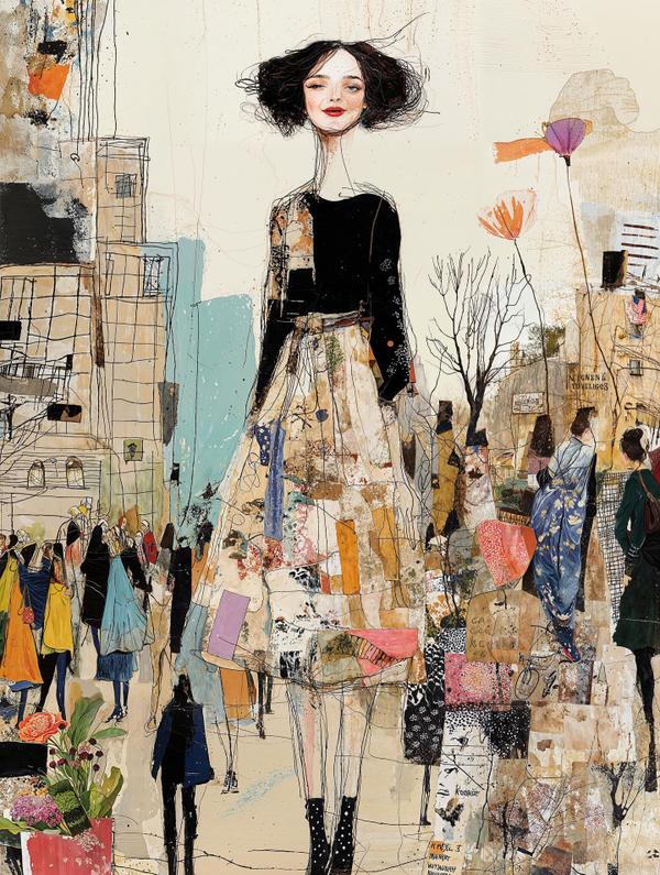
Like if Egon Schiele crashed a fashion editorial, wandered through a flea market, and somehow pulled the whole thing off.
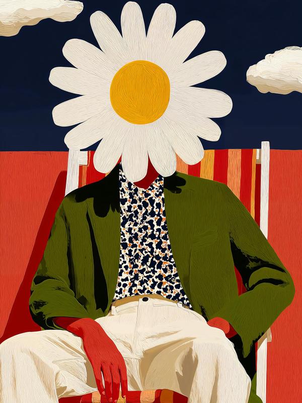
Like if a daisy somehow became the most interesting person at the party.
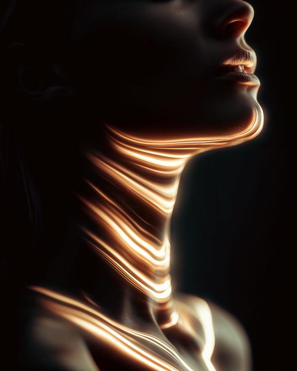
Like if elegance got struck by lightning and decided to enjoy it.
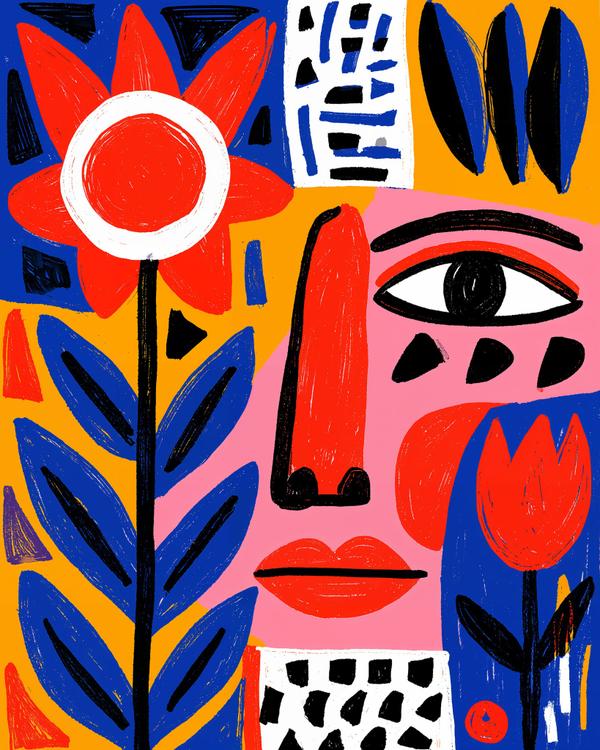
She has one eye, one enormous flower beside her, and absolutely no interest in explaining either.
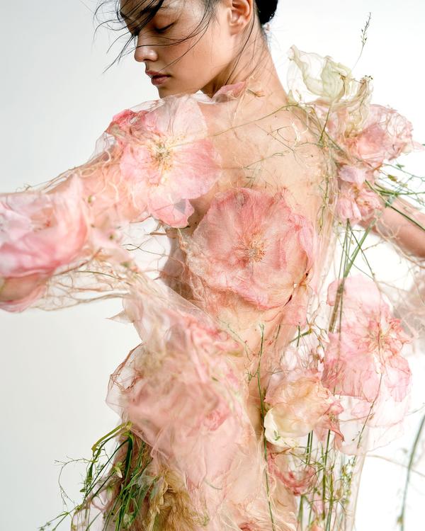
She looks like someone caught spring halfway through becoming a dress.
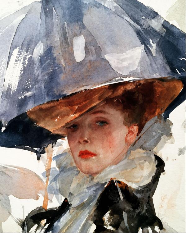
He didn’t paint every ray of light. He saved it a seat.
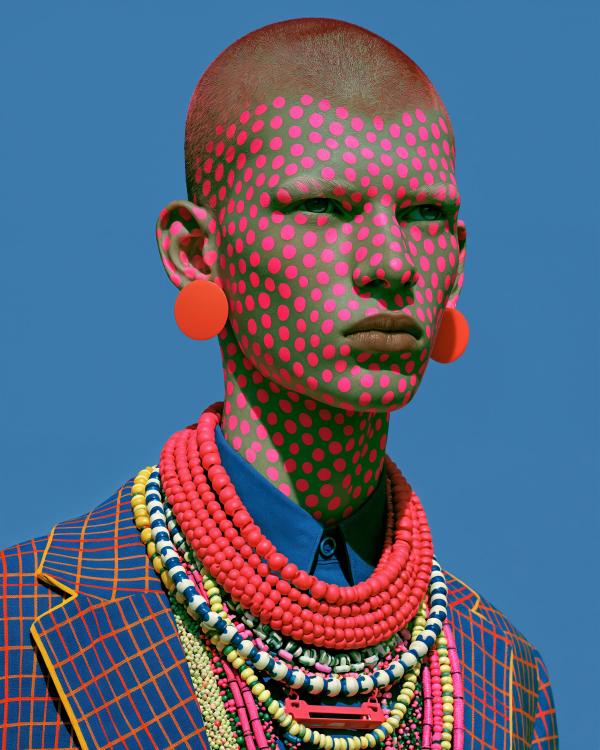
This looks like Yayoi Kusama crashed a fashion editorial and left the room brighter.
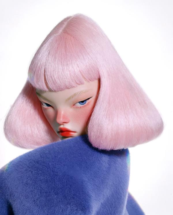
She looks like she just walked out of a dream, canceled everyone’s nonsense, and brought her own weather.
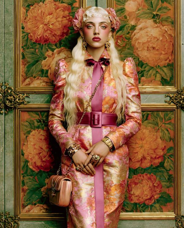
She looks like she arrived at breakfast dressed for a diplomatic summit between flowers.
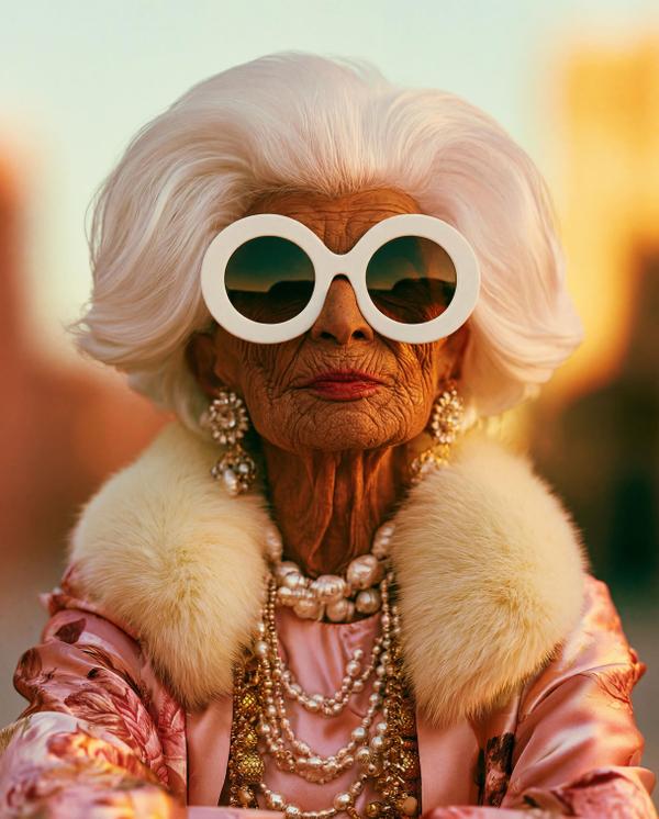
She didn’t age out of style. Style aged up to meet her.
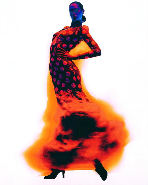
If posture were a weapon, we’d all be in trouble.
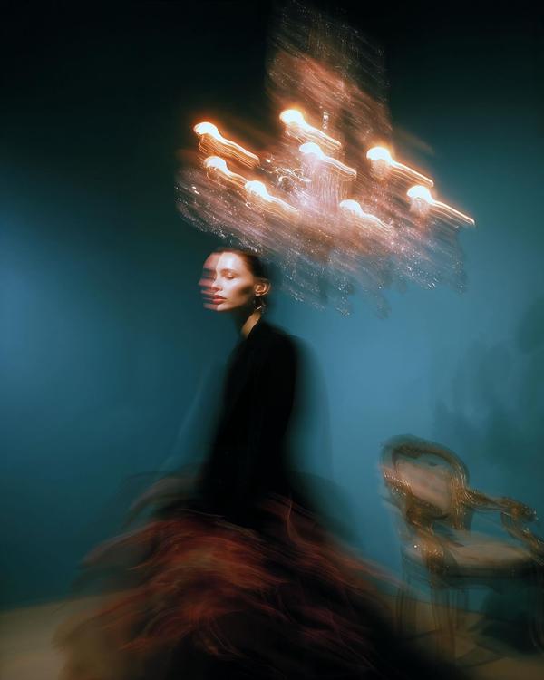
Like if elegance had a panic attack. In a good way.
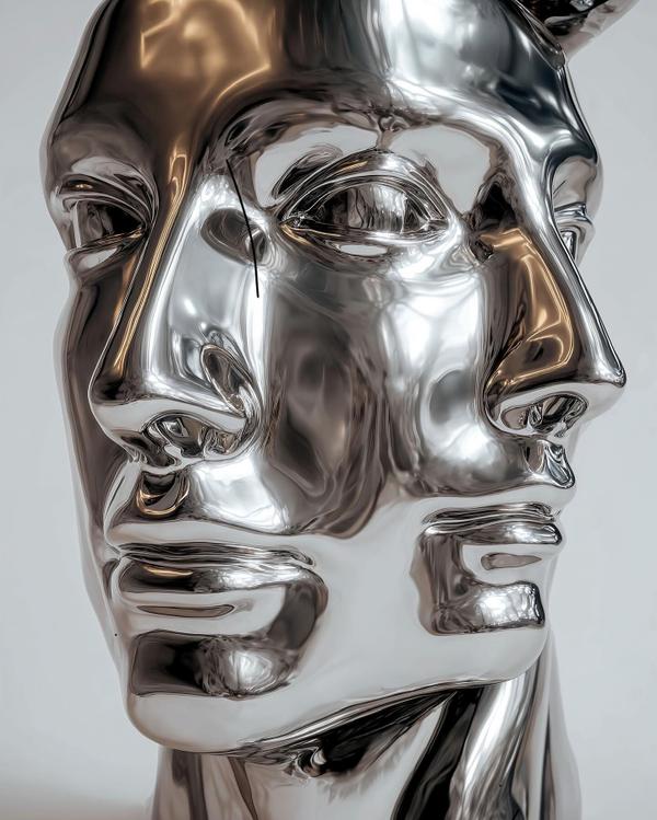
Like if a Greek bust had a nervous breakdown inside a luxury car showroom.
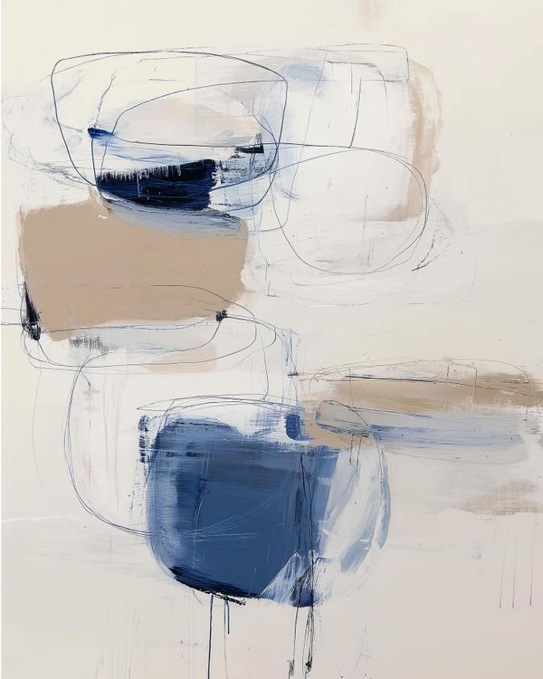
Like a cocktail napkin sketch went to therapy and came back emotionally available.
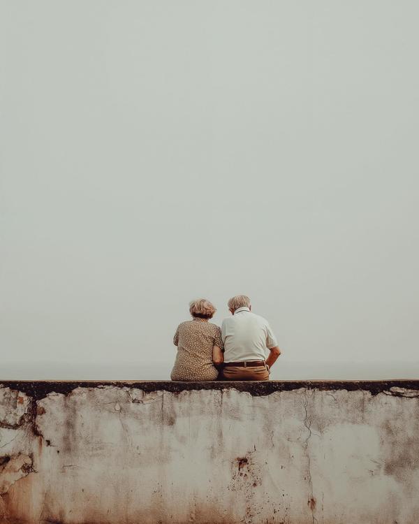
Like a love story directed by silence and edited by time.
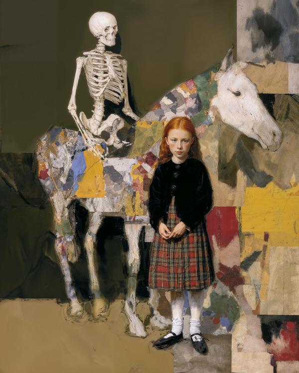
Like if a Victorian portrait got ghosted by reality and decided to make that everyone else’s issue.
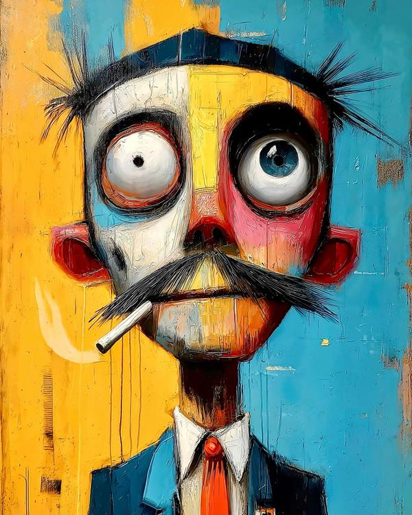
This guy looks like he just remembered he left the oven on in 1987.
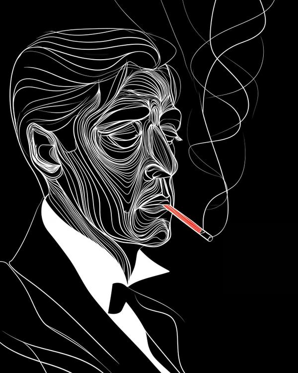
Ever watch someone become a legend in slow motion?
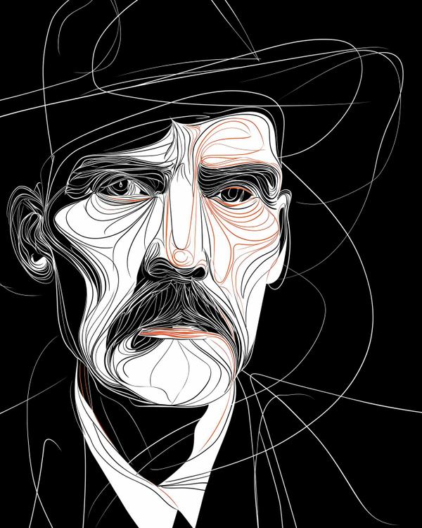
If a face could deliver a monologue with one raised eyebrow, it’d be this one.
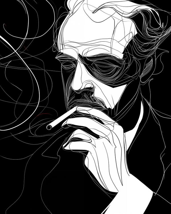
Black void. White wireframe swagger. A halo of smoke doing figure eights like it’s auditioning for its own close-up.

Quick note before anyone spikes their phone: this isn’t a team jersey. Left, right, center—doesn’t matter. Truth is missing more than ever, and what’s worse? The absence is getting normalized. Like we’re all supposed to nod politely while reality gets workshopped.
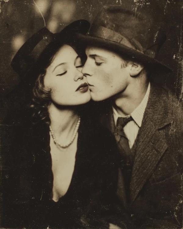
That warm sepia haze. The pearl strand catching just enough glow to feel like a whisper. The soft brim of his hat tilting in like it’s in on the secret. A kiss so close it’s practically a signature.
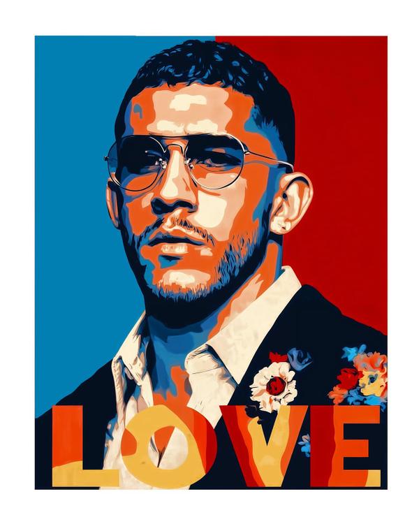
Blue on one side. Red on the other. And the word LOVE planted at the bottom like a stake in the ground.
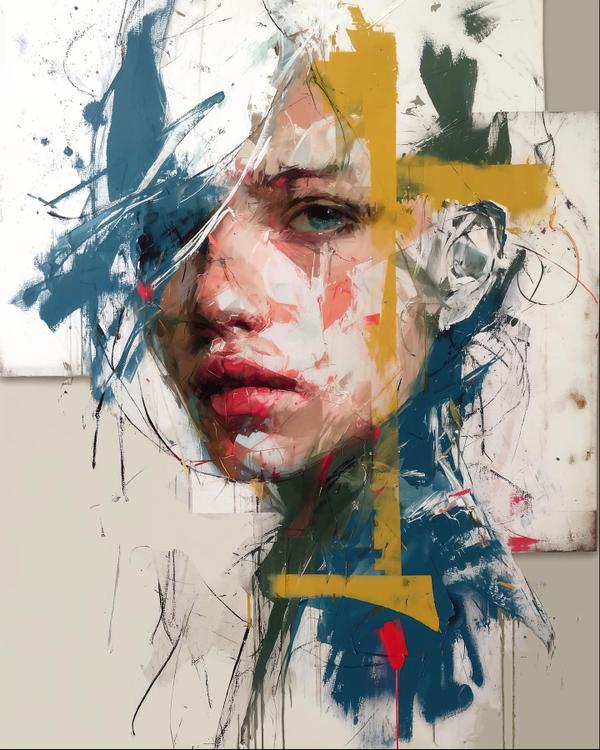
Teal bruises of paint. A mustard-yellow cross slicing the face like tape on a crime scene. And those hot little red drips—like the canvas couldn’t keep the secret in.
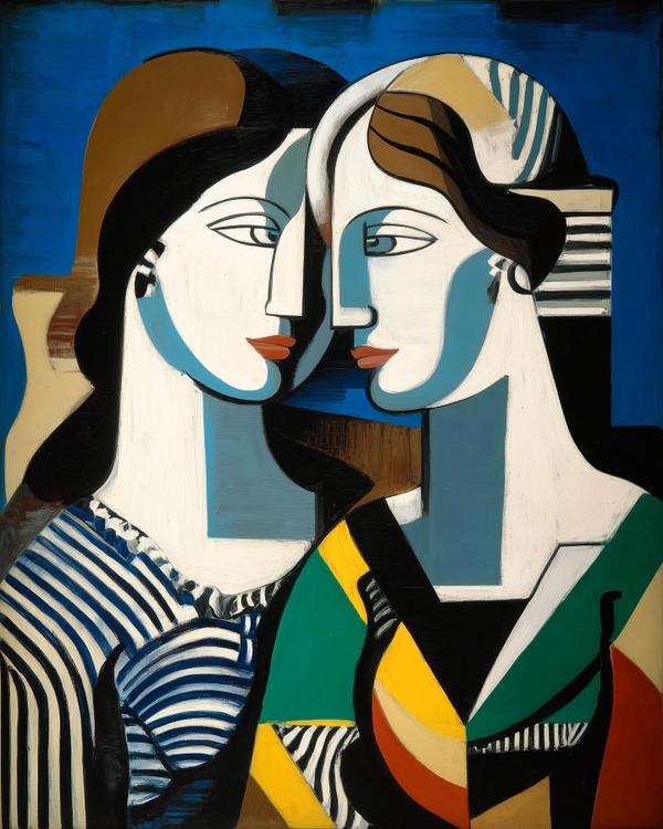
A cobalt-blue backdrop that hums like late-night jazz. Two sculpted profiles pressed so close the air between them feels borrowed. And those clean color blocks—teal cheek, rust lip, a slash of yellow—like emotion reduced to geometry.
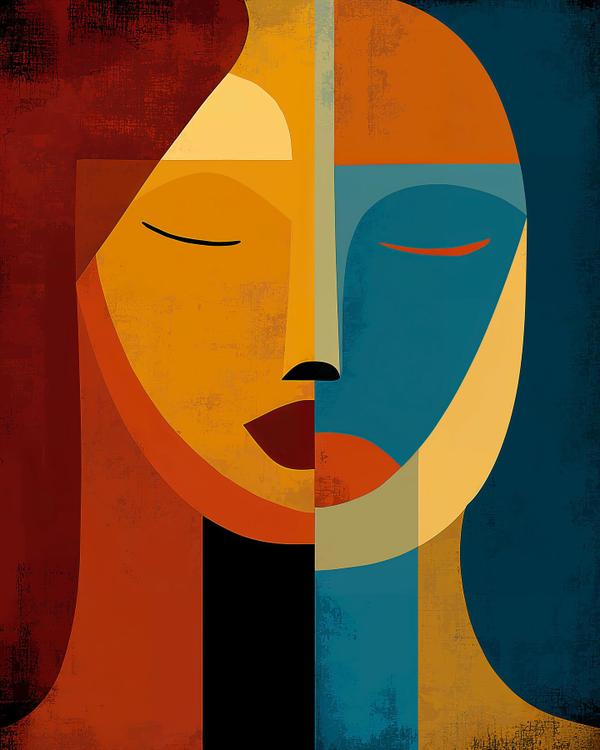
A face sliced clean down the middle. Burnt orange and honey on one side, deep teal and midnight blue on the other. Two eyelids reduced to calm little brush-strokes, like someone hit “mute” on emotion.
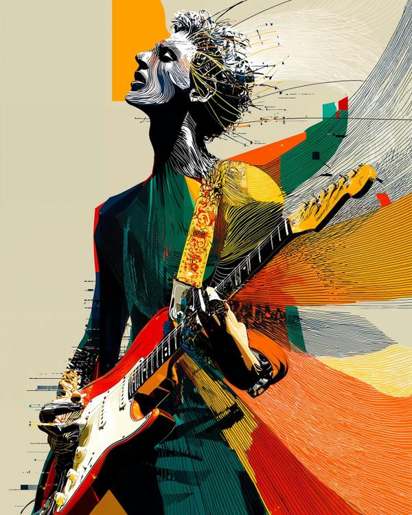
That screaming orange backdrop. The red-and-white guitar slashing across the frame. And those fine, windblown lines whipping off his hair like the music has its own weather.
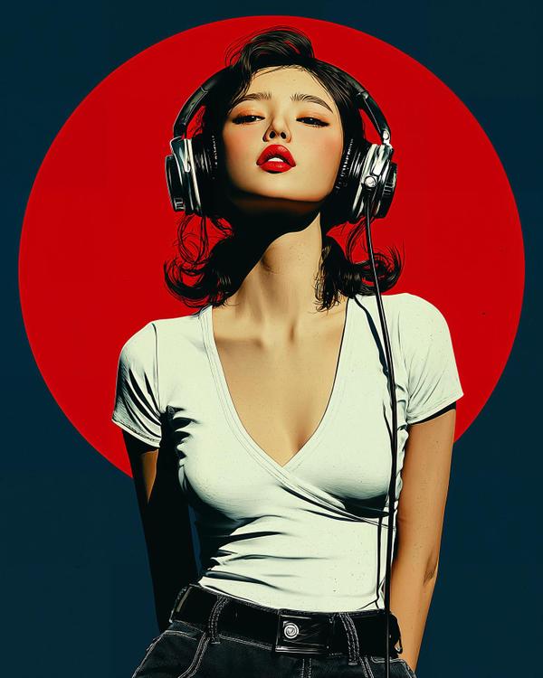
A lipstick-red bullseye behind her head. Chrome headphones catching the light like jewelry. And that soft white tee, almost glowing against a midnight-blue field.
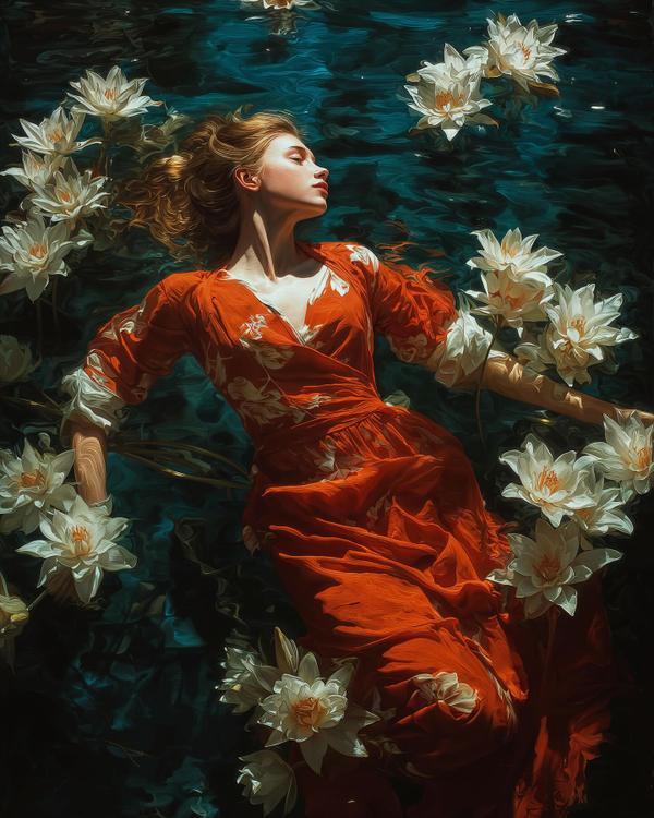
A flame-red dress rippling like spilled ink. White lilies popping like little spotlights. And that deep teal water, thick with brushstrokes, almost velvet.
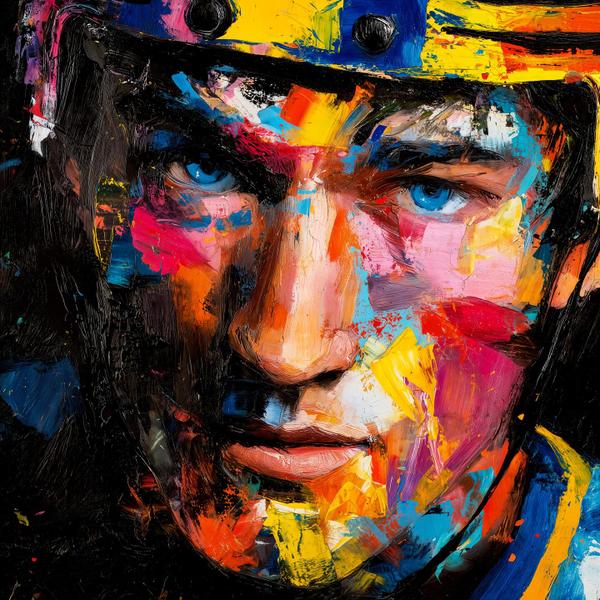
You can’t paint Sid (an earlier post) without honoring Mario.
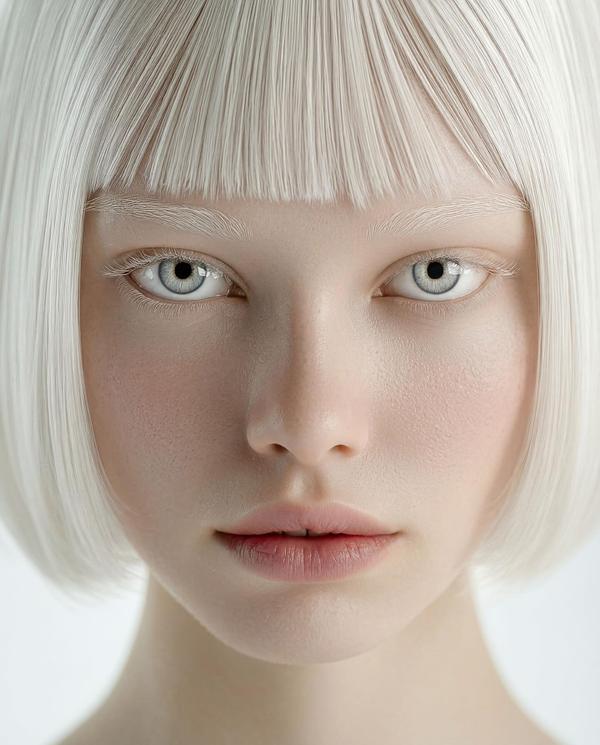
Platinum bangs cut like fresh snow. Ice-gray eyes that don’t blink first. And a blush so faint it feels like the room is cold, not her.
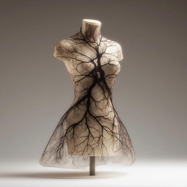
Ivory torso. Smoke-gray background. Black branches crawling over the body like veins that decided to become a forest.
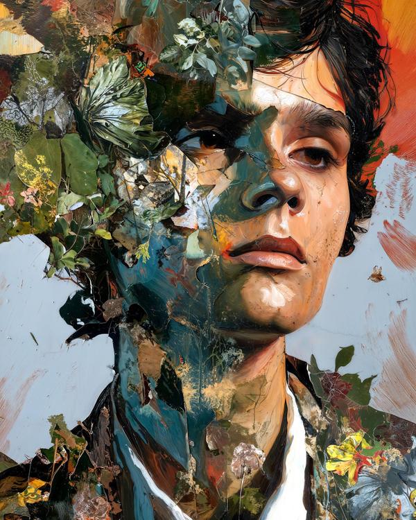
A half-face swallowed by leaves. Teal-blue shadows pooling on the cheek. And a gaze that’s calm… but absolutely not letting you off the hook.
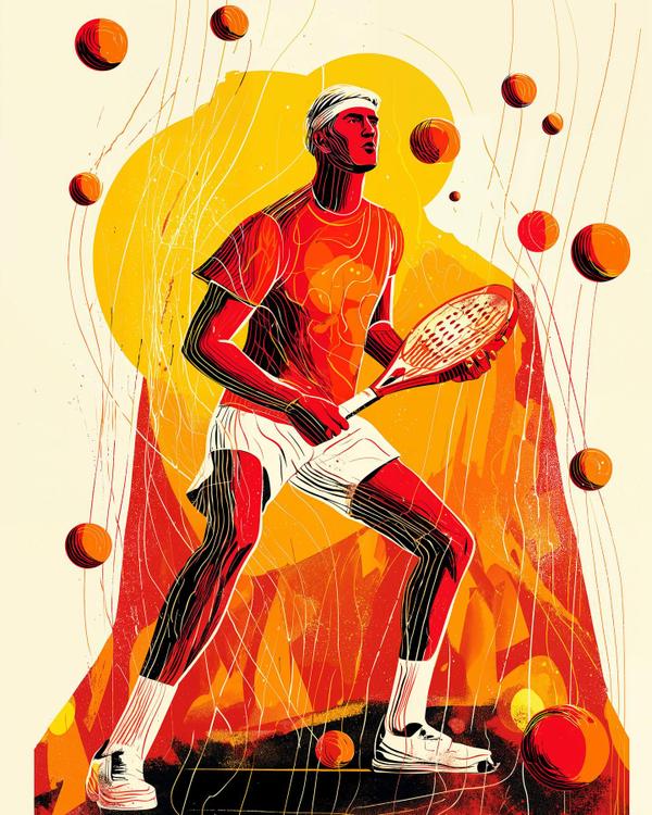
A flame-red player mid-ready stance. A molten yellow halo behind his head. And padel balls raining down like tiny suns that missed their orbit.
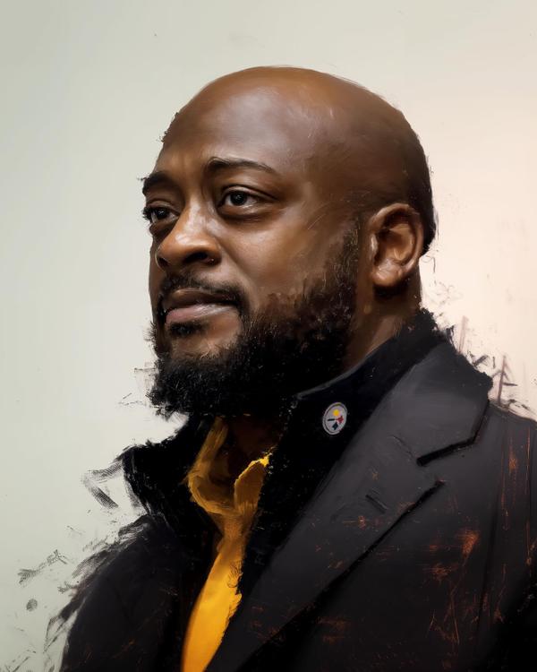
Soft ivory background. A calm three-quarter gaze. That Steelers crest catching the light like a tiny medal on a storm-dark collar.
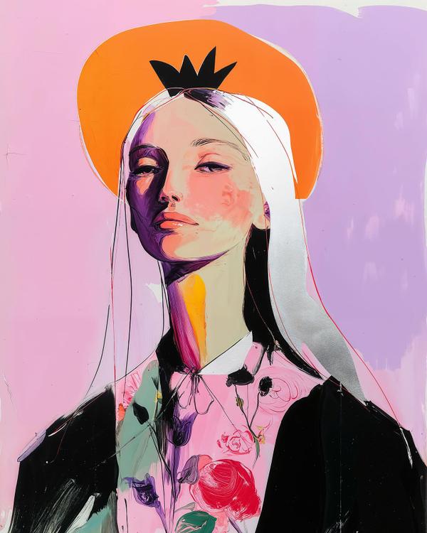
Orange disk blazing behind her head. A black crown shape like a comic-book exclamation point. One side of her face dipped in bruised violet shadow.
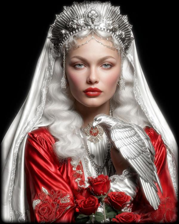
(A reinterpretation of yesterday’s concept) Silver crown. Blood-red satin. A falcon so metallic it looks forged, not feathered.
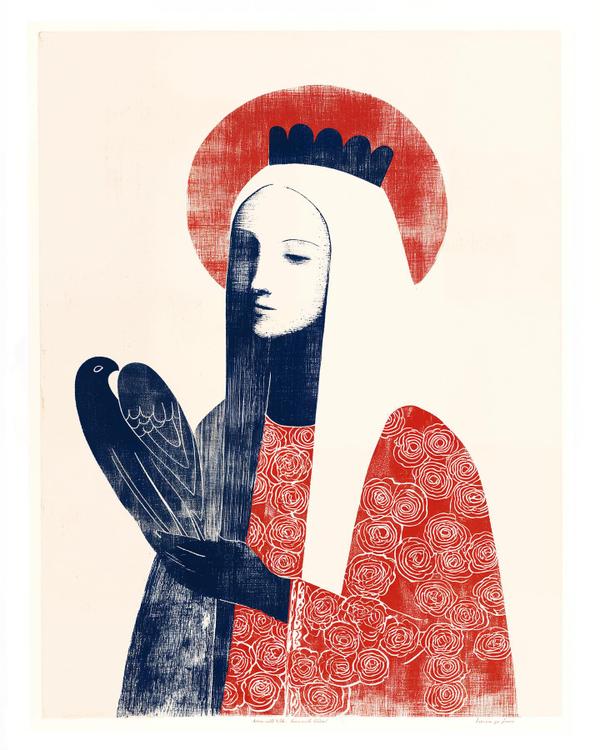
Brick-red halo like a sunburned coin. A curtain of snow-white hair. That inky bird wing, scratched with little carved feather-lines.
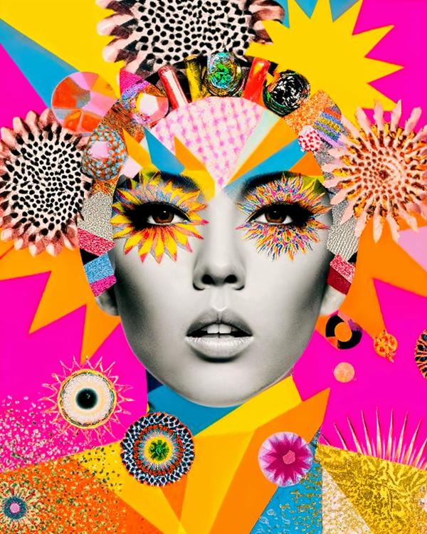
Hot-pink background. A grayscale face, dead center. Firework eye makeup bursting in yellow and rainbow petals.
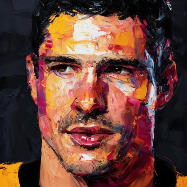
Knife-thick oranges and hot pinks stacked like chipped ice. A black midnight background that makes the face glow. That stare, half calm, half challenge. Twist: this portrait is built from layers, and so is the moment.
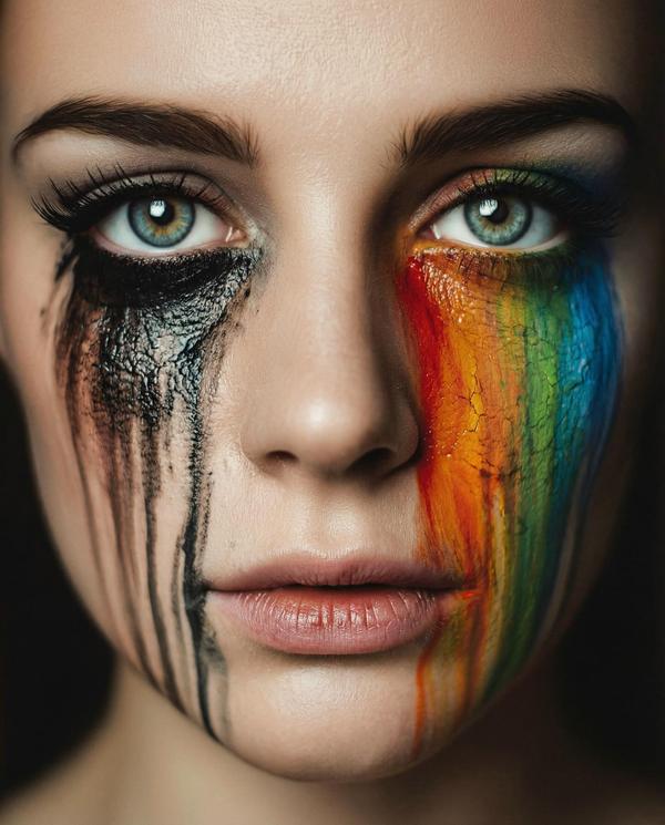
Ice-blue eyes locked dead center. Tar-black mascara cracked and crawling down one cheek. A rainbow of dried paint melting on the other like spilled candy lacquer. The twist is simple: this face is throwing a party and a funeral at the exact same time.
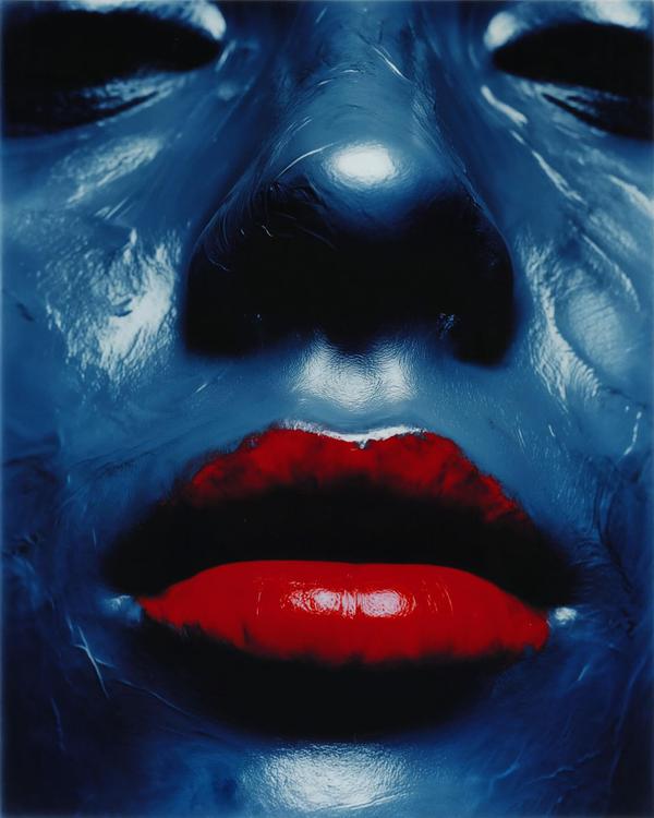
Cobalt skin that looks wet, like fresh paint. Eyes swallowed into black shadows. Lips so glossy cherry-red they could sign autographs.
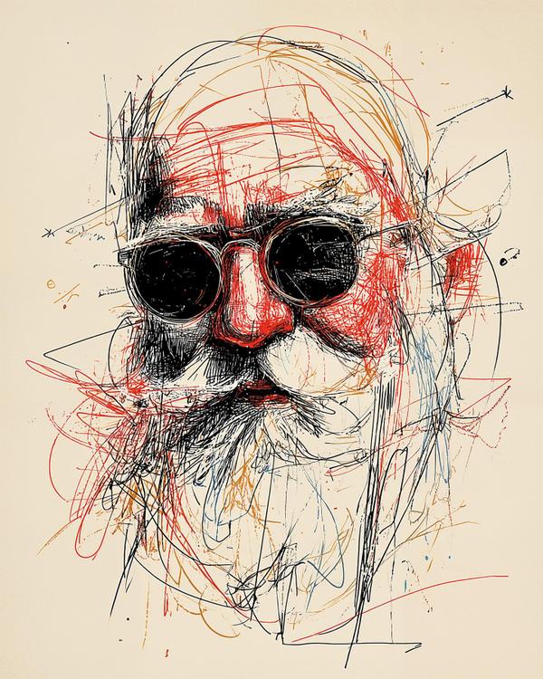
Oversized black goggles. A cherry-red nose that’s basically a stop sign. Wild scribble lines in red, blue, and ink-black, like the page caught a snowball to the face. The twist? This Santa looks less “milk and cookies” and more “I DJ the North Pole after-hours.”
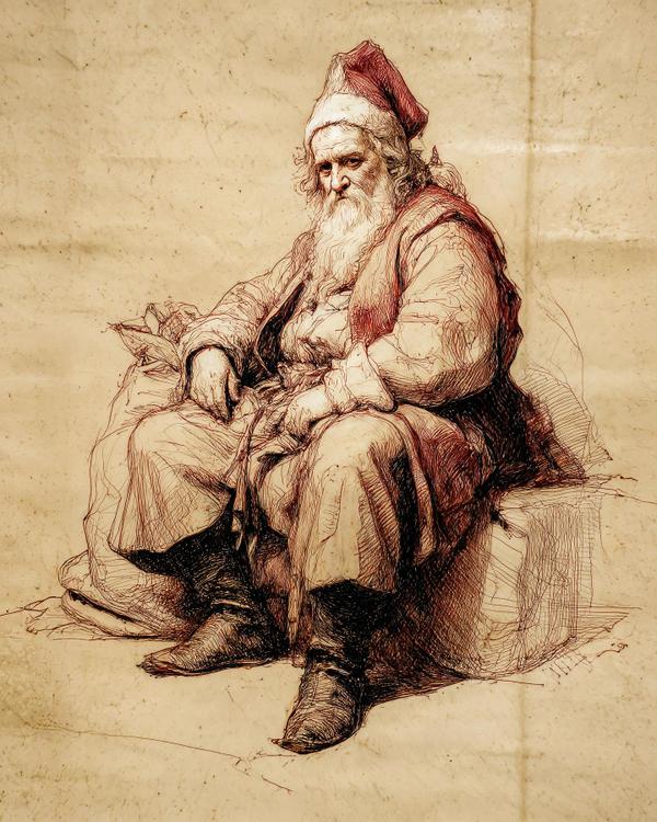
Rust-brown ink lines. A slumped red cap. Boots planted like they’ve carried a whole century.
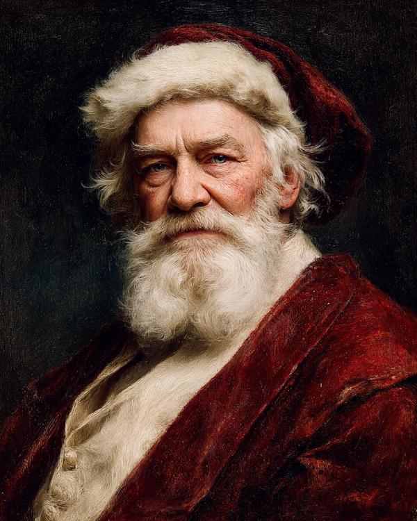
Crushed-velvet red brushing into darkness. A beard painted in chunky, confident strokes. Ice-blue eyes catching a single, bossy highlight.
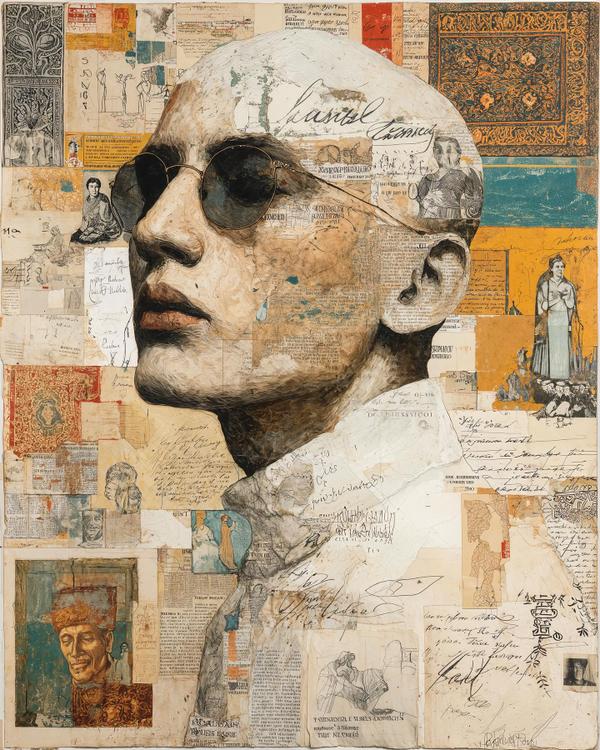
A friend of mine just got back from Cambodia—wide-eyed, and talking about temples, carvings, color, and history like it’s a playlist. That kind of trip doesn’t stay in your camera roll. It follows you home. This piece is my little aftershock of that inspiration.
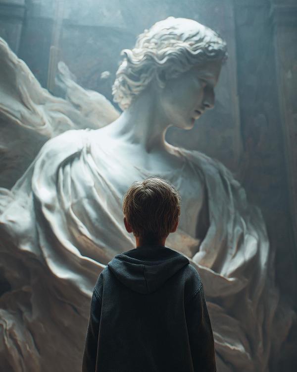
Ever stare at a statue so powerful you half expect it to blink first? This kid looks like he just met divinity—and she’s carved out of silence.
You know that feeling when your brain is exhausted but your chest is lit?
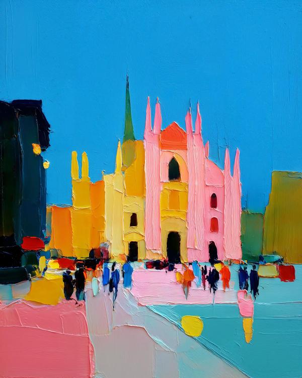
The Duomo di Milano just showed up wearing pink… and somehow it’s pulling it off.
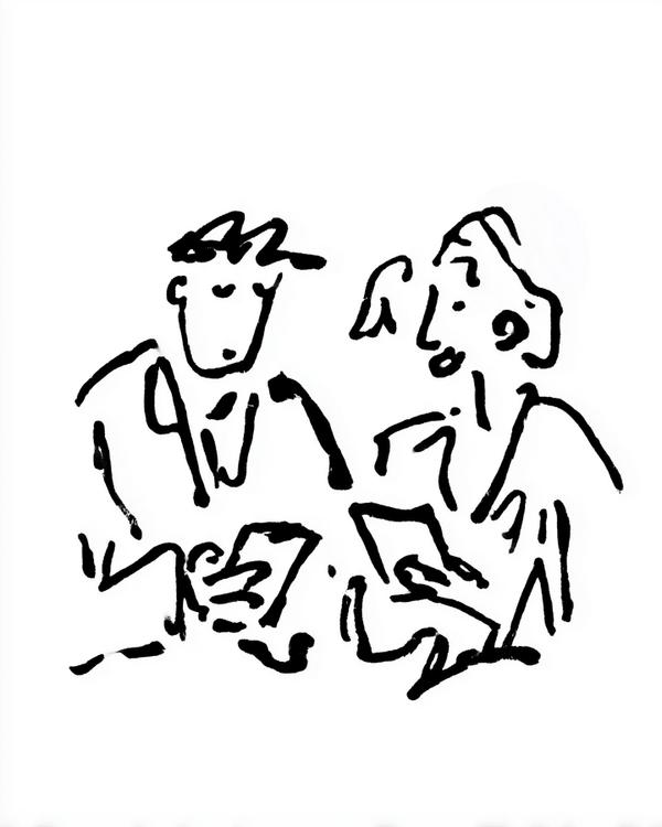
Nothing says romance like sitting shoulder-to-shoulder… both scrolling like it’s a competitive sport.
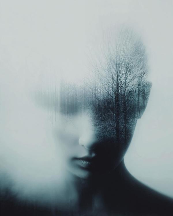
A face fades in and out of the mist here, like it’s thinking about showing up to life but hasn’t fully committed. The features are soft, almost airbrushed away, while a line of bare winter trees slices straight through the skull. Thoughts as branches, memories as twigs, worries as fog. Cozy, right?
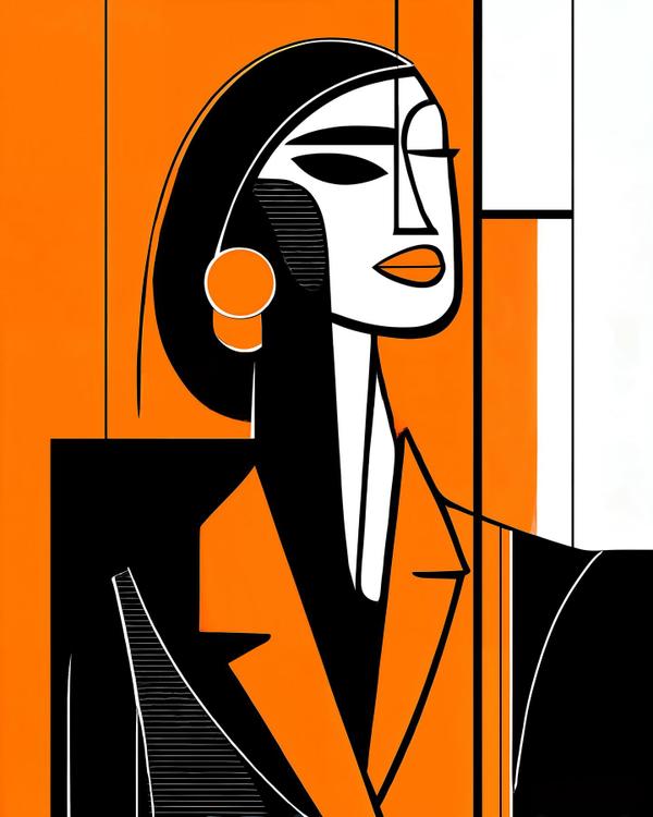
Tell me you run the room without telling me you run the room.
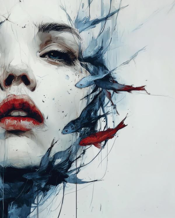
A half-submerged face, all porcelain light and cracked quiet, with a small storm of fish slipping across her jawline. Two of them go full diva in red, echoing those smudged, movie-star lips. The rest stay cool in inky blues, like they know something we don’t.
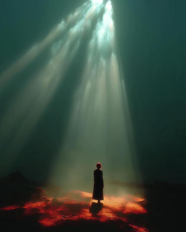
Ever had a spotlight so dramatic it feels like the universe yelled, “Step here, we need to talk”? That’s this moment. One figure, one glowing island of red, and a sky pouring down light like it’s late to its own performance.
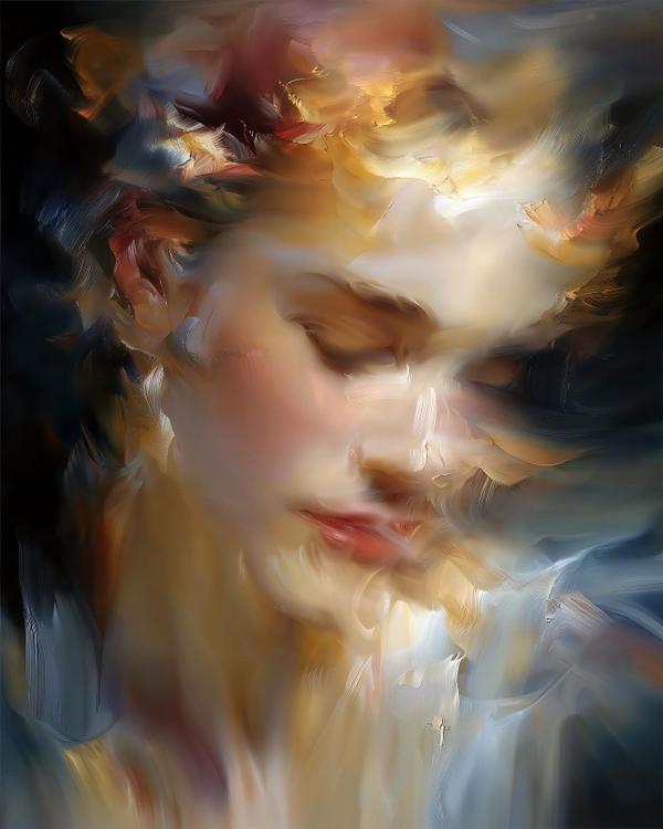
It’s like someone hit pause on a feeling, not a face.
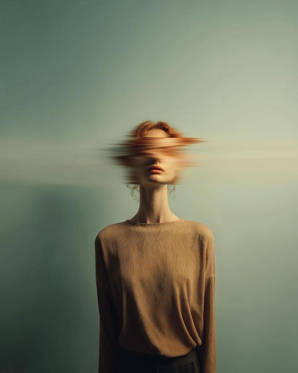
Ever have one of those days where your thoughts are buffering but your face has to pretend everything’s fine? Yeah. That’s today’s piece.
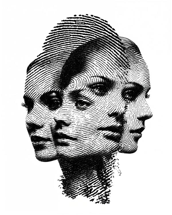
Three faces, one fingerprint — like your mind trying to pick a profile picture.
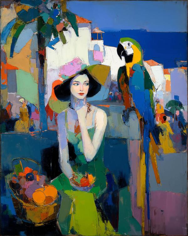
Some paintings whisper. This one samba-dances.
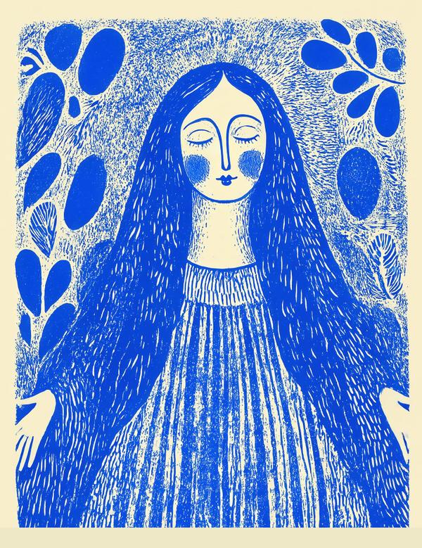
Ever feel like your brain’s a browser with 42 tabs open, and this woman is the one who finally found the “Close All” button?
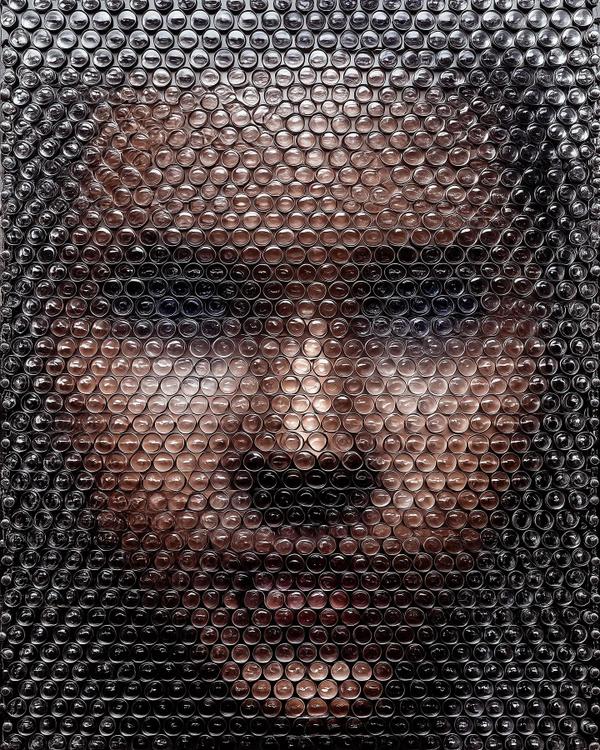
A face pressed under bubble wrap—half selfie, half shipping label. From two feet away it reads as a moody portrait; step closer and the skin tones dissolve into hundreds of glossy domes catching light like a field of tiny moons. It’s pointillism for the Amazon era.
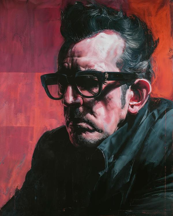
Here we get Costello not as the wiry, witty crooner of Allison or Pump It Up, but as a mythic figure carved in oil and shadow. The slicked-back pompadour and black-frame glasses are pure iconography—like Superman’s cape, but for punk-meets-new-wave. Visually, it’s channeling Caravaggio’s chiaroscuro drama, Francis Bacon’s psychological edge, and a touch of Lucian Freud’s raw, fleshy honesty. The light slices his brow like a stage spotlight while the background burns crimson, as if the room itself can’t handle his voltage. This is less portrait, more sermon—painted in pigment, not notes. Concept to know: Chiaroscuro. It’s the art-world word for weaponized light and shadow, pioneered by Caravaggio to make saints look like mobsters. Here, it transforms a singer into something more—half prophet, half prizefighter. Fun fact worth dropping at a bar: Elvis Costello’s real name is Declan Patrick MacManus. He once said he chose “Costello” (his mother’s maiden name) partly because it looked better on a marquee. Branding, kids—it matters. So what’s this painting telling us? That Elvis Costello isn’t just a musician—he’s a mood, a menace, a chiaroscuro lesson wrapped in guitar strings and attitude.
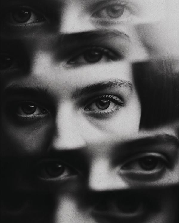
Ever feel like the universe is watching you… but stylishly? This hypnotic study in repetition turns the human gaze into a design element — equal parts magnetic and unsettling, like if Escher tried photography after a sleepless night. The overlapping eyes pull you into a hall of mirrors where identity dissolves and perception multiplies. It’s not one person watching — it’s everyone and no one at once. Artistically, this lands somewhere between Surrealism and Psychological Minimalism — think Man Ray’s experimental portraits meets René Magritte’s eerie self-reflections. The precision of the crop (no brows, no context, just pupils) turns intimacy into abstraction. By stripping away facial features, the artist forces us to stare at the very mechanism of seeing — a visual feedback loop where the viewer becomes the viewed. In black and white, every tonal shift counts. That contrast? It’s pure chiaroscuro drama — Caravaggio would’ve nodded in approval before wondering how you even took this photo. Fun fact: Eyes are the only part of the human body that never grow in size — the same eyes you had as a baby are staring back at you right now. Which means… you’ve been perfecting that “judgmental side-eye” since birth. So yes, art can stare back. Just don’t blink first — it’s probably grading your aura.
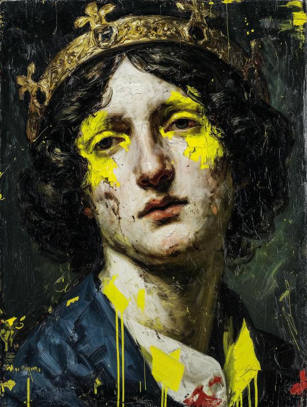
You ever spill mustard on your shirt five minutes before a big meeting? This painting is that… but with a crown.
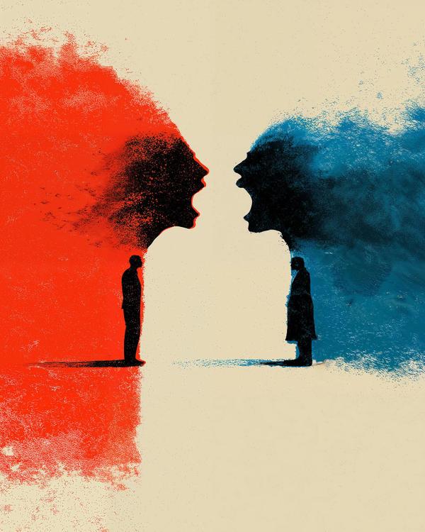
Ever notice how the internet sometimes feels like a shouting match between colors? Red yells, blue yells louder, and somewhere in the middle stand two tiny humans wondering if they’re even in the same conversation.
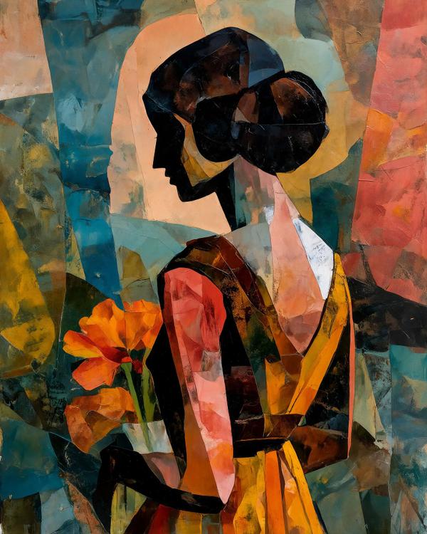
This piece takes the classic elegance of a woman holding flowers and runs it through a Cubist blender. Notice how her profile is pure silhouette—black, sharp, and timeless—while her dress and surroundings splinter into angled shards of orange, teal, and ochre. It’s like someone pressed pause on a stained-glass window mid-explosion and decided, “Yep, that’s art.” The heavy influence here? Cubism, again courtesy of Picasso and Braque, but softened with a romantic twist. Where many Cubist works focused on bottles and guitars, this leans toward the human form—closer to Juan Gris, who often gave Cubism more clarity and warmth. You could also trace a line back to Modigliani’s elongated figures, though here the elongation is replaced by geometry, as if the sitter herself became part of the architecture. Here’s the fun paradox: even though her face is flat black, the image feels more alive. Why? Because Cubism isn’t about illusionistic depth—it’s about truth in fragments. It tells us: people aren’t just one angle, one glance, one photo. We’re a collage of shifting perspectives—memories, moods, and light bouncing off us all at once. Fun fact: Picasso’s portraits were once described as “like looking at a woman through a broken mirror.” What was once seen as brutal distortion is now considered radical honesty. So next time someone says this doesn’t “look real,” you can tell them: reality is overrated—sometimes the truest picture is the fractured one.
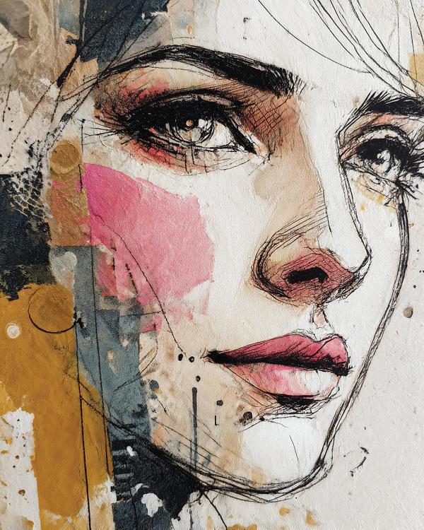
This piece lives in the in-between: half precise draftsmanship, half abstract graffiti spill. Think Egon Schiele’s raw linework meets Jenny Saville’s fearless flesh tones, with a splash of street-art swagger à la Banksy’s paint drips. The eye is meticulously hatched like an old master engraving, but the cheek blush looks like the artist just flung a pink cocktail against the canvas and said, “Yeah, that’ll do.” Spoiler: it more than does. Art Lesson in Disguise: This mash-up of control and chaos is a hallmark of contemporary mixed-media portraiture. The tight ink sketch gives you structure, while the watercolor splatters keep it alive, breathing, unpredictable. It’s the visual equivalent of jazz: you’ve got the sheet music, but the soloist is making it up as they go. Fun fact: In Japanese aesthetics, there’s a concept called wabi-sabi—the beauty of imperfection and impermanence. Those drips, smudges, and “oops” moments? They’re not mistakes, they’re the magic. Next time your coffee splashes on your notes, just call it avant-garde. So here we are: half Renaissance draft, half punk-rock wall mural, fully hypnotic. Look long enough into those ink-lined eyes and you’ll swear they’re looking back.
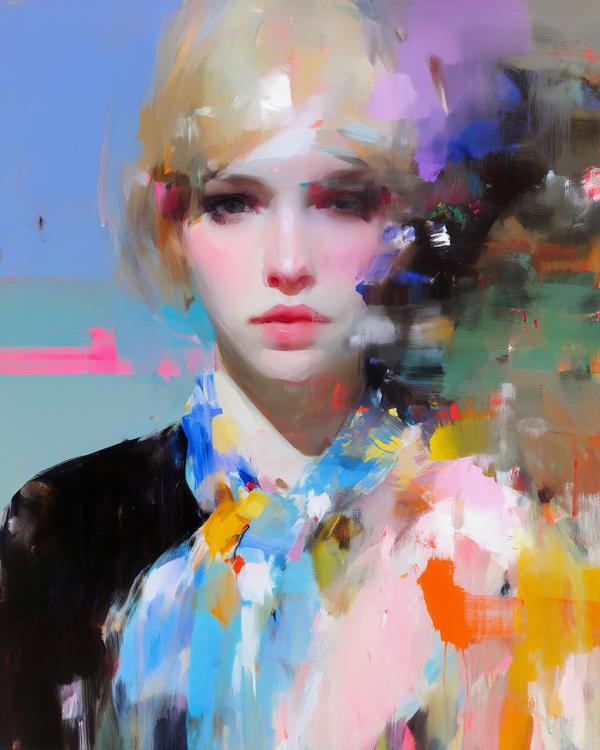
What you’re seeing here is a quartet of portraits that live right on the border between fashion photography and abstract expressionism. The faces are delicate, porcelain-smooth—think John Singer Sargent’s society portraits or 1950s Vogue spreads shot by Irving Penn. But then—bam!—the brushstrokes go rogue, exploding into colorful chaos like Pollock crashing a Jeremy Scott runway or Cecily Brown painting with confetti cannons. This is a classic example of gestural abstraction meeting figuration: the painter grounds us with recognizable faces, then destabilizes the image with painterly eruptions. That tension—the crispness of the gaze versus the blur of the world—is what makes you stare longer. It’s portraiture that doesn’t just capture a person, but the feeling of being a person in a messy, overstimulated world. Art term to drop at brunch: “Impasto.” That’s the thick, textured paint you can almost feel here. Fun fact: Van Gogh practically sculpted with impasto so much that conservators today worry about the peaks of his paint cracking like old frosting. And here’s a fact you’ll definitely want to repeat: in 1913, a critic described the Armory Show’s new modern art as looking like it had been “flung in the face of the public.” Judging by this piece, the tradition is alive and well—except now it feels more like glitter than a punch. So, next time someone asks why portraits need to look like people, you can say: “Because sometimes they need to look like feelings instead.”
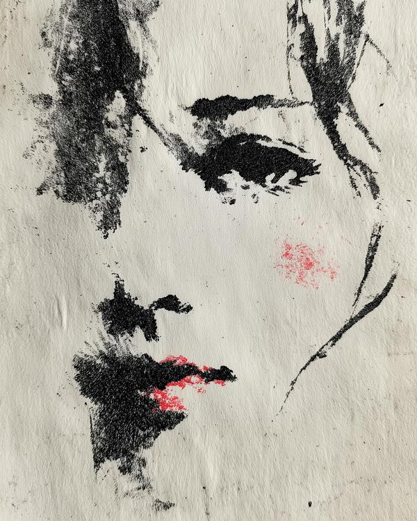
This piece leans on the centuries-old Japanese art of sumi-e (ink wash painting). Think of sumi-e as painting’s minimalist cousin: a style that asks, “How few strokes can I use before the viewer fills in the rest?” Instead of piling on detail, sumi-e artists work with restraint—brush, ink, water, and the white silence of paper. The emptiness is as important as the mark. That’s why this portrait feels both airy and intense: the paper does half the storytelling. You can see echoes of Zen calligraphy here, where the gesture matters as much as the image. In Western terms, imagine if Franz Kline (Abstract Expressionism) and Egon Schiele (expressionistic portraits) went out for sushi and sketched each other on a napkin. Fun fact to drop at brunch: In sumi-e, the first brushstroke is considered the most alive—hesitate, and you lose the energy. That’s why the bold eye here feels so electric; it’s like the brush took a deep breath and nailed it in one go. The little blush of red? That’s a classic trick too. Japanese and Chinese ink painters sometimes used cinnabar or vermilion for accents, to make the monochrome pop. It’s the visual equivalent of dropping chili flakes on a delicate dish—minimal but unforgettable. So next time you’re doodling, try this rule: stop two strokes earlier than you want to. The space you don’t fill might be the most powerful part of the image.
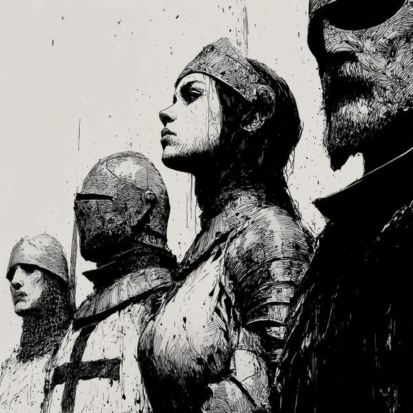
You know it’s serious when everyone’s in full armor and she’s the only one listening for drama. Four figures. All in profile, all marching forward in stoic silence… except Joan. Her head tilts, neck stretched, eyes sharp. She’s not posing. She’s reacting. Something just clanged, whispered, or betrayed offstage, and her body heard it before her brain did. The drawing style lives somewhere between Albrecht Dürer’s engravings and a Frank Miller graphic novel. All that frantic cross-hatching? That’s not mess. That’s value. Tiny scratched lines build shadow, weight, and metal, the way old printmakers faked “gray” with nothing but black ink and patience. Composition trick to steal: rhythm and rupture. The line of helmets creates a drumbeat across the page, evenly spaced, same direction. Then Joan breaks the rhythm. Different armor, exposed face, neck arched. Our eye goes to the person who refuses to march in emotional lockstep. And the silence helps. No background castle, no blazing battlefield. Just vertical scratches that feel like rain, smoke, or noise she’s the only one willing to acknowledge. Dinner-table fun fact: Joan of Arc was probably only 17 when she led armies and 19 when she died. Your “I’m behind in life” speech does not stand a chance against that résumé.
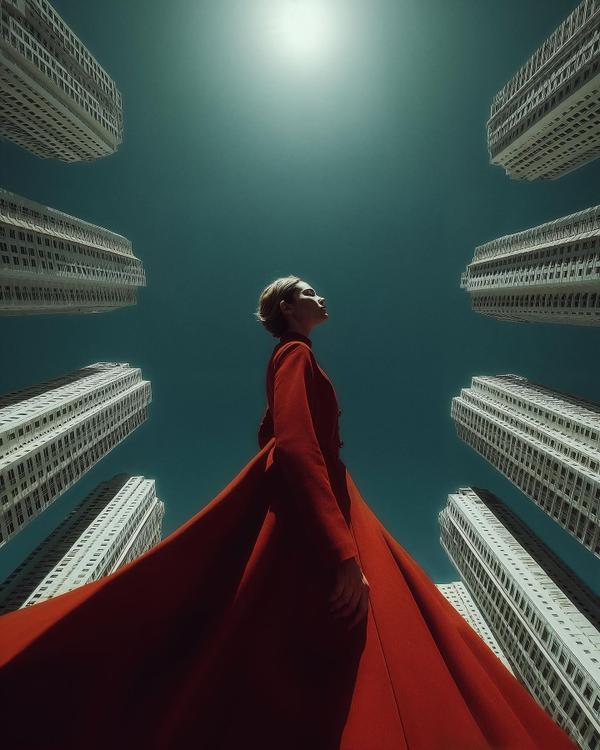
This piece is all about perspective—literally. Shot (or imagined) from a worm’s-eye view, the figure in red suddenly looks monumental, as if they’re holding their own against a concrete canyon. The buildings bend inward, almost bowing, while the sun crowns the subject like a divine spotlight. It’s fashion editorial meets futuristic cathedral.
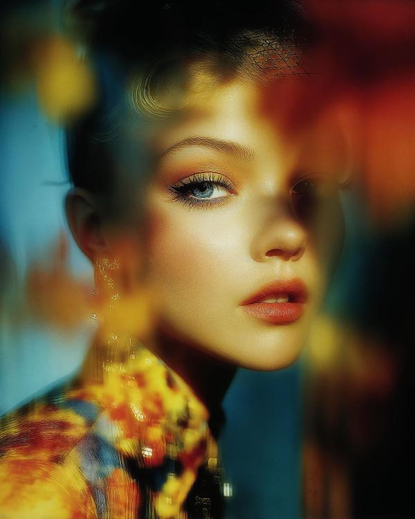
This piece steps into the world of Elizaveta Porodina, the Moscow-born, Munich-based fashion photographer I stumbled upon in the Wall Street Journal. She recently shot Sydney Sweeney, and trust me — if you thought your camera roll was fire, this is Olympus-level divine. Porodina’s signature? Painterly surrealism. Her images look less like glossy fashion spreads and more like oil paintings trapped inside a prism. Notice the blurred doubles, the spectral echoes, the way color bleeds across fabric like molten glass. She bends light the way painters bend pigment — not to capture reality, but to reinvent it. Compare her to Paolo Roversi, the Italian master of fashion photography. Roversi gave us the soft, ethereal, almost ghostly glow of 8x10 Polaroids — every subject a whisper, a memory, a dream. Porodina, meanwhile, is louder. She trades sepia ghosts for jewel tones and iridescent shadows. If Roversi is a candlelit aria, Porodina is a synthwave ballad pulsing in a neon cathedral. Fun fact to impress your next gallery date: Porodina studied psychology before becoming a photographer. Which explains why her portraits don’t just show people — they psychically haunt you. So here’s the takeaway: Porodina isn’t just the future of fashion photography — she’s proof that the line between painting and photography is now a smear of color, blurred beautifully into oblivion.
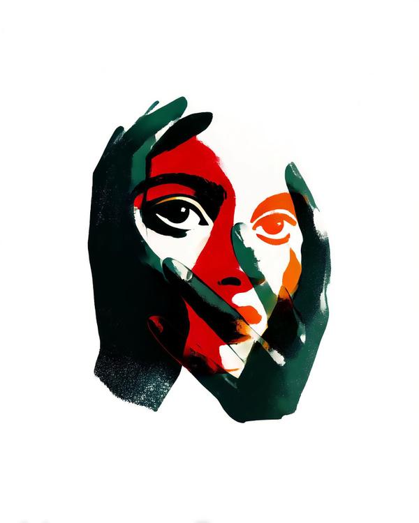
The color blocks of red, orange, and green scream silkscreen pop, echoing Andy Warhol’s flat colors and Richard Hamilton’s early Pop experiments. But the drama of those hands? That’s Expressionism whispering in the background—think Egon Schiele’s angular fingers or Käthe Kollwitz’s stark prints, where hands carried just as much emotion as the face. Notice the trick here: the hands aren’t realistically shaded. They’re shapes, almost stencil-like, overlapping like collage pieces. That technique takes cues from screen printing, where color layers are built one slab at a time. And by leaving a stark white background, the artist amplifies the tension—it’s just you, the face, and those intrusive hands. Fun fact: In art history, hands have often been used as emotional shortcuts. From medieval prayer icons to Michelangelo’s Creation of Adam, hands symbolize power, vulnerability, or control. Here, they almost smother the face, turning the simple act of framing into a story about identity, pressure, or maybe just a bad selfie angle. The punchline? It’s art that stares back at you while also blocking its own mouth. A little Warhol glamour, a little Schiele angst, and a lot of “what exactly are we hiding here?”
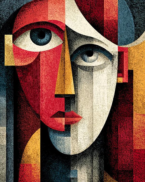
We’re staring into a fractured portrait where geometry does all the talking. Sharp rectangles slice into soft curves, bold reds collide with moody blues, and golden shards punch through like rays of fractured light. It’s Cubism in full voice—Pablo Picasso’s DNA is all over this, with the deconstructed planes and sideways-meets-front view perspective. But there’s also a modern twist: the textured grit and bold color blocking echo contemporary illustrators like Elia Volpi, who blends digital precision with vintage poster vibes. Here’s the art history snack pack for your next dinner party flex: Cubism was less about painting faces and more about painting time—showing multiple angles at once, like a flipbook smashed into one frame. Picasso and Braque invented it around 1907, and it flipped the art world upside down. Without Cubism, we probably wouldn’t have abstract art as we know it. Notice how one eye looks like it’s staring you down while the other has already swiped left? That’s intentional distortion—forcing your brain to reconcile two truths at once. The result? A portrait that feels both ancient and futuristic, like an artifact dug up from a civilization that hasn’t been born yet. Fun fact: Picasso once said, “It took me four years to paint like Raphael, but a lifetime to paint like a child.” This piece channels that childlike boldness with adult-level confidence. So next time someone says “my kid could paint that,” just smile and ask: “Yeah, but could they reinvent how humans see reality?”
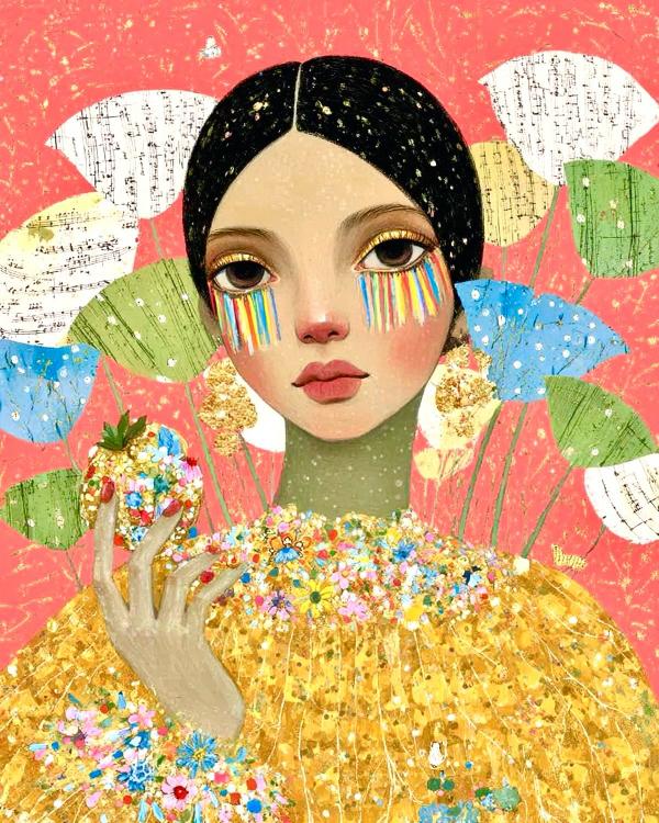
The flat, decorative surfaces and lush textures owe a debt to Klimt’s gilded portraits, while the surreal tears and solemn gaze recall Kahlo’s blend of pain and poetry. There’s also a whisper of Yayoi Kusama’s obsessive patterning in the background and maybe even some Odilon Redon in the dreamlike colors. It’s high drama dressed in pastel hues.
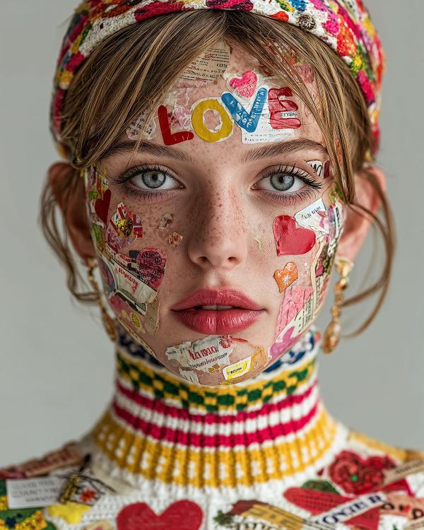
This piece takes the humble sticker sheet and cranks it to haute couture. What you’re looking at is essentially Pop Art meeting Vogue. Think Richard Hamilton’s collages (the guy who made consumer packaging into fine art) crossed with Yayoi Kusama’s obsession with repeated motifs, then filtered through the glossy editorial lens of Tim Walker’s fashion photography. The face becomes a canvas, but instead of oils and pastels, we get the language of everyday consumer culture—labels, hearts, candy-colored typography. It’s playful, but also subversive: a commentary on how identity is often pieced together by the logos and messages that stick to us, literally and metaphorically. Art Concept: This is collage art reimagined as body art. Collage has always thrived on mixing the banal with the beautiful, from Hannah Höch’s Dada photomontages to Barbara Kruger’s bold text-meets-image mashups. Here, stickers—the stuff of childhood trades and trapper keepers—become high fashion ornamentation. Fun fact to flex on a friend: Stickers as an art form actually have a long underground history—“sticker bombing” started as a guerrilla street art tactic in the 1980s, with brands like André the Giant Has a Posse turning into Shepard Fairey’s OBEY empire. What was once rebellious tagging has now been repackaged as luxury chic. So, is it fashion? Is it art? Or is it the ultimate middle-school nostalgia trip dressed up in couture yarn? Trick question: it’s all three, and it’s fabulous.
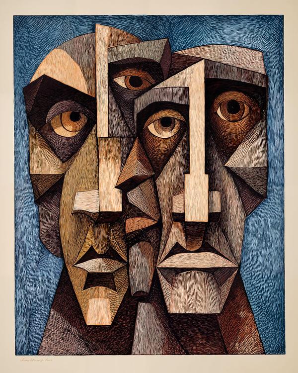
Ever feel like you’re arguing with yourself in the bathroom mirror? This painting takes that feeling, multiplies it by three, and then gives it a geometry lesson. We’ve got fractured faces stacked like a cubist Jenga tower—Picasso would be proud, but so would Escher. The artist slices planes of shadow and light with razor precision, giving each face the bone structure of a Greek statue reassembled by IKEA. The cross-hatched texture? That’s straight out of German Expressionist woodcuts, where linework does the emotional heavy lifting. Why it works: these three faces share eyes, angles, and awkward silences. It’s a visual metaphor for how identity isn’t a single portrait—it’s overlapping drafts, contradictions, and side profiles all crammed into one canvas. The longer you look, the more your brain tries to “solve” it, like a visual Sudoku that stares back. Influences: * Pablo Picasso (Cubist distortion, multiple perspectives at once) * Georges Braque (geometry with grit) * José Clemente Orozco and the Mexican muralists (bold outlines + political gravitas) * And a whisper of Käthe Kollwitz in the hatching, giving every surface a pulse. Fun fact to drop at brunch: Cubism was once dismissed as “geometric folly,” but within a decade, fashion designers were copying it into dresses and even perfume bottles. So yes, that perfume on your dresser? It owes a debt to Picasso’s sketchbook. This isn’t just a portrait—it’s a mood board for your inner committee.
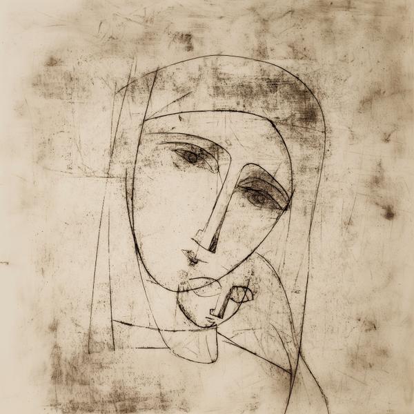
At first glance, this piece looks like it was whispered into existence—soft, delicate lines, yet each stroke lands with intention, like someone doodling with the weight of history on their pencil. The elongated noses and almond eyes nod toward Amedeo Modigliani, while the geometric flattening and quiet angularity carry the echo of Cubism’s rebellious heart. But here’s the twist—this isn’t pure Picasso-era chaos. There’s a warmth, a modern minimalism, that softens the abstraction. And if you’re picking up on the Madonna and Child vibe—you’re right. The mother’s tilted face bends toward the child like a crescent moon, both figures locked in a timeless embrace that’s been painted for centuries… only here it’s been stripped down to its emotional blueprint. That’s where Peggy Kuiper struts in. Her work lives in that dreamy intersection where modern digital fluidity meets classic form. I first stumbled across her after Olivia Wilde posted a piece she bought (celeb art inspo, anyone?). Kuiper’s portraits feel like they’re drawn from memory—stripped of excess, yet packed with intimacy. Her influence shows here in the way emotion is distilled into the barest shapes without losing that sacred tenderness. Fun fact: Minimalist portraits like this rely on line economy—the art of saying the most with the least. It’s harder than it looks. Every curve has to carry meaning, because there’s nowhere for a bad line to hide. It’s like haiku for your eyeballs. Save this one for the next time someone says “less is more” and you want to prove it with actual evidence.
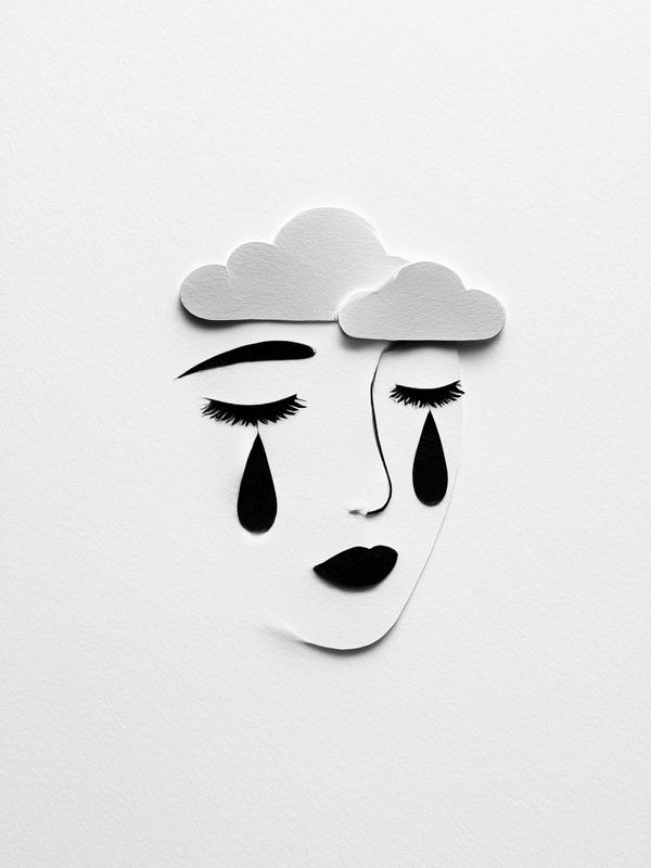
Sometimes the heaviest storms happen in the lightest materials. This minimal cut-paper-and-ink face channels the spirit of modernist collage, with a dash of surrealism’s emotional punch. The clouds-as-thoughts motif could have strolled right out of a René Magritte dreamscape, while the clean, sculptural paper cuts nod to contemporary paper artists like Eiko Ojala, who carves shadows as precisely as lines. The beauty of this style is how it thrives on less. By stripping color and detail, the artist forces your brain to fill in the emotional atmosphere. This is a cousin to “negative space” art—where what isn’t drawn is just as important as what is. Here’s the fun science bit: your brain is a champion pattern matcher. Within milliseconds, it turns a few black shapes into a face (this is called pareidolia—the same reason you see animals in clouds or a face in your toast). But it doesn’t just see the face—it feels it. We’ve got specialized neurons called mirror neurons that fire when we see expressions, making us “catch” the mood. That’s why this piece can tug your heartstrings with nothing more than clouds, lashes, and teardrops. Fun fact to drop: paper art isn’t just craft—it has deep roots in fine art history. Picasso and Braque pioneered papier collé (glued paper collage) in the early 1900s, and Matisse’s famous “cut-outs” in his later years were basically painting with scissors.
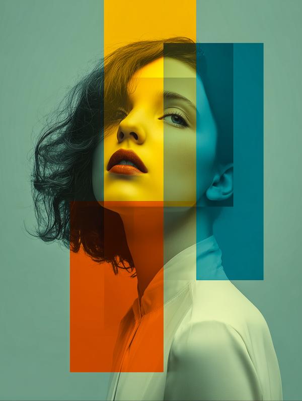
At first glance, you see a face. But stay with me—this isn’t just a portrait, it’s geometry crashing the party.”
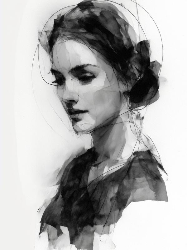
This dreamy portrait is basically what happens when watercolor spills wine and charcoal does the cleanup—moody, graceful, and just the right amount of messy. We let the ink bleed, blur, and break rules? That’s not a mistake, it’s a move. This flowing style balances between elegance and entropy, where the illusion of control almost slips away—like trying to look calm on a Zoom call while your cat knocks over a lamp. The vibe? Think Egon Schiele meets fashion illustration, with a whisper of Zdzisław Beksiński’s ghost floating through. The sharp, gestural lines hint at Schiele’s expressionist figures, but the softness and beauty feel more like a modern editorial sketch come to life. The use of white space gives the portrait a haloed minimalism—a visual inhale. Art snack of the day: This piece plays with negative space—aka the art world’s version of “what you don’t say matters as much as what you do.” Letting parts of the paper breathe actually amplifies the emotion, making the portrait feel more ethereal, almost like it’s fading into memory. Fun fact: Artists like Schiele and Klimt often sketched in ways that left parts “unfinished” on purpose—it draws your eye into what isn’t there, making your brain fill in the blanks. Basically, it’s artistic Jedi mind tricks. She’s not drawn—she’s conjured. Like smoke in a spotlight.
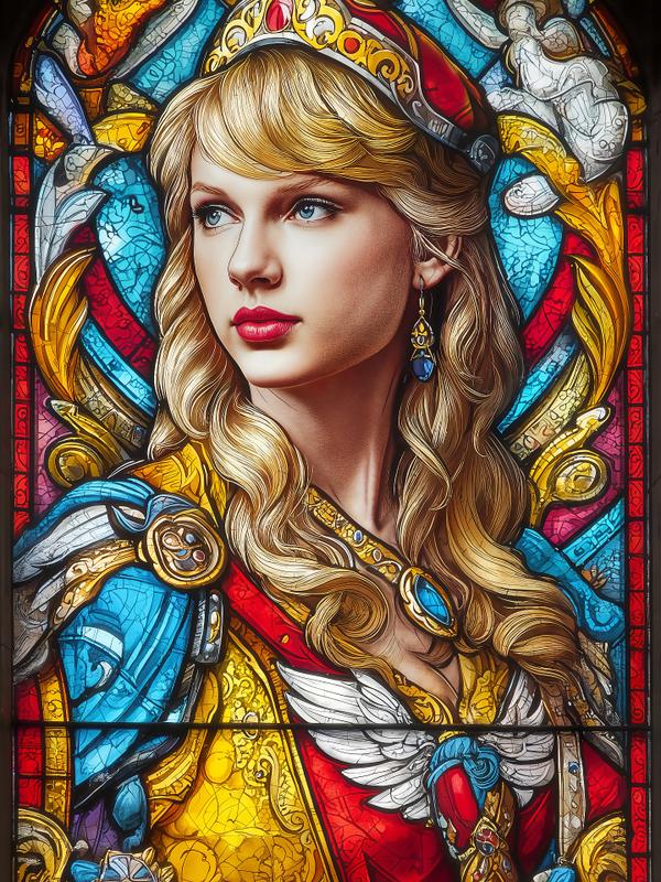
Taylor Swift just announced her next album, and the internet bowed in unison. This stained-glass vision doesn’t just show her—it crowns her. Draped in rich jewel tones, framed like a monarch in her throne room, she’s got the kind of commanding stare that says: “Yes, I’m dropping it at midnight, and yes, you’re cancelling your plans.”
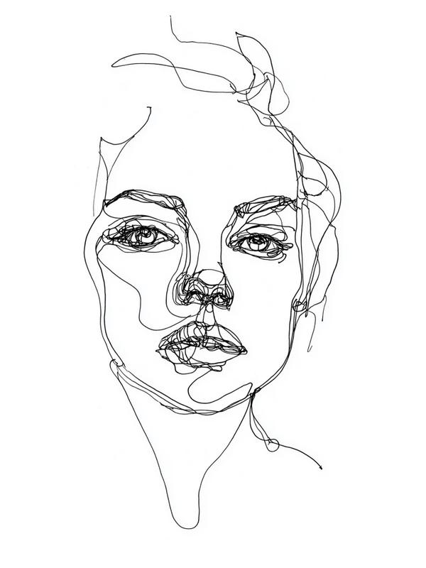
Ever try to draw someone without lifting your pen off the page? That’s exactly what’s going on here—a one-line portrait that’s basically a contour drawing on caffeine. It’s raw, it’s fluid, it’s like a brainwave got tangled in a spaghetti noodle and decided to become a face. Look closely: no erasing, no redos. Just one continuous line dancing its way from brow to cheek to lips, looping like it’s got somewhere to be but also forgot what time it was. This technique is rooted in contour line drawing, a practice where artists focus on feeling the form more than rendering perfection. It was famously used in blind drawing exercises, where you stare at the subject and never peek at the paper. Why? To train your brain to really see, not just glance—like art therapy with a side of vertigo. Fun art facts you’ll want to drop at brunch: * Pablo Picasso loved this method so much, he could knock out a full bull in one line—with swagger. * Henri Matisse turned to simple, flowing lines in his later years, often drawing with scissors during his “cut-outs” phase. * David Hockney has a whole iPad series inspired by line drawing, showing that even 21st-century tech bows down to the basics. * In traditional Chinese brush painting, artists are trained to make one brushstroke convey volume, movement, and emotion—aka the OG one-line masters. * The ancient Greeks used a version of contour drawing on pottery… because yes, even 2,000 years ago people liked clean lines. Emotional hook? This portrait gets it. It’s beautiful, messy, imperfect—and still holds together. Just like you on a Monday.
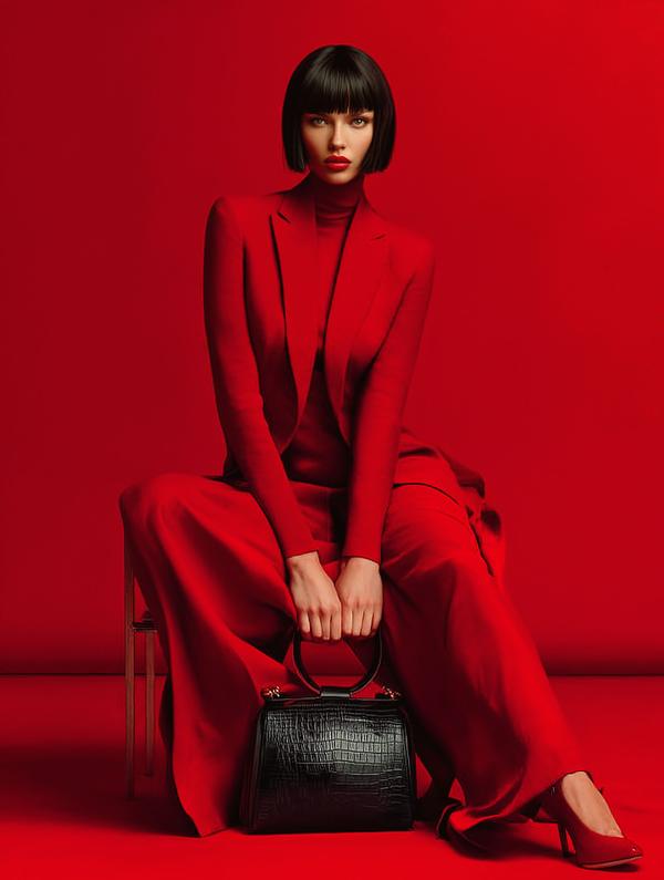
Red isn’t just a color — it’s a statement, a temperature, and a mood. And today’s piece channels the power of two fashion photography legends through one stunning shot. Photography Inspiration: Paolo Roversi + David Sims This image fuses Roversi’s romanticism and painterly softness with Sims’s stark minimalism and graphic punch. You get: The dreamlike drama of Roversi The bold clarity of Sims And a fierce, futuristic woman in control of it all.
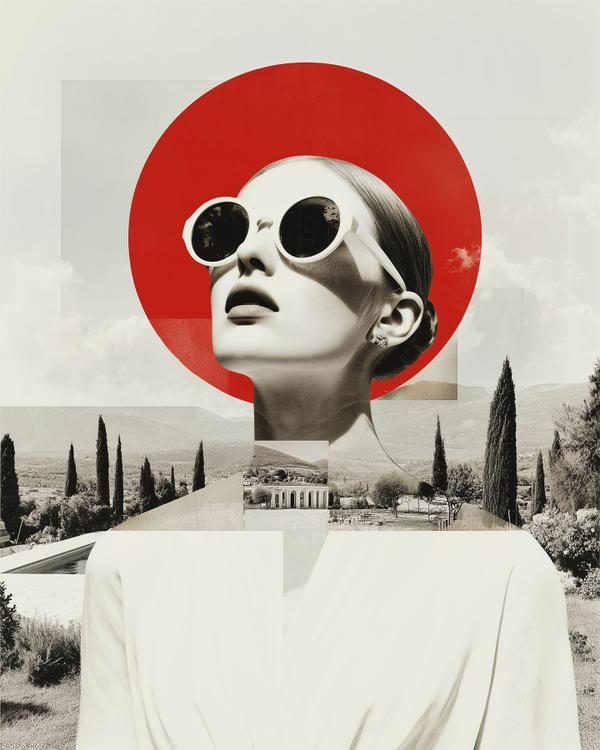
This surreal sun-soaked siren is what happens when Dada takes a Roman holiday.
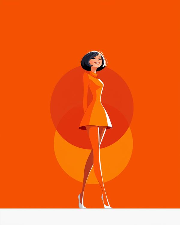
What happens when you blend 1960s mod fashion, anime flair, and a splash of Tarantino’s retrofuturistic noir? You get this technicolor fever dream — where Twiggy laughs in the face of gravity, hemline rules, and anything less than fabulous. Shot from a cinematic low angle, this wide-angle feels pulled straight from a 60s fanzine reimagined in an alternate universe — where Mary Quant rules the runway and every frame is scored with surf rock and sass. This isn’t just art. It’s eyeliner, attitude, and aftershocks of atomic pop culture — all wrapped in a cell-shaded wink.
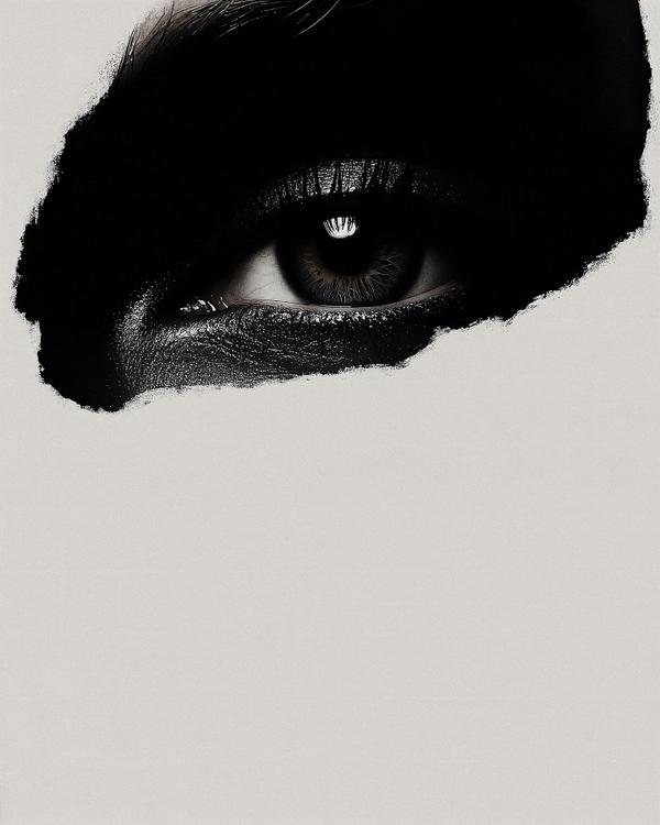
This hyper-focused eye emerges from a black void like it just pierced the fourth wall — and your subconscious. This piece plays on negative space and visual tension, borrowing from both noir aesthetics and the surreal minimalism of Rafal Olbinski or Kumi Yamashita. That single eye? It’s more than a gaze — it’s a spotlight, a question mark, and a mirror, all in one.
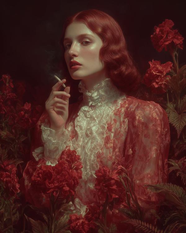
Step into the lush, seductive tangle of longing. Today’s piece explores the theme of desire through a modern-meets-Baroque visual language — crimson blooms, opulent lace, and a glance that could start a revolution (or at least a scandal). The subject, with 1940s waves and a cigarette poised like punctuation, feels plucked from a fever dream painted by Caravaggio’s goth cousin. Let’s break it down: * Color: Red dominates — a classic symbol of passion, danger, and appetite. It’s not just the flowers that are burning. * Light & Shadow: We get serious chiaroscuro vibes here — the dramatic play of light and darkness heightens emotion and tension (a nod to 17th-century masters like Rembrandt or Artemisia Gentileschi). * Texture: That sheer embroidered lace? It’s tactile temptation. It whispers Victorian restraint while the smoke says otherwise. This isn’t just a portrait — it’s a mood. A craving. A power play wrapped in petals and satin. Art fact: In art history, “desire” was often coded — through fruit, flowers, even lighting. Think Botticelli’s Primavera or Klimt’s golden lovers. This image continues that legacy but with a 21st-century smirk.
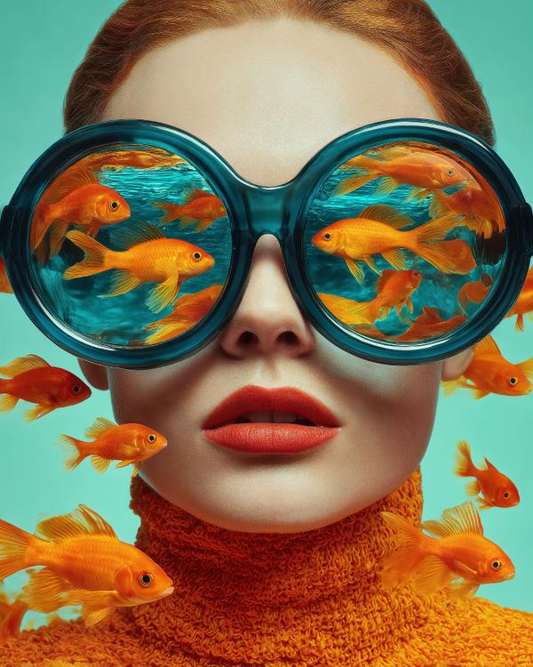
Inspired by the surreal style of Mirjam Duizendstra, this portrait dives headfirst into whimsy. Bold colors, nature-meets-human mashups, and a face that’s clearly been to the deep end of daydreams. Goldfish for thoughts? Yes. Over-the-top goggles? Obviously. This is what happens when your imagination refuses to stay in the shallow end.
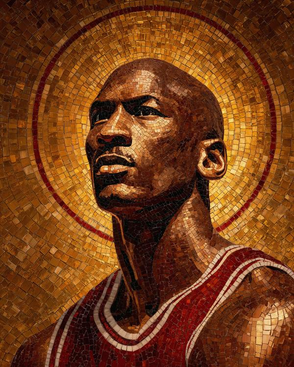
Today’s piece is a tribute to the one and only Michael Jordan, the man who didn’t just play the game—he redefined it. As the NBA playoffs heat up, it felt right to honor the GOAT with something timeless: a Byzantine mosaic style that reflects his almost divine influence on basketball and culture.
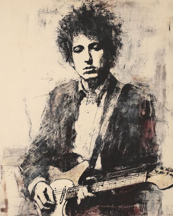
Through the Veil with Dylan
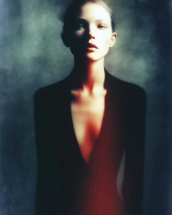
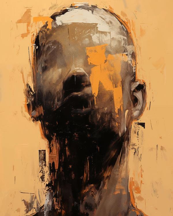
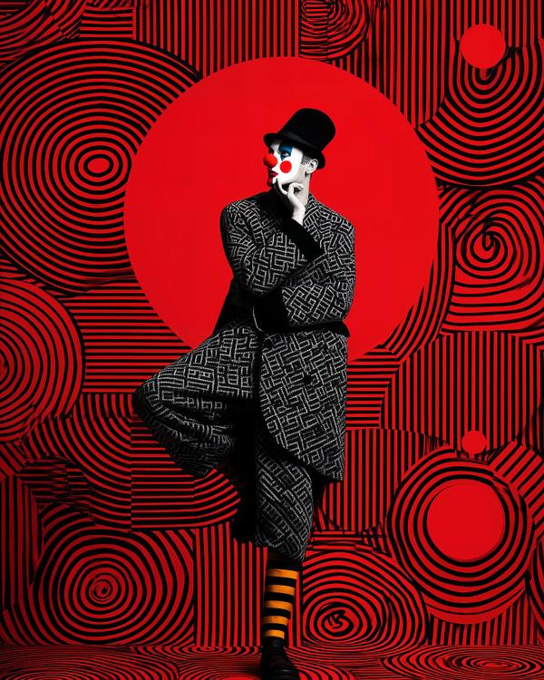
Stephen Sangmeister, and the principles of the Bauhaus School.
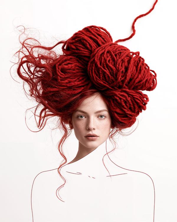
Some days your thoughts arrive neatly folded. Other days they show up as a craft-store emergency.